

I’ll be honest with you. The first time I tried to make my bedroom feel cozy by painting it a warm terracotta, it came out looking like the inside of a pumpkin. Too orange, too intense, and under my single bedside lamp, practically glowing. I repainted within three weeks.
That embarrassing experiment taught me more about warm bedroom colors than any blog ever did: the shade you see on a chip at the hardware store is not the shade you’re going to live with. Light changes everything. Room size matters. And ‘warm’ doesn’t mean orange by default.
So, if you’re sitting in a bedroom that feels cold, sterile, or like it came with the house and never really became yours, this article is for you. We’re going through 15 of the best warm bedroom color ideas with real paint names, real pairing advice, and the lighting caveats most guides skip entirely.
| What Are Warm Bedroom Colors? Warm bedroom color ideas refer to paint shades and palettes that use red, orange, yellow, or brown as their base, creating a cozy, inviting atmosphere. These include terracottas, warm beiges, dusty blushes, chocolates, and golden tones. The key difference from cool colors (blues, grays) is their ability to make a room feel smaller, more intimate, and emotionally grounding. |
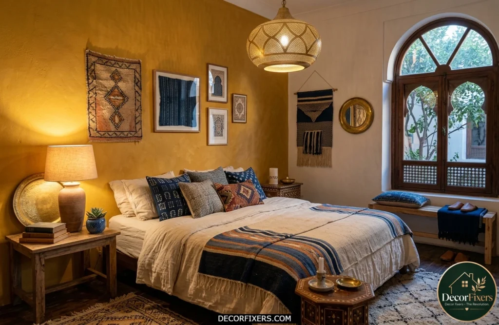
1. Terracotta, The Color That Feels Like a Hug
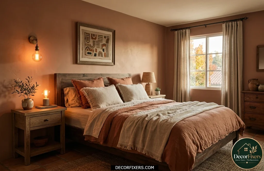
Terracotta is having a serious moment, and it’s not going anywhere in 2026. Designers consistently reach for it because it bridges earthy and elegant without trying too hard.
The go-to pick is Sherwin-Williams Cavern Clay (SW 7701), a saturated but grounded terracotta with brown undertones that keeps it from reading as Halloween orange. Pair it with a cream ceiling, natural linen bedding, and warm Edison-style bulbs. The result is a room that feels like a Tuscan hotel suite, but your own.
2. Warm Greige, The Hardest-Working Neutral You’re Ignoring
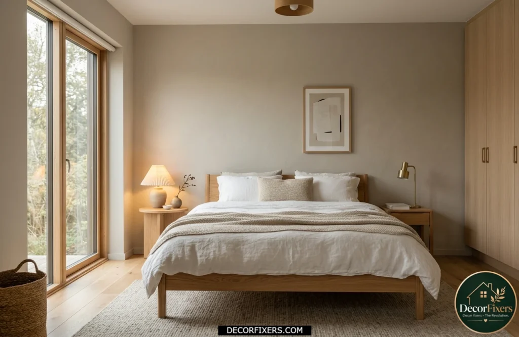
Greige (grey + beige) sounds boring until you see it in a bedroom with warm undertones. It’s the color that makes a room feel calm without feeling cold.
A warm greige palette works especially well in compact spaces because it reflects light while maintaining a cozy atmosphere. If you are decorating a smaller room, these Small Bedroom Ideas can help you maximize both comfort and visual space without sacrificing style.
It reads cream-like in bright daylight and shifts to a warmer, slightly deeper tone under incandescent light at night. That shift is exactly what you want in a bedroom. It’ll never make you feel like you’re sleeping in a hospital or an open-plan office.
3. Chocolate Brown, The Bold Move That Works
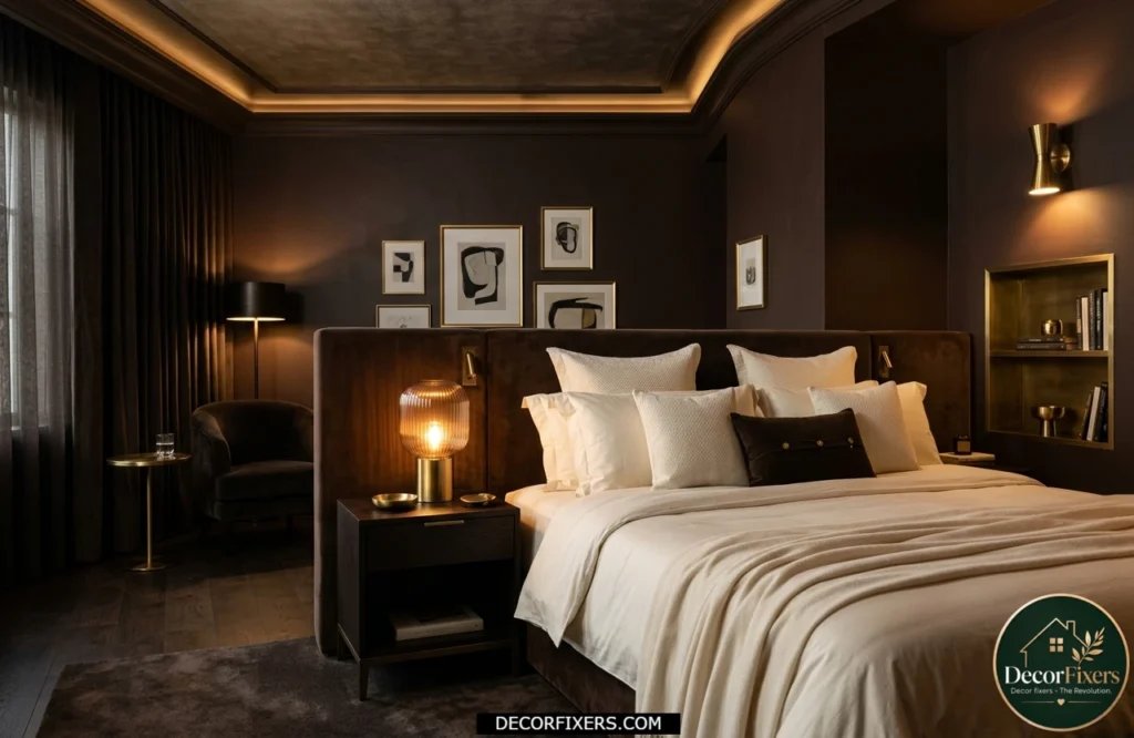
Here’s the thing: dark warm colors in a bedroom are not a mistake. They’re a commitment. Chocolate brown, think Benjamin Moore’s Warm Cocoa or Sherwin-Williams Kaffee, creates a cocooning effect that makes a room feel intentionally intimate, not accidentally small.
Pantone’s 2025 Color of the Year, Mocha Mousse, pushed cocoa browns into the mainstream conversation for good reason. If you’re going this deep, balance it with a light-colored ceiling and warm metallic accents (brass, aged gold). The contrast prevents the walls from swallowing the room.
4. Dusty Mauve, Warm and Sophisticated, Not Feminine
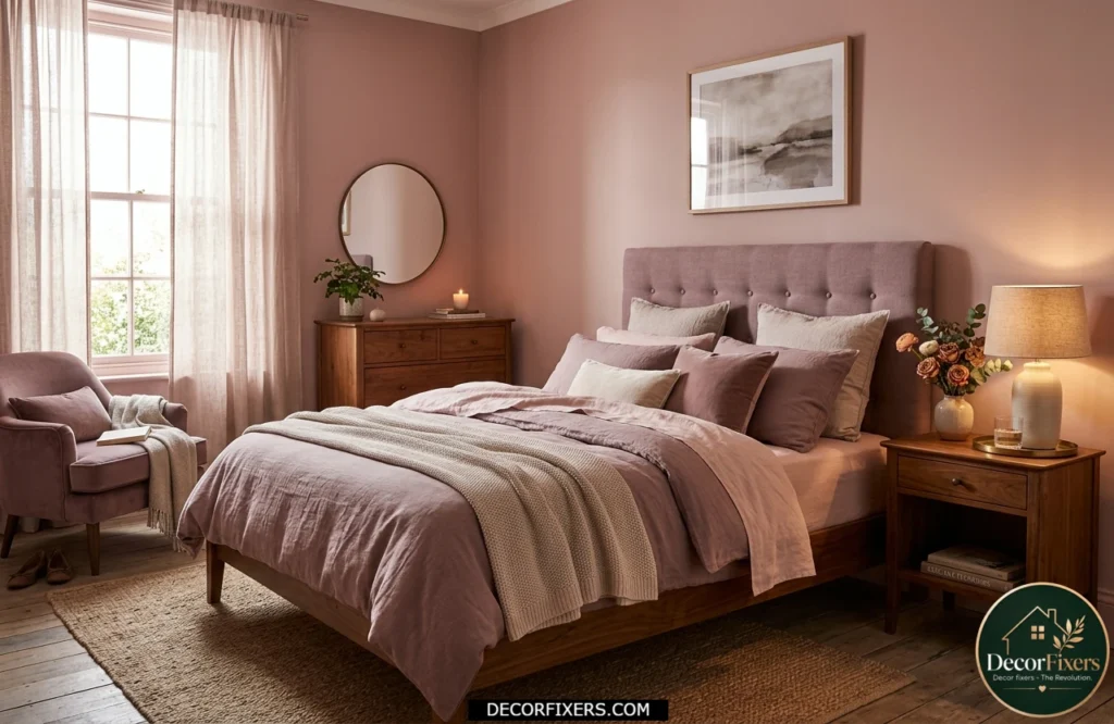
Dusty mauve is one of those colors that confuses people when they hear it, then immediately makes sense when they see it. It’s a muted, grayed-out pink with warm undertones, closer to a dried rose petal than bubblegum.
What I love about it for bedrooms is that it reads differently depending on the light. In the morning sun, it looks barely-there blush. At night under warm lighting, it deepens into something that feels genuinely romantic. Benjamin Moore’s Mauve Desert is worth a sample. Pair it with warm wood furniture and soft white trim.
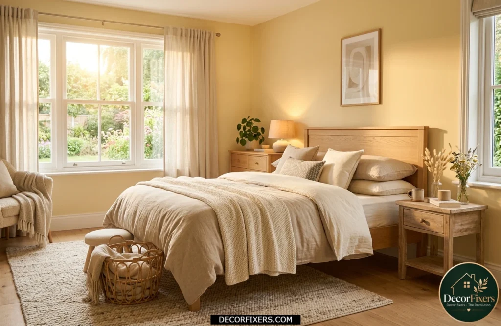
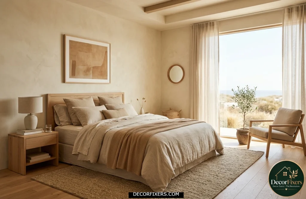
5. Warm White, Because Not All Whites Are Created Equal
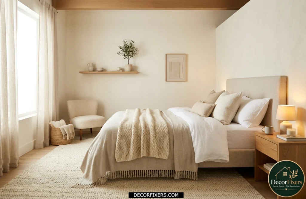
If you’ve ever painted a room ‘white’ and it turned blue-grey or looked clinical, you used a cool white. Warm whites have yellow, pink, or cream undertones that make them glow softly rather than bounce harsh light.
Warm white walls create an excellent foundation for layered textures and elevated details. For readers looking to add a more sophisticated hotel-inspired feel, these Cozy Luxe Retreat Upgrades offer practical ways to transform a simple bedroom into a refined sanctuary.
Quick note: Warm whites work in small bedrooms where terracotta or brown might feel overwhelming. They’re not a cop-out, they’re a deliberate choice.
Quick Comparison:
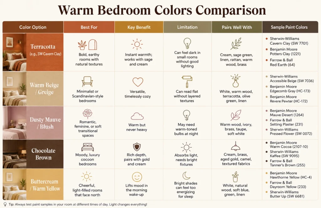
| Color Option | Best For | Key Benefit | Limitation |
| Terracotta (e.g., SW Cavern Clay) | Bold, earthy rooms with natural textures | Instant warmth; works with sage and cream | Can feel dark in small rooms without good lighting |
| Warm Beige / Greige | Minimalist or Scandinavian-style bedrooms | Versatile, timelessly cozy | Can read flat without layered textures |
| Dusty Mauve / Blush | Romantic, feminine, or soft transitional spaces | Warm but never heavy | May need warm-toned bulbs at night |
| Chocolate Brown | Moody, luxury cocoon bedrooms | Rich depth, pairs with gold and cream | Absorbs light, needs bright fixtures |
| Buttercream / Warm Yellow | Cheerful, light-filled rooms that face north | Lifts mood in the morning wake-up | Bright shades can feel too energizing for sleep |
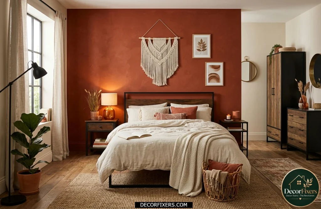
6. Burnt Sienna, Earthy Without the Full Terracotta Commitment
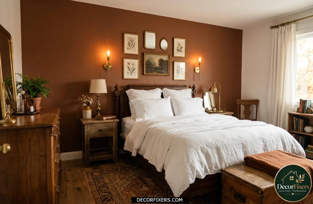
Burnt sienna sits between terracotta and brown; it’s more red and complex than classic terra cotta, with a richness that reads antique and sophisticated. It’s the color of old Roman walls. If full terracotta feels too brave, burnt sienna is the more wearable version.
Use it as an accent wall behind the bed rather than all four walls. Pair with white bedding, dark wood nightstands, and brass hardware. The combination looks expensive without requiring an expensive budget.
7. Buttercream Yellow, The Mood-Lifter Nobody Talks About
Most people assume yellow is wrong for a bedroom. That’s actually a good instinct; bright, saturated yellows are too stimulating for sleep. But soft buttercream and warm straw tones are different entirely. They carry warmth without energy.
8. Warm Sage Green, Were Warm Meets Earthy
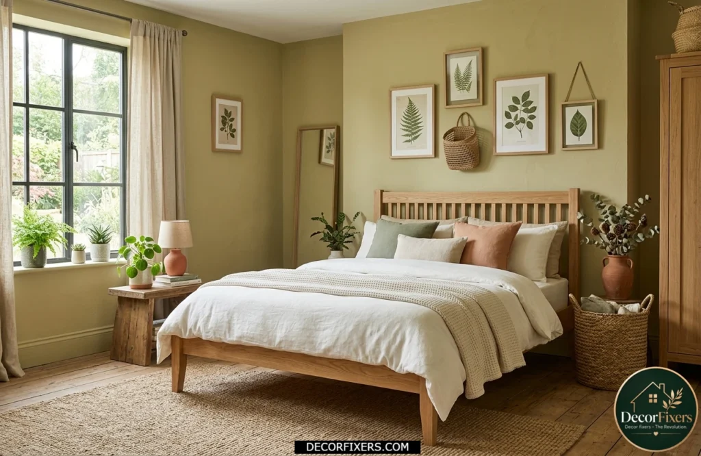
Sage green often gets classified as a cool color, but warm-toned sage, the kind with yellow rather than blue undertones, sits comfortably in the warm palette. It’s the bridge between earthy and refreshing.
Benjamin Moore’s Pale Avocado or Sherwin-Williams Privilege Green both lean warm. They pair beautifully with terracotta accents, raw wood, and off-white. This combination is especially powerful in bedrooms that receive a lot of natural light; the green doesn’t deepen into something cold the way cool sages do.
9. Blush Pink, When Done Right, It’s Far from Girly
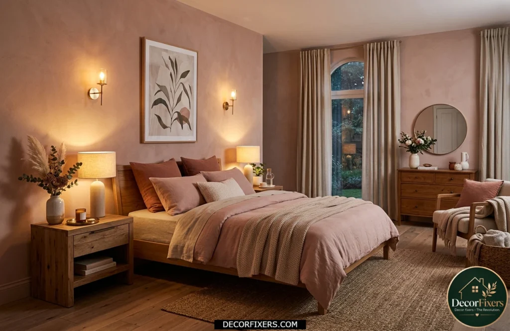
Muted, grayed blush is not the pink of childhood bedrooms. Paired with warm woods, linen, and dark trim, it becomes a genuinely sophisticated backdrop. Farrow & Ball Dead Salmon, yes, that’s actually the name, is the gold standard here. It’s a warm pink with terracotta undertones, beloved in European interior design, and it looks completely different at 8 am versus 10 pm.
I’ve seen conflicting takes on blush in bedrooms; some designers argue it reads too sweet, others swear it’s the most flattering wall color a room can have because it reflects warm light onto faces and fabrics. My read is this: in muted, earthy versions, blush is one of the most versatile warm bedroom colors available.
10. Mocha and Coffee Tones, Quiet Luxury Made Simple
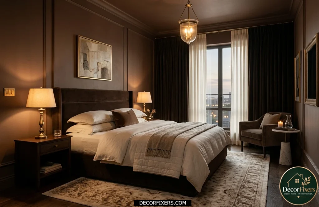
The quiet luxury trend pushed deep mocha and coffee tones into bedrooms, and they stuck. Pantone’s Mocha Mousse (the 2025 Color of the Year) is the clearest signal that rich brown-warmth isn’t leaving the design conversation anytime soon.
What makes these tones work for sleep spaces is their low energy. They’re warm but not stimulating. Deep but not claustrophobic, especially when you keep the ceiling lighter and introduce brass or honey-toned wood. Think: a five-star hotel room that doesn’t feel performative.
11. Golden Ochre, Artisan and Warm Without Going Full Mustard
Ochre is mustard’s more mature older sibling. It carries the warmth of yellow but is grounded with enough brown to feel earthy rather than cheerful. It’s an excellent accent wall choice for bedrooms that want visual drama without going dark.
Pair golden ochre with deep navy bedding for a palette that feels deliberate and collected, or with cream and rust tones for something more Moroccan-inspired. Sherwin-Williams’ Harvest Gold is a solid starting point for testing the shade.
12. Deep Burgundy, The Moody Warm Color Nobody Expects
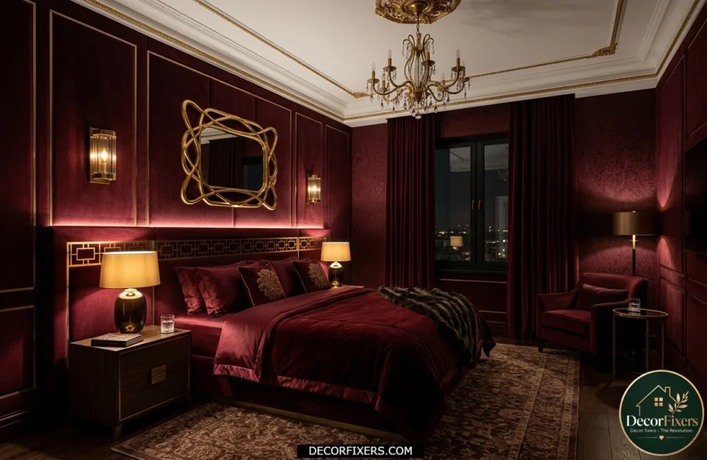
Burgundy in a bedroom sounds like a bold risk. It actually works, particularly as an all-four-wall color, because of how it interacts with warm lighting. Under a warm bulb, burgundy walls glow rather than darken, creating one of the most genuinely intimate spaces you can make.
The trick is committing. Half measures (one accent wall, paired with beige) tend to look unfinished. Go full room, use white ceiling paint with a yellow undertone, and lean into gold and brass accessories. This is the cocooning effect that designers reference when talking about bedrooms that feel like destinations.
13. Warm Taupe, Elevated Neutral That Never Feels Sterile
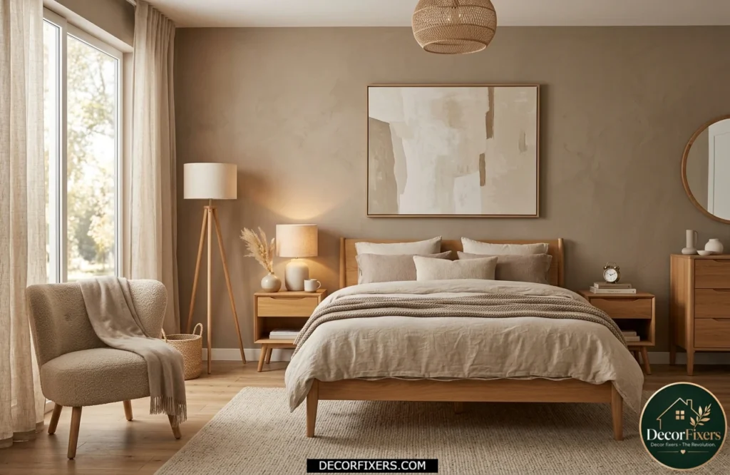
Taupe is what happens when brown and grey meet, but warm taupe has enough brown in it to sit firmly in the cozy column. It’s probably the safest warm color choice for first-time bedroom painters because it’s nearly impossible to get wrong.
Sherwin-Williams Shiitake (SW 9173) and Benjamin Moore Pale Oak (OC-20) are the two names that come up constantly among designers. Both have warm undertones that activate under evening light. They look expensive, pair with everything, and will outlast any trend cycle.
14. Rust and Paprika, When You Want Warmth to Be a Statement
Rust is terracotta’s bolder, more confident cousin. It has more red in it, more fire. It shouldn’t cover all four walls unless you know your room and lighting extremely well, but as a statement, whether on an accent wall, a ceiling, or through upholstery, it’s striking.
Look, if you’re in a room with good natural light and high ceilings, rust walls can absolutely work. The constraint is artificial lighting.
Rust deepens dramatically under warm bulbs, which can be beautiful or overwhelming depending on the intensity. Always test with a large sample patch first, and observe it at both noon and midnight.
Rust tones naturally complement woven materials, handcrafted décor, and collected accessories. If you enjoy this relaxed aesthetic, these Boho Bedroom Ideas provide additional inspiration for creating a warm and personality-filled sleeping space.
15. Warm Sand and Camel, The Low-Risk, High-Return Option
Sand and camel tones are the warm bedroom colors for people who want coziness without commitment. They’re light enough to keep a room feeling open, warm enough to feel welcoming, and versatile enough to work with almost any furniture style.
Benjamin Moore’s Camel (2165-30) and Sherwin-Williams Antique White both deliver that sun-warmed wall effect that makes a bedroom feel like it gets more natural light than it actually does. This is the right move for north-facing rooms, small bedrooms, or anyone starting their warm-color journey for the first time.
How to Choose the Right Warm Bedroom Color
| Step-by-Step: Choosing Your Warm Bedroom Color 1. Identify your room’s natural light; north-facing rooms need lighter warm shades (beige, sand, warm white). 2. Pick your undertone: red-based (terracotta, burgundy), yellow-based (ochre, buttercream), or brown-based (taupe, chocolate). 3. Buy 3–4 peel-and-stick or painted samples and observe them at 3 different times: morning, afternoon, and evening under your actual lamps. 4. Confirm the color against your existing flooring and furniture; warm colors with the wrong undertone can clash with wood tones. 5. Test your lighting: warm bulbs (2700K–3000K) support all warm colors; cool daylight bulbs will fight them. |
The One Thing Most Warm Bedroom Color Guides Miss
Artificial light changes everything. A terracotta that looks stunning in a bright studio apartment can turn muddy-brown in a bedroom with a single 40-watt lamp. This is the variable that most top-ranking articles on warm bedroom colors either skip or bury at the bottom.
The simple rule: warm colors (red, orange, yellow undertones) are intensified by warm bulbs (2700K–3000K Kelvin rating). They’re subdued and sometimes unpleasantly dulled by cool daylight bulbs (5000K+). If you’re committed to terracotta or burgundy, match it with warm-spectrum lighting throughout the room, not just the bedside table.
This works best for bedrooms where you control all light sources. It won’t resolve the problem if your only light is a harsh overhead fixture; in that case, start with lighter warm neutrals (warm beige, buttercream) until you can add lamps.
CONCLUSION:
Choosing a warm bedroom colour sounds simple. Pick a warm paint, roll it onto the walls, and enjoy a cosy space. In reality, it is rarely that straightforward. I learned that the hard way after choosing a terracotta shade that looked rich and inviting in the store but turned bright orange under my bedroom lighting. That experience taught me that colour is influenced by far more than a paint chip.
The colours that work best depend on the room’s natural light, the direction the windows face, the size of the space, and even the type of bulbs you use at night. A warm beige can feel calm and sophisticated in one room but dull and flat in another. The same is true for terracotta, taupe, sage, blush, and other popular warm tones.
The 15 ideas in this guide are not simply a collection of trending colours. They are practical options that help you understand how warm colour palettes behave in real homes and how to choose one that supports rest, comfort, and everyday living.
Before committing to any paint color, test samples on multiple walls and view them at different times of the day. Trust how the space feels, not just how it photographs. A bedroom should feel comfortable, personal, and easy to live in for years.
FAQs:
Q: What’s the best warm color for a small bedroom?
A: Warm beige, greige, and buttercream are excellent choices for small bedrooms because they reflect light and create an open, inviting feel. While terracotta and burgundy can add warmth, they often work best when balanced with layered lighting and lighter furnishings to prevent the room from feeling cramped.
Q: Should I use warm colors in a bedroom that gets no natural light?
A: Yes, but choose carefully. Warm whites and light beiges will add warmth without closing the room in. Pair with warm-bulb lighting (2700K) and avoid dark warm colors like chocolate brown or rust, which need daylight to balance them.
Q: Is terracotta still in style for 2026?
A: Absolutely. Interior designers and major paint brands, including Sherwin-Williams and Benjamin Moore, have continued featuring earthy terracotta tones in their trending palettes through 2025 and 2026. It’s one of the most durable color trends of the decade.
Q: What warm colors are easiest to live with long-term?
A: Warm taupe, greige, and warm white; they don’t fatigue the eye the way bold warm colors can. They also work with extra furniture styles and seasonal decor changes.
Q: How do I make a warm bedroom color feel luxurious, not cheap?
A: Three things: quality paint finish (eggshell rather than flat), warm-toned metallic accents, and layered lighting. The color itself matters less than the execution around it.

Creator of DecorFixers, sharing practical home and interior ideas focused on real-life usability, simple design improvements, and budget-friendly solutions.