

I have repainted the same small living room three times in two years. Not because I was bored, but because every time I trusted a generic “just go white” tip from a blog, I ended up with walls that looked like a hospital corridor under a grey London sky.
Nobody tells you that the rules change completely once your living room is under 12 square meters. Nobody tells you that the color that looked perfect on a Pinterest board was photographed in a south-facing studio with a skylight and a professional lighting rig.
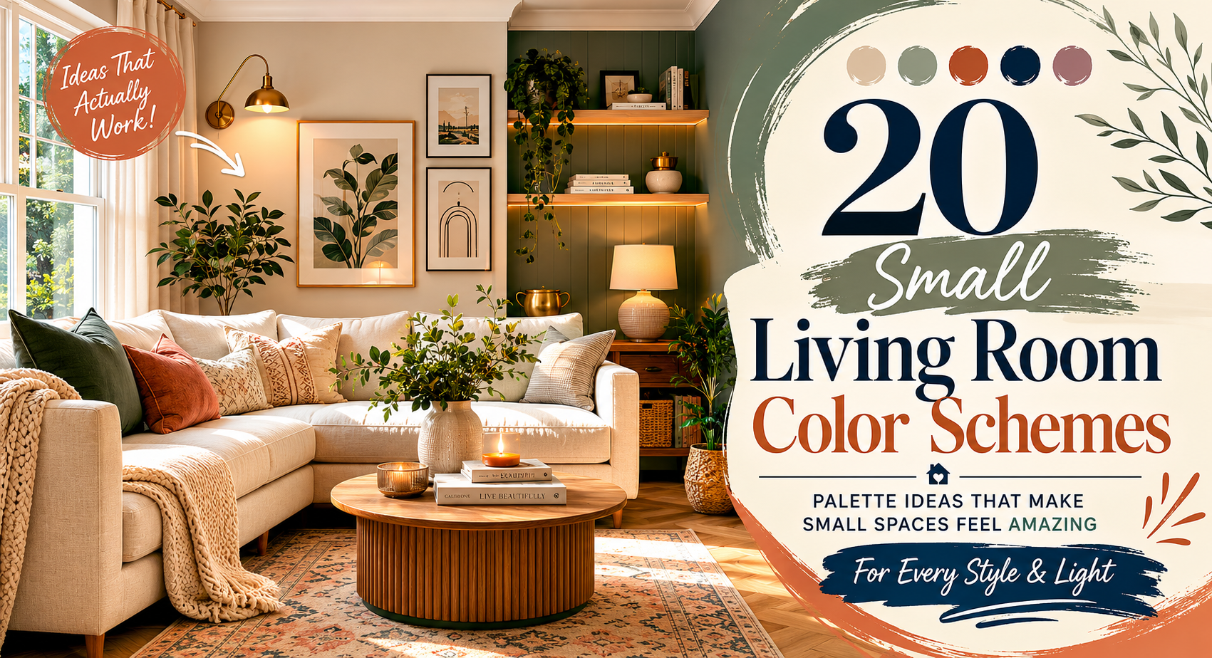
That frustration is exactly why I want this guide to be different. These 20 small living room color schemes aren’t aesthetic mood boards; they’re practical palettes with real reasoning behind them, mapped to room orientation, light sources, and what you’re actually trying to feel when you walk through the door. Let’s get into it.
| Small living room color schemes are curated combinations of wall, trim, and accent colors chosen specifically to visually expand, warm, or define a compact living space. The right scheme accounts for living room orientation, natural light levels, ceiling height, and the paint finish used, not just the color swatch on the tin. |
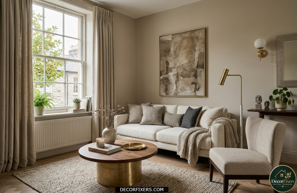
1. Warm White, The Smarter Off-White for South-Facing Rooms
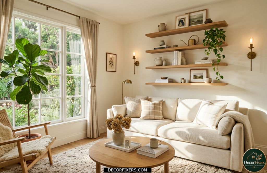
Not all whites are equal. Warm whites with yellow or pink undertones, think Benjamin Moore’s Chantilly Lace or Dulux Timeless, bounce morning and afternoon light beautifully in south or east-facing rooms. The result is a living room that feels clean without feeling clinical.
Pair warm white walls with natural wood shelving, warm brass hardware, and cream textiles. Avoid pure brilliant white if your room faces north, as it will turn grey-blue by midday and your space will feel colder, not larger.
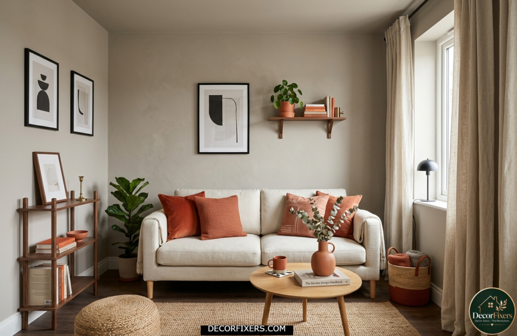
2. Greige, The Fail-Safe Neutral That Actually Has Personality
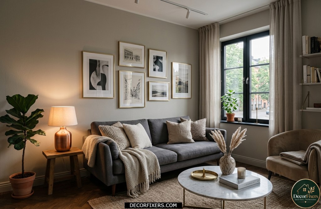
Greige, that warm grey-beige hybrid, is the most forgiving color in a small living room. It hides minor scuffs, pairs effortlessly with almost any sofa color, and keeps the living room feeling settled rather than stark. Farrow & Ball’s Jitney is a perfect example: complex enough to feel considered, neutral enough to never overwhelm.
Here’s the thing: Greige can fall flat in north-facing rooms under artificial light. If your living room doesn’t get direct sun, layer in warm metallic, brushed brass picture frames, a copper side lamp, and the whole palette warms up significantly.
3. Sage Green, Nature-Inspired Calm for Compact Spaces
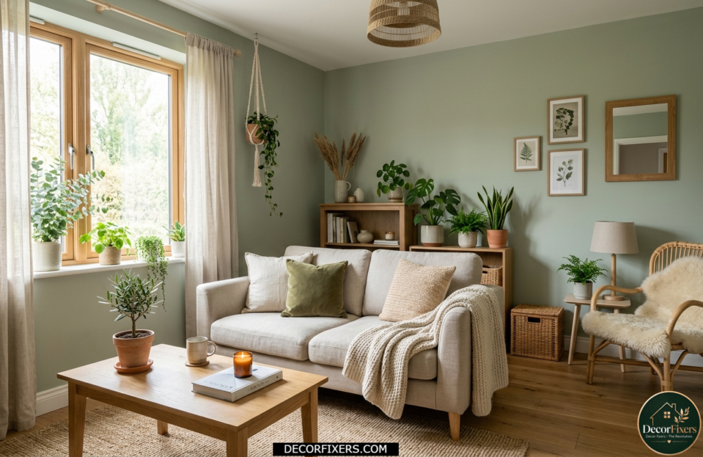
Sage green has become the go-to shade for people who want color without commitment. Its grey undertones keep it from feeling loud, while its green base brings a sense of outdoor calm into cramped urban apartments. It works especially well with natural textures, rattan, linen, and unfinished oak.
A practical note: test Sage in your room at different times of day. Under warm artificial light in the evening, some sage shades pull noticeably grey. Little Greene’s Sage Green holds its warmth better than many competitors at night, which makes a meaningful difference in a living room you actually use after dark.
4. Soft Terracotta, The Color That Makes Small Rooms Feel Intentional
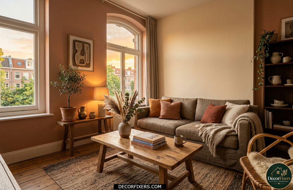
Terracotta got a bad reputation in the 1990s because people used it aggressively. The 2025 version is softer, more muted, think sunbaked clay rather than brick. In a small south-facing room, soft terracotta absorbs light in the evening and returns it as a warm, amber glow that makes the space feel far more inviting than any neutral ever could.
Use it on three walls and keep one wall, ideally the one opposite the window, in a cream or warm white to prevent the living room from closing in. Farrow & Ball’s Dead Salmon sits in this territory beautifully, warm enough to feel bold but quiet enough to live with every day.
5. Dusty Pink, The Underrated Scheme That Works in Any Light
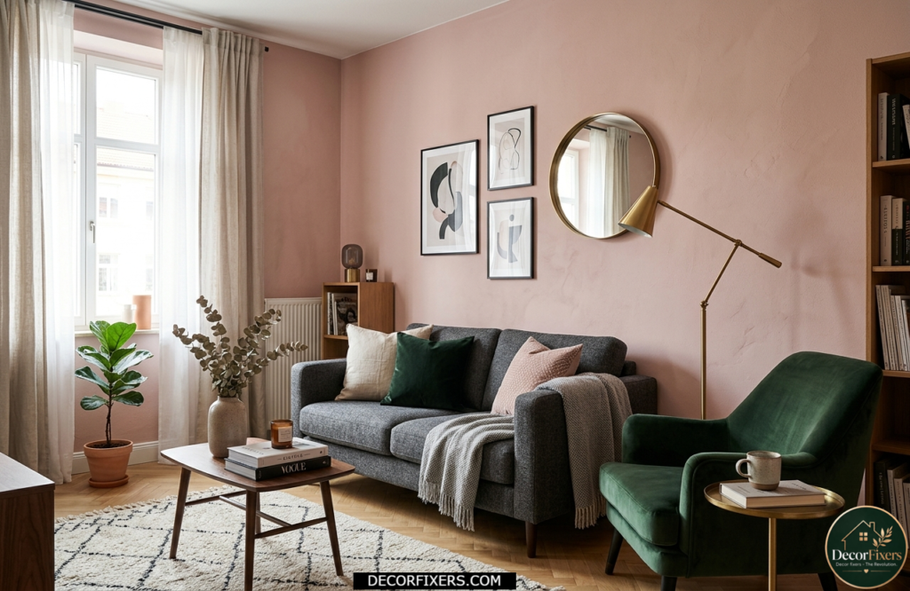
Dusty pink is one of those colors that designers recommend far more often than civilians dare to try. It reads warm in south-facing living rooms, surprisingly rich in north-facing ones, and it pairs with almost every furniture color: charcoal, navy, warm camel, and forest green.
Or maybe I should say it this way: dusty pink isn’t a “feminine” color, it’s a light-responsive color. In low light, it deepens into a complex blush. In bright light, it lifts into something fresh and airy. If you’ve been avoiding it because it sounds risky, that’s exactly the reason to try it.
What makes a color work in a small living room?
The best small living room color schemes balance light reflectance value (LRV), undertone warmth, and room orientation. According to Sherwin-Williams’ design research, the perception of room height varies by only about two inches between light and dark colors, meaning the space-expanding effect of pale walls is far smaller than most guides claim. What actually makes a room feel bigger is choosing colors with the right undertone for your light source, maintaining tonal consistency between walls and trim, and understanding whether your room faces north or south before picking a single shade.
6. Pale Blue-Grey, The Classic That Opens Up Any Ceiling
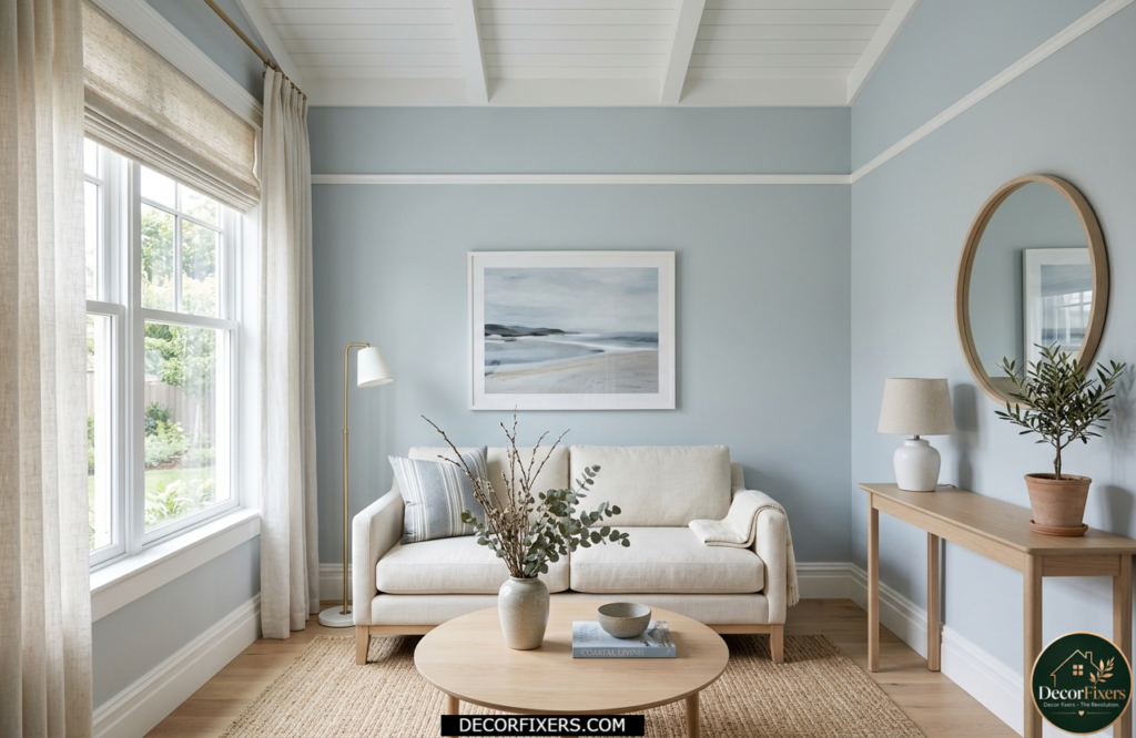
Blue-grey is the color that makes ceilings disappear. The cool undertone draws the eye upward, creating the illusion of more vertical space, especially useful if your living room has standard 8-foot ceilings and feels boxy.
It pairs well with white woodwork, pale oak furniture, and any textile with a hint of blue or green. Benjamin Moore’s Pale Smoke is a reliable choice. It doesn’t tip into cold or clinical, there’s just enough grey to keep it grounded.
7. Color Drenching, One Shade, Head to Toe, Surprisingly Freeing
Color drenching, painting walls, ceiling, skirting boards, and even door frames in the same shade, sounds counterintuitive for a small living room. It isn’t. When there’s no contrast between surfaces, the eye stops registering where walls end, and space begins. The room feels like a cocoon rather than a box.
This is one of the most underused techniques for compact living rooms. Little Greene and Johnstone’s Paint both suggest it explicitly for small spaces with limited natural light, and once you see it executed well, you’ll understand why. Pick a mid-tone with warm undertones, olive, terracotta, dusty teal, never a cool grey, which will feel like a cave.
8. Deep Navy Blue, Dark Done Right for a Jewel-Box Effect
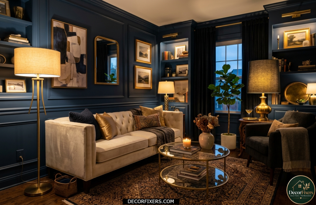
Here’s the opinion a few readers will push back on: dark colors can make small living rooms feel better, not worse. The condition is that you execute them intentionally. A deep navy, Benjamin Moore’s Deep Royal, for instance, turns a cramped room into a jewel box. The walls recede, the furniture becomes the focus, and the room feels deliberately intimate rather than accidentally small.
The critical requirement is layered lighting. A single overhead bulb in a dark-walled room will feel oppressive. Add a warm floor lamp in the corner, a table lamp beside the sofa, and candles on the coffee table, and the navy comes alive. I’ve seen conflicting data on dark colors in small spaces: some designers swear by them, others avoid them entirely. My read is this: it depends entirely on the lighting plan, not the paint tin.
9. Warm Cream and Ivory, Softer Than White, More Alive Under Lamplight
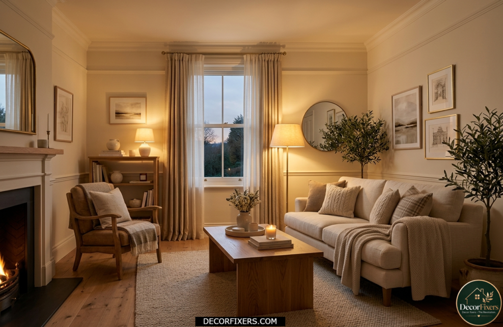
Cream and ivory are what white wants to be. They have enough warmth to feel human under both natural and artificial light, without the yellowness that tips into dated. They also make wood tones sing, something stark white often fails to do.
If you’re decorating a small living room on a budget and want the safest possible baseline, start here. Cream gives you flexibility: layer bolder accents seasonally, and the room never feels stale. Budget Living Room Decor Ideas, for anyone who wants to build this kind of flexible palette affordably, this guide covers exactly how to do it without sacrificing style.
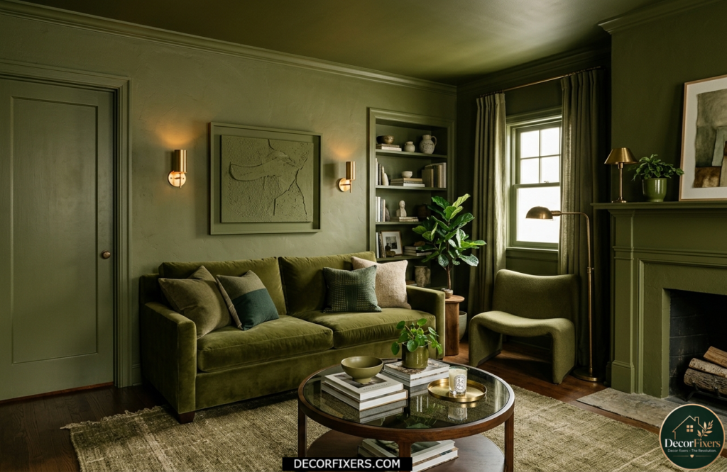
10. Muted Olive Green, The Earthy Scheme That Recedes Beautifully
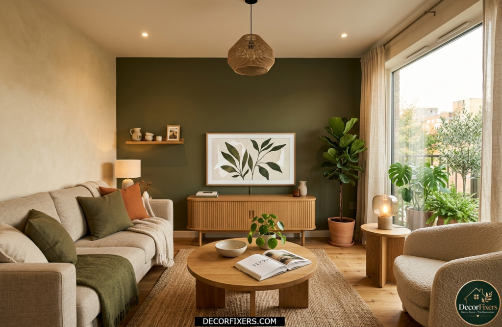
Muted olive is one of those colors that does invisible work. It pulls back visually, especially on a TV wall, making the living room feel deeper than it is. Interior designer, Suzanne Pearce, notes that olive-dominated home trends in 2024 have carried into 2025 precisely because it bridges biophilic warmth and sophisticated restraint.
The caveat: test it under artificial lighting before committing. Some olive shades turn grey-green under warm bulbs, others turn brown-green. The sweet spot is an olive with a warm yellow undertone that stays green across all light conditions.
11. Tonal Monochrome, Layers of One Color to Add Depth
Tonal monochrome doesn’t mean boring. It means choosing three values, light, mid, and deep, of the same color family and distributing them across walls, soft furnishings, and accessories. The effect is visual depth without visual noise.
For a small living room, place the lightest tone on the walls, mid-tone on the sofa, and the darkest as accents in cushions, throws, or a side table. The room gains texture and dimension without any single element fighting for attention. This is a genuinely underused technique.
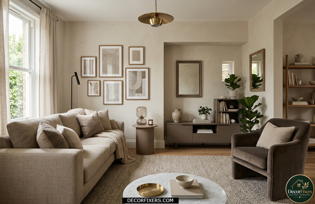
12. Warm Stone and Putty, The Sophisticated Neutral Beyond Beige
Putty, warm stone, and greige-leaning taupe sit in a category that feels more considered than standard beige. They have enough complexity to look intentional but remain adaptable enough to survive multiple furniture changes and seasonal redecorating.
These tones belong to what Little Greene calls the “Stone palette”, a range of warm neutrals with earthy, mineral undertones. They work particularly well in Tier 1 markets like the UK and North America, where living rooms often deal with limited natural daylight for three to six months of the year.
13. Forest Green Accent Wall, Bold Without Overwhelming
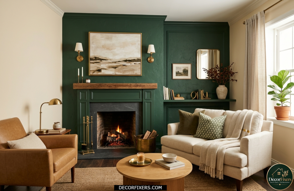
An accent wall in deep forest or Brunswick green creates an instant focal point without requiring you to commit every surface to a bold color. The key is restraint: one wall only, ideally the wall your sofa faces. Keep the remaining three walls in a warm cream or warm white to balance the depth.
This works particularly well in living rooms where a fireplace or artwork is placed against the accent wall. The green frames the feature and draws the eye directly to it, which paradoxically makes the room feel more organized and therefore less cramped.
14. Japandi Palette, Warm White, Raw Wood, and One Muted Accent
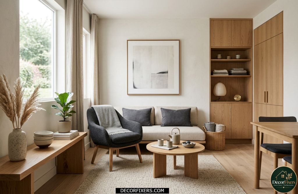
The Japandi approach to color is restrained by design: warm white or light putty walls, natural wood tones, a single muted accent, usually charcoal, dusty olive, or warm clay, used sparingly in textiles. The absence of color is the design choice.
For a small living room, this palette removes visual clutter at the color level before you’ve moved a single piece of furniture. If you want to understand how this philosophy applies to the full room layout, Japandi Living Room Ideas delves into the spatial principles behind this approach. It’s one of the most practical applications of minimalism for compact spaces.
Quick Comparison:
| Color / Scheme | Best For | Key Benefit | Limitation |
| Warm White / Off-White | South & east-facing rooms | Reflects light, feels airy | Can look flat without layering |
| Greige (Gray + Beige) | North-facing or low-light rooms | Warm and neutral, hides scuffs | May read dull under artificial light |
| Sage Green | Biophilic, Scandi, or boho spaces | Calming, pairs with wood tones | Needs good natural light to stay green |
| Soft Terracotta | South-facing, cozy apartments | Warm glow, earthy & trend-proof | Too much can make space feel smaller |
| Deep Navy / Midnight Blue | Accent wall or a small den | Dramatic, cocoon-like depth | Needs layered lighting to avoid gloom |
| Dusty Pink / Blush | Modern, feminine, or eclectic rooms | Soft warmth, surprisingly versatile | Bold decor can clash if the palette is busy |
| Color Drenching (one bold tone) | Rooms with no natural focal point | Unifies and expands perceived depth | Requires commitment before painting |
15. Soft Plum and Mauve, Unexpected, Warm, and Surprisingly Space-Expanding
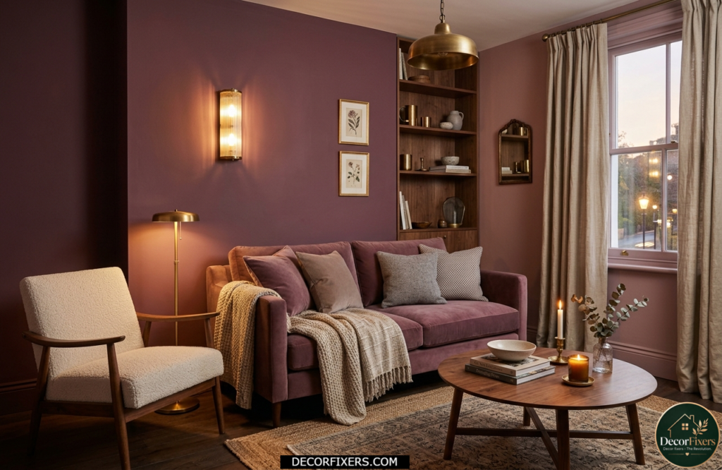
Plum and mauve are emerging as credible alternatives to pink for people who want warmth without sweetness. The red and blue pigments in plum create a complex, shifting tone that looks different depending on the time of day, muted and soft in morning light, richer and more jewel-like under evening lamps. It pairs exceptionally well with warm neutrals, aged brass, and dark walnut furniture.
If you’re nervous about plum on all four walls, start with it on a chimney breast or alcove. Live with it for a week before deciding whether to extend it.
16. Pale Lemon and Warm Yellow, The Brightness Hack for North-Facing Rooms
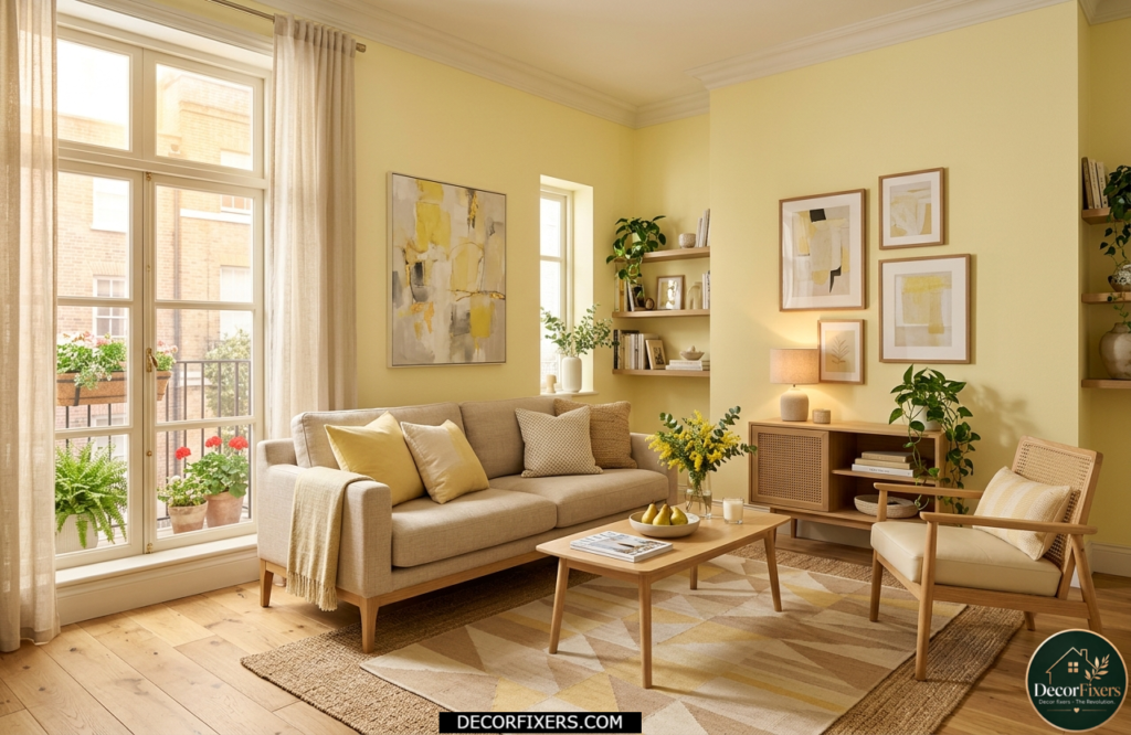
North-facing living rooms don’t get direct sunlight; they receive cool, diffused light all day. The standard advice is to use warm white, but pale lemon or warm yellow is actually more effective: it simulates the warmth that sunlight would bring in a south-facing room.
Little Greene’s creative director Ruth Mottershead recommends this approach specifically for small, north-facing rooms with limited light, leaning into warmth rather than trying to brighten with a cool white that will only amplify the grey cast of the light. A barely-there lemon, not a school canteen yellow, is the target.
17. Charcoal and Warm White, High Contrast Done Quietly
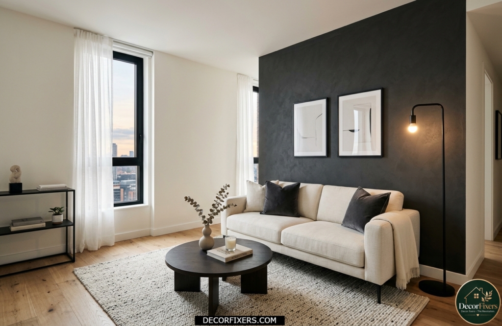
High-contrast schemes in small living rooms work when the contrast is localized rather than repeated everywhere. One charcoal wall against three warm white walls creates drama without fragmentation. The dark wall recedes, and the room appears deeper as a result.
Avoid repeating the charcoal in the furniture. If the wall is dark, the sofa is also dark, and the rug is dark, the room stops reading as high contrast and just reads as heavy. One strong statement per room is a rule that holds across almost every color decision you’ll make.
18. Dusty Teal, The Color That Bridges Warm and Cool in One Scheme
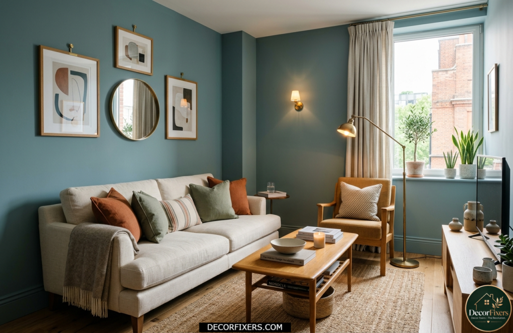
Teal is a color that walks the line between blue’s cool recession and green’s natural warmth. In its dusty, desaturated form, it avoids both extremes: it neither chills the living room nor overwhelms it with color. It’s one of the most versatile options in a small living room because it reads differently depending on what surrounds it.
Pair dusty teal with warm cream, honey oak, and aged brass for a scheme that feels both calm and collected. It also works as a color-drenching choice, one of the few mid-tones that holds up without becoming either oppressive or washed-out when applied head to toe.
19. Blush and Mushroom, A Two-Tone Pairing That Feels Genuinely Modern
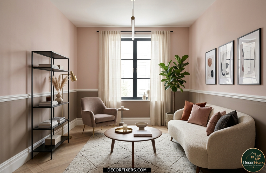
Two-tone color schemes, painting walls in two colors separated by a dado rail, picture rail, or painted dividing line, work extremely well in small rooms because they break up the monotony of a single plain wall without adding visual clutter.
Blush above and mushroom below is a pairing that feels current without being trend-dependent. The blush catches light near the ceiling, making the living room feel taller, while the deeper mushroom grounds the lower half and prevents the scheme from feeling insubstantial. Both Benjamin Moore and Farrow & Ball have multiple options in each category.
20. The 60-30-10 Approach, A Framework, Not Just a Single Color
The 60-30-10 rule is the most useful framework for small living room color schemes that most paint brand articles skip completely. It states: 60% of the room uses a dominant color (walls), 30% uses a secondary color (sofa, curtains, large rug), and 10% uses an accent (cushions, lamp base, picture frames). Applied to a compact room, it prevents the overuse of any single tone, which is the most common reason small living rooms feel chaotic rather than intentional. For practical layout ideas that work alongside any of these palettes, Small Living Room Design Ideas covers spatial planning and furniture arrangement in compact spaces, because color and layout decisions are inseparable.
The beauty of 60-30-10 is that it’s color-agnostic. Any palette from this list can be plugged into it. Pick your dominant tone first, then build from there.
| How to Choose a Small Living Room Color Scheme (Quick Reference) 1. Identify your room’s orientation; north-facing rooms need warm undertones; south-facing rooms handle cool tones. 2. Test paint samples as A4-sized swatches directly on the wall, observing in the morning, afternoon, and under evening lamps. 3. Decide your LRV target, light colors above LRV 70 for maximum openness; below LRV 50 for cocooning warmth. 4. Apply the 60-30-10 rule, 60% dominant wall color, 30% secondary in soft furnishings, 10% in accent details. 5. Choose your finish, eggshell or satin for walls (washable), semi-gloss for woodwork and skirting boards. |
FAQs:
Q: What’s the best color for a small living room to make it look bigger?
A: Warm whites and off-whites with yellow undertones (LRV 75+) are the most reliable choice for creating an open feel. However, color drenching in a mid-tone can achieve a similar effect by removing the visual contrast between surfaces.
Q: Should I use dark colors in a small living room?
A: Yes, intentionally. A single dark accent wall, or full color drenching in a warm, deep tone, can make a small living room feel cozy and designed rather than cramped. The key condition is adequate layered lighting. Without it, dark walls feel oppressive.
Q: How do I choose a color scheme for a north-facing small living room?
A: Avoid cool whites and stark blues; they amplify the grey cast of north-facing light. Choose warm tones with yellow, red, or orange undertones: warm cream, pale lemon, terracotta, or greige. These simulate the warmth that direct sunlight would provide.
Q: What colors make a small living room feel taller?
A: Painting the ceiling the same color as the walls, or very slightly lighter, removes the visual “lid” effect and draws the eye upward. Pale blue-grey on walls also recedes vertically and creates the illusion of greater ceiling height.
Q: When should I use color drenching in a small space?
A: Color drenching works best when a living room lacks a natural focal point, has low natural light, or has an awkward shape you want to minimize. Use a mid-tone with warm undertones, never a cool grey, and ensure the lighting plan is warm and layered before committing.

Creator of DecorFixers, sharing practical home and interior ideas focused on real-life usability, simple design improvements, and budget-friendly solutions.
1 thought on “20 Wonderful Small Living Room Color Schemes: Palette Ideas That Work”