

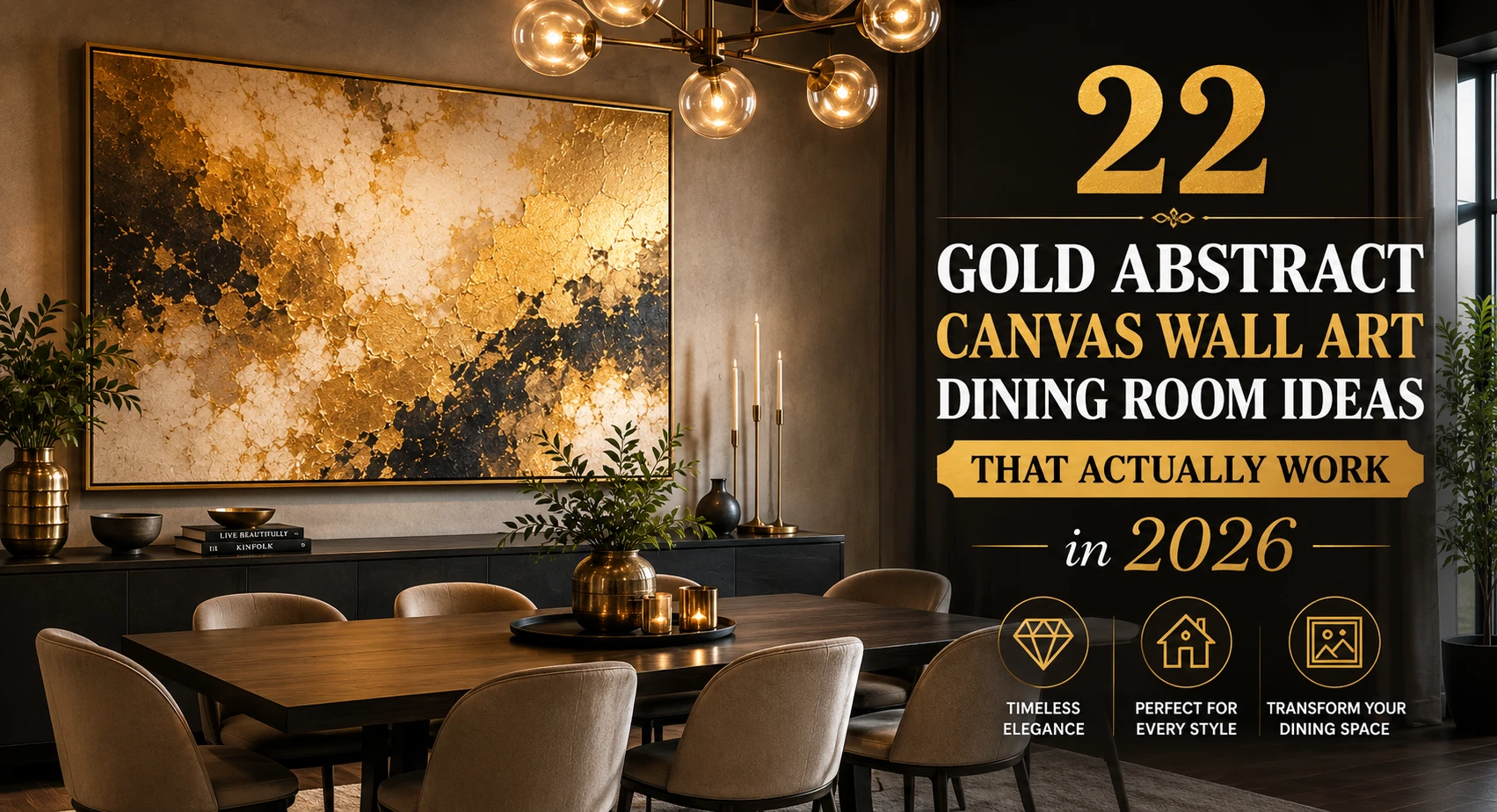
That blank wall above your dining table is staring at you again. You’ve scrolled through hundreds of Pinterest boards, opened a dozen Amazon tabs, and still nothing feels right, too small, too generic, or just weirdly beige for the space you’ve worked so hard to create. I’ve been there.
The truth is, gold abstract canvas wall art is one of those rare décor choices that works across almost every dining room style, from modern farmhouse to glam contemporary, without demanding a designer budget. The trick is knowing which gold, what size, and how to place it so the room breathes instead of feeling cluttered.
Here are 22 real, styled ideas. No filler. No stock-photo vibes. Just honest picks that tie a dining room together.
Gold abstract canvas wall art for dining rooms refers to canvas prints or hand-painted pieces featuring non-representational compositions, brushstrokes, geometric shapes, or fluid forms, rendered in gold tones (yellow gold, champagne gold, rose gold, or antique gold). They serve as focal-point décor that adds warmth, light reflection, and a luxury feel to the dining space.
1. The Single Oversized Statement Canvas
One large canvas, we’re talking 40″ × 60″ or bigger, hung centered above a dining table immediately anchors the whole room. No gallery wall planning. No measuring four different frames. Just one piece doing all the heavy lifting.
Go for a piece with a predominantly gold palette on a dark navy or charcoal background. The contrast pops beautifully under warm pendant lighting, and it catches the eye the moment anyone walks in. This works best in rooms with 9-foot or higher ceilings; anything lower and it can feel oppressive.
2. Gold Diptych Above a Long Sideboard
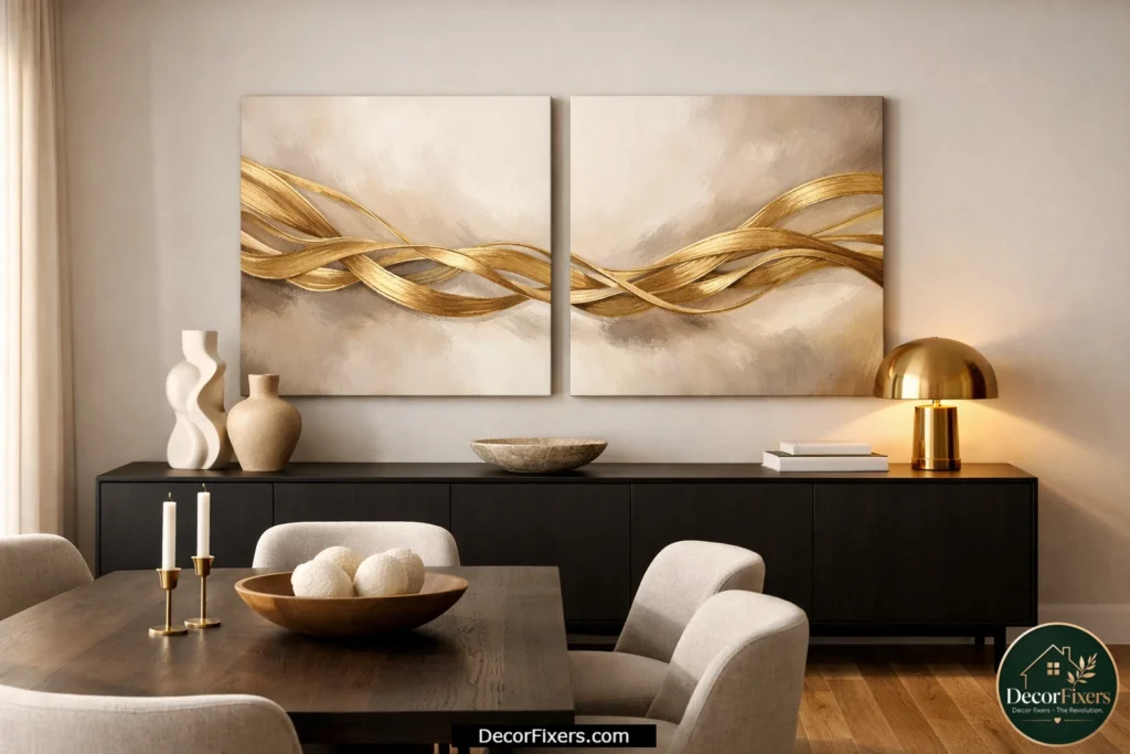
A matched pair of 24″ × 36″ canvases hung side by side with a 2-inch gap gives you visual width without the weight of a single huge piece. The symmetry reads as intentional and elevated, not like you just grabbed two random prints.
Look for diptych sets where the gold flows across both panels as a continuous composition. Kline Collective does this beautifully, and their sets start around $229 for both panels. Hang them at eye level, roughly 57″ to the center of the grouping, right above a sideboard or console table.
3. Champagne Gold on White, The Clean Minimal Look
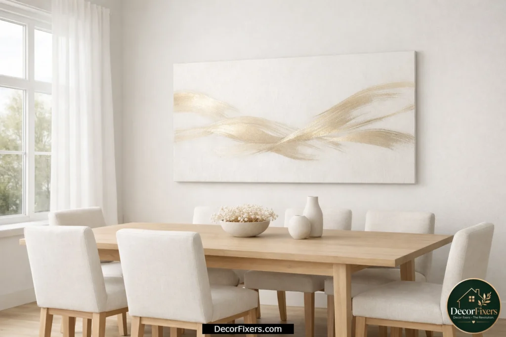
Here’s the thing: not all gold is the same. Champagne gold, that soft, barely-there pale metallic tone, reads completely differently from bright yellow gold. On a white or cream canvas background, it creates an almost luminous, gallery-worthy effect that works especially well in Scandinavian-style or minimalist dining rooms.
If your dining room has white walls, light wood furniture, and linen upholstery, bright yellow gold will clash. Champagne gold unifies the space instead. NordicWallArt carries several large-format options in this colorway, with sizes ranging from 20″ to 48″.
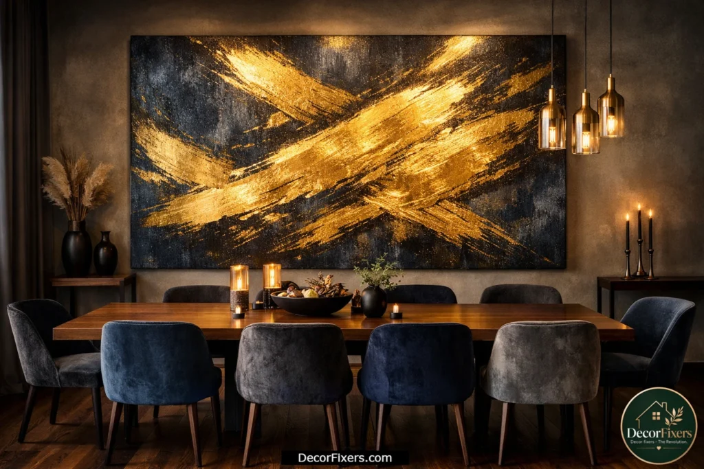
4. Gold and Black Abstract Canvas for a Moody Dining Room
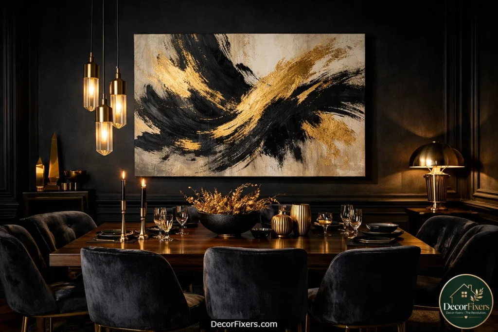
If your dining room leans dramatic, dark walls, black metal chairs, velvet upholstery, a gold-and-black canvas is your match. The combination mimics the richness of Art Deco without going full 1920s revival.
Choose abstract pieces with thick gestural brushstrokes in black and gold on a neutral background. The organic marks soften the hard black elements in the room. A 30″ × 40″ framed option from Amazon’s QSQ line runs around $45–$65 and, surprisingly, photographs well for the price. It won’t fool a gallery curator, but it photographs beautifully and holds up in person.
5. Textured Gold Impasto Canvas, When You Want Real Depth
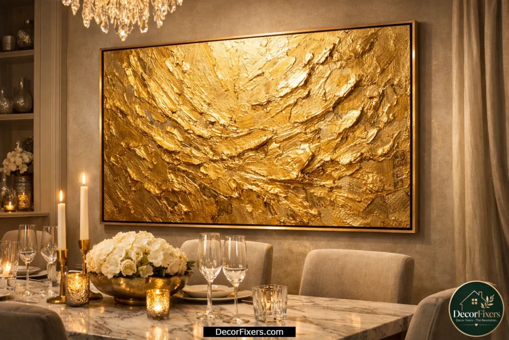
Flat prints are fine. But textured impasto canvases, where the paint sits raised off the surface in thick ridges and peaks, catch dining room light in a way no print can replicate. Under a chandelier or pendant, the shadows shift slightly as you move, making the piece feel alive.
These are genuine hand-painted pieces and are priced accordingly. Expect to spend $150–$400 for a quality textured original. Etsy has a healthy market of independent artists in this style. Search ‘gold impasto abstract canvas’ and filter by size, you’ll find custom-size options most galleries don’t offer.
6. Triptych Set for Wide Dining Room Walls
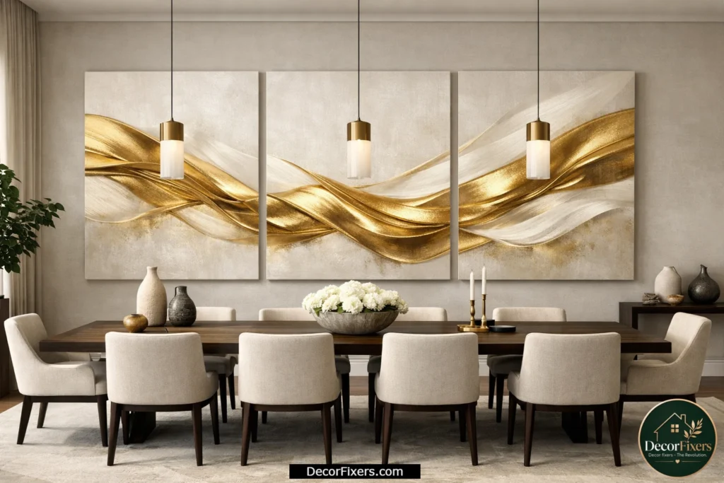
A three-panel triptych covering 6 to 8 feet of wall is the single best solution for large dining rooms that feel empty no matter what you hang. The horizontal span matches the visual width of a long dining table, so everything feels balanced.
The panels should be equal size, typically 3 panels of 16″ × 24″ or 3 panels of 20″ × 30″, with a continuous gold abstract composition that reads as one image across all three. Hang with a 1.5″ gap between panels for visual cohesion. Society6 offers affordable print-on-demand triptych options in gold abstracts, customizable by size.
Quick Comparison: Which Canvas Format Works Best?
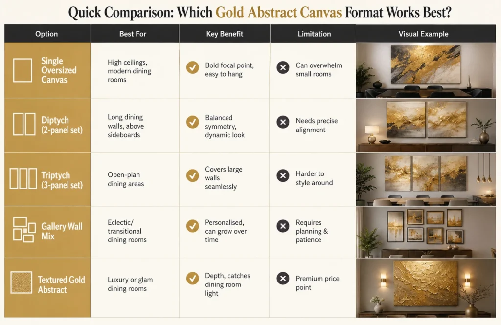
| Option | Best For | Key Benefit | Limitation |
| Single Oversized Canvas | High ceilings, modern dining rooms | Bold focal point, easy to hang | Can overwhelm small rooms |
| Diptych (2-panel set) | Long dining walls, above sideboards | Balanced symmetry, dynamic look | Needs precise alignment |
| Triptych (3-panel set) | Open-plan dining areas | Covers large walls seamlessly | Harder to style around |
| Gallery Wall Mix | Eclectic/transitional dining rooms | Personalised, can grow over time | Requires planning & patience |
| Textured Gold Abstract | Luxury or glam dining rooms | Depth, catches dining room light | Premium price point |
How to Size Gold Abstract Canvas Art for Your Dining Room:
To choose the right canvas size, follow these steps:
- Measure the wall width above your table or sideboard.
- For a single canvas: aim for 50–75% of the furniture width below it.
- For a multi-panel set: the combined width should reach 80–90% of furniture width.
- Hang the bottom edge of the canvas 6–8 inches above the table or sideboard top.
- Step back and confirm: the canvas shouldn’t visually compete with a chandelier above the table.
7. Rose Gold Abstract Canvas for a Warm, Romantic Dining Room
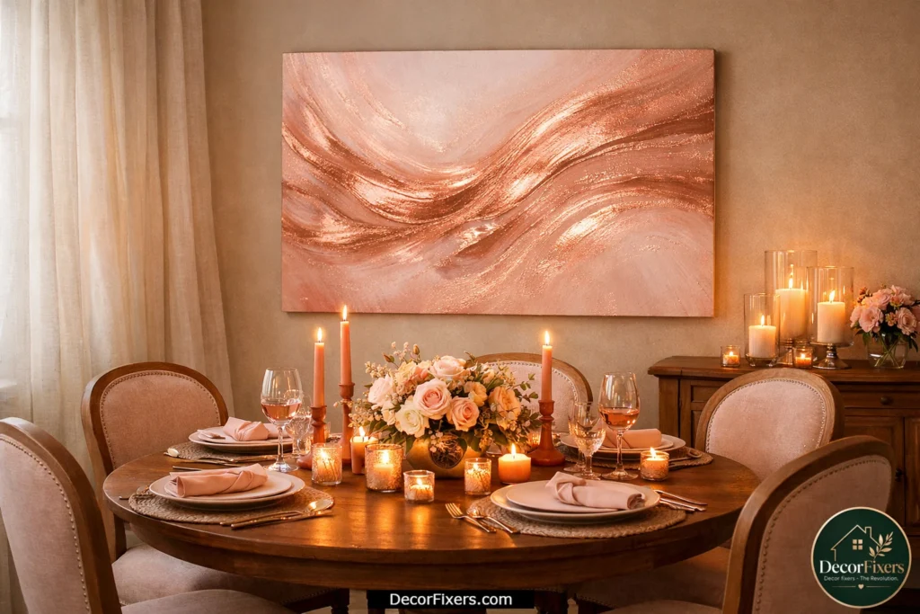
Rose gold as a décor color has matured. It’s no longer the 2017 millennial-pink moment, paired with abstract art on canvas, rose gold now reads as genuinely warm and sophisticated, especially in dining rooms with blush or terracotta accent colors.
A 24″ × 32″ rose gold fluid abstract above a round table with warm-toned chairs creates an intimate dinner-party atmosphere. Look for pieces with visible brushstroke movement; static washes of rose gold feel flat. The movement keeps the eye engaged.
8. Antique Gold Abstract, Right for Traditional and Transitional Dining Rooms
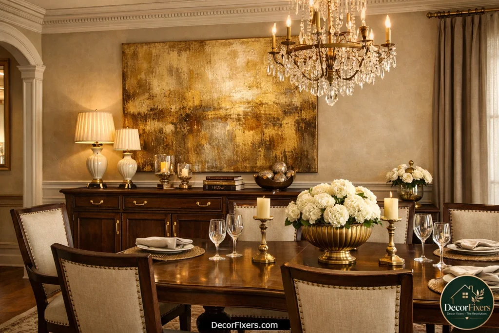
I’ve seen conflicting advice on this; some sources say bright modern gold works in any room, while others push neutral tones exclusively. My read is that for rooms with warm brown wood furniture, brass hardware, or traditional architectural details, antique gold (that slightly muted, aged-brass tone) is the better call every time.
Bright yellow gold against a honey-oak dining table looks jarring. Antique gold harmonizes. Search for ‘aged gold abstract canvas’ or ‘burnished gold wall art’; the naming varies by retailer, but the tone is consistent: warmer, slightly desaturated, and pairs with wood beautifully.
9. Gold Leaf Abstract Canvas, the Genuine Article
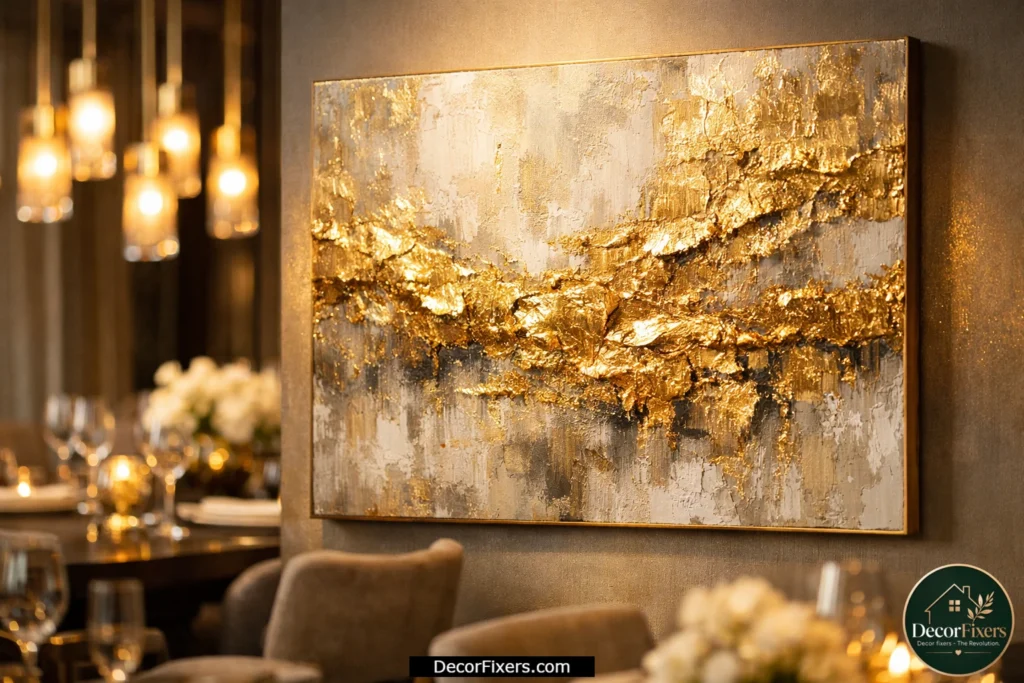
Actual gold leaf application on canvas creates a dimensional shimmer that no metallic ink print can match. The leaf catches light at different angles and has a warmth that reads as unmistakably luxurious.
These aren’t cheap; genuine gold leaf pieces start around $200–$600 at independent galleries and Etsy. But in a dining room where the table and chairs represent a significant investment, skimping on the wall art shows. Gold leaf abstract pieces from artisan makers on Etsy often include partial gold leaf combined with oil or acrylic paint. This hybrid approach keeps costs reasonable while retaining the authentic shimmer.
10. Modern Abstract Geometric Gold Canvas
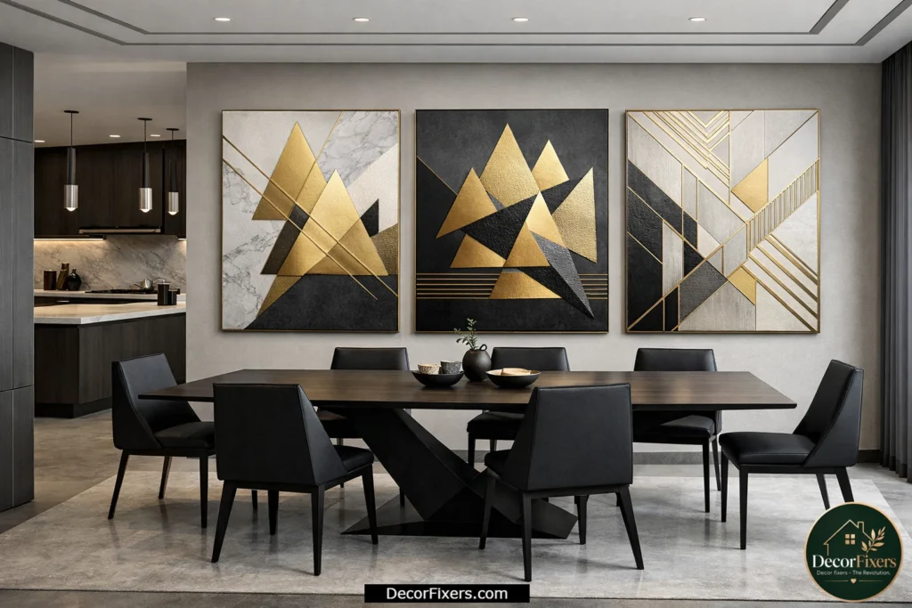
If your dining room has clean lines, angular furniture, and a contemporary palette, geometric gold abstract art, think overlapping triangles, hexagonal arrangements, or linear compositions in gold on grey, reads as deliberate and precise rather than decorative.
The key distinction: purely geometric gold art feels more masculine and structural; fluid abstract gold feels softer and more organic. Neither is better; it depends entirely on the room’s existing energy. Geometric works especially well in open-concept spaces where the dining room adjoins a modern kitchen.
11. Gold Abstract Canvas Above the Dining Table, Exact Hanging Height Guide
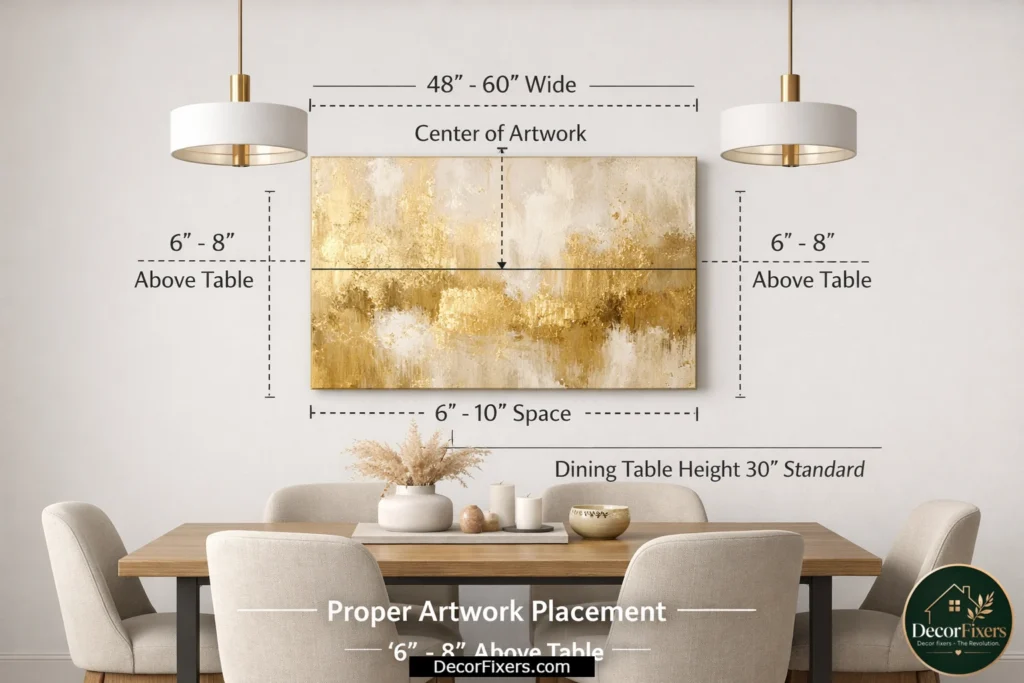
Most people hang dining room wall art too high. Way too high. The standard rule is: the bottom edge of the canvas sits 6–8 inches above the table surface when the art is above the table, or at 57″ to the center of the canvas from the floor when it’s on an open wall.
Quick note: if you have a chandelier or pendant above the table, treat the bottom of the light fitting as your visual ceiling for the art. The canvas shouldn’t compete with, or visually merge into, hanging light fixtures. Leave at least 12″ clearance between the top of the canvas and the bottom of any pendant.
12. Gold Abstract Canvas with Navy Blue, A Combination That Never Fails
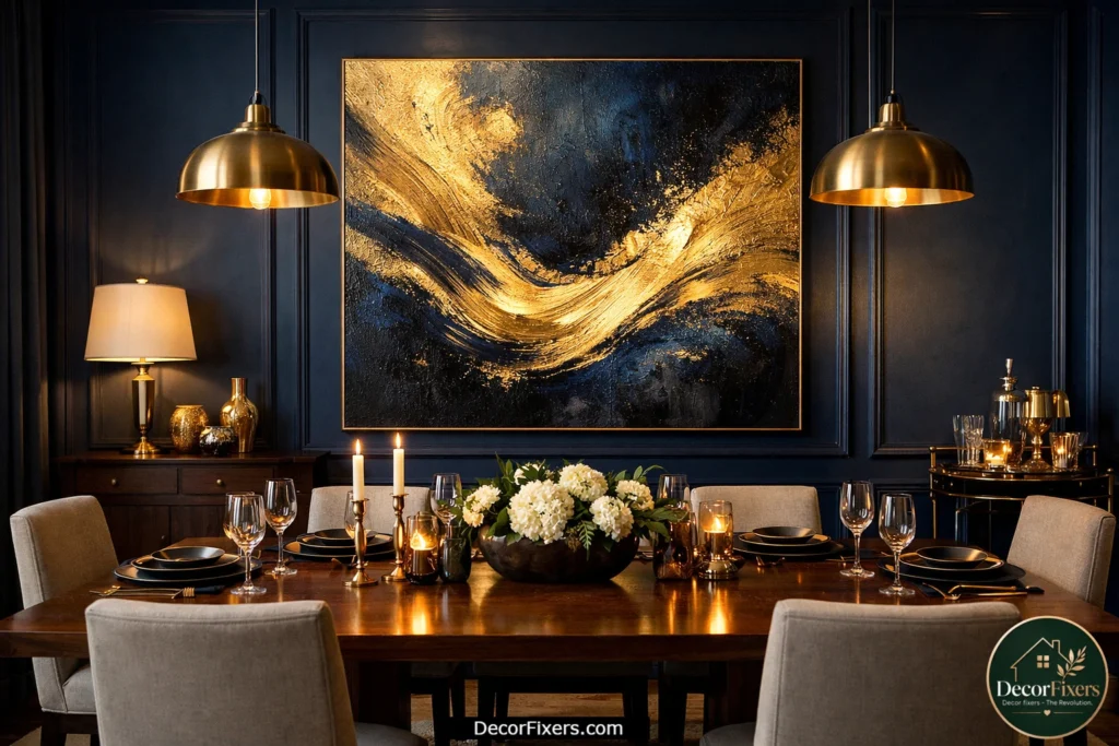
Navy and gold is a classic color pairing, nautical, regal, and deeply satisfying to look at. In abstract form, a canvas where deep navy and warm gold coexist in fluid or gestural compositions feels both elevated and accessible.
This combination works with: walnut dining tables, white upholstered chairs, brass pendant lights, and navy accent walls. It also works as a single statement piece in an otherwise neutral room. If you’re committing to a color direction for your dining room, gold-and-navy abstract is one of the safest bets in the genre.
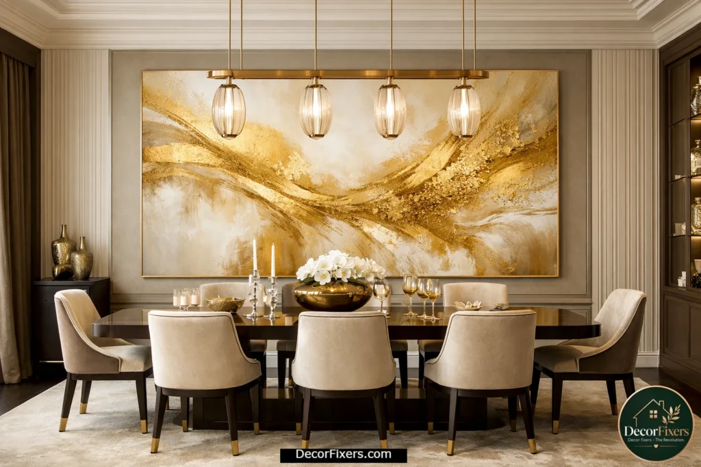
13. Framed Gold Abstract Canvas, When the Frame Matters
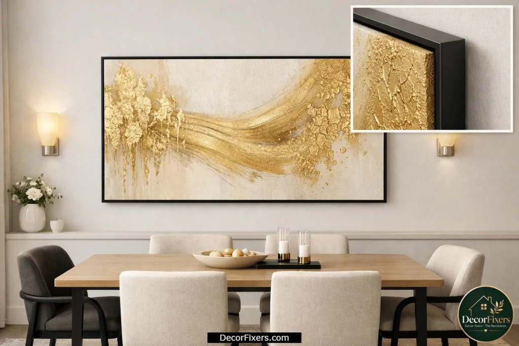
Gallery-wrap canvases (where the image wraps around the frame edge) look clean and contemporary. But sometimes the frame itself carries the room, a thin black metal frame adds graphic sharpness; a wide linen-wrapped mat adds museum formality; a thin gold floater frame repeats the metallic tone of the art itself.
The one framing choice most people regret: thick, ornate gold frames on abstract art. The art fights the frame. For gold abstract pieces, always use thin, simple frames, or no frame at all. Let the composition breathe.
14. Gold Abstract Canvas in a Small Dining Room, Sizing That Doesn’t Crowd
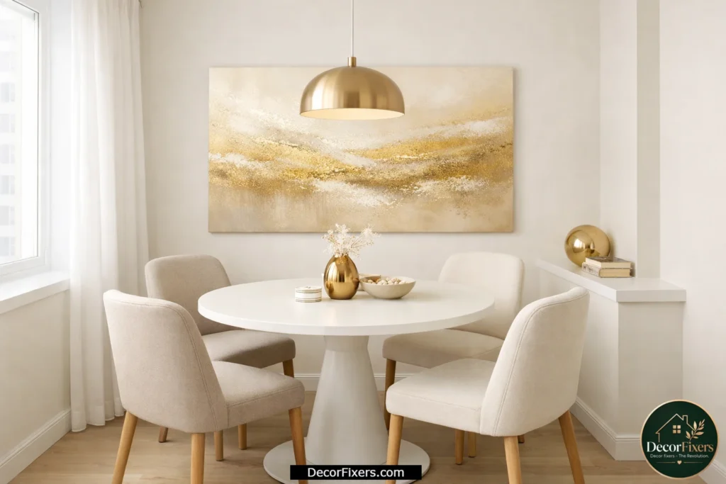
Oversized art in a small dining room sounds counterintuitive. But a single medium-to-large canvas, rather than several small pieces, actually makes a compact dining room feel bigger. Small pieces hung close together on a small wall create visual noise; one confident piece creates depth.
For small dining rooms, the sweet spot is 24″ × 36″ to 30″ × 40″. Anything under 20″ wide looks like it got lost on the wall. Light-background gold pieces, champagne or blush gold on cream, reflect light into the room, amplifying the sense of space.
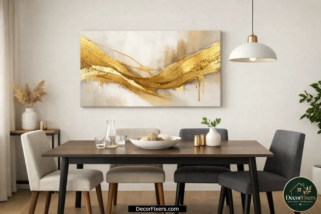
15. Gold Abstract Canvas Paired With Natural Wood, Organic Luxury
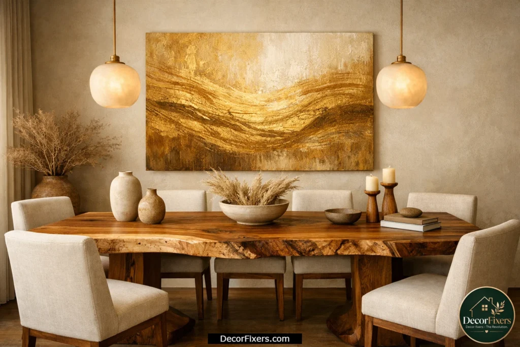
This is the pairing I’d argue is underrated: warm gold abstract art above a live-edge or natural wood dining table. The organic quality of the abstract brushstrokes echoes the natural grain of the wood; they speak the same visual language.
Keep other elements restrained. Let the art and the table be the conversation. Neutral linen chairs, simple pendant lighting, and a single sculptural centerpiece. Or maybe I should say it this way: when the art and the furniture are both interesting, everything else in the room should be quiet.
Why Gold Abstract Art Works Especially Well in Dining Rooms
Warm colors in dining spaces are psychologically proven to stimulate appetite and conversation. According to research cited by Fortune Business Insights (2025), the global wall art market, led by canvas, is valued at USD 66.89 billion in 2025 and growing at 8.55% annually, with residential dining and living room applications driving residential segment growth. Gold tones in abstract art serve a dual function: they reflect warm-spectrum light from dining room fixtures, and they create an aspirational, elevated ambiance that no other single décor element achieves as efficiently.
16. Gold Abstract Canvas Gallery Wall, How to Build One Properly
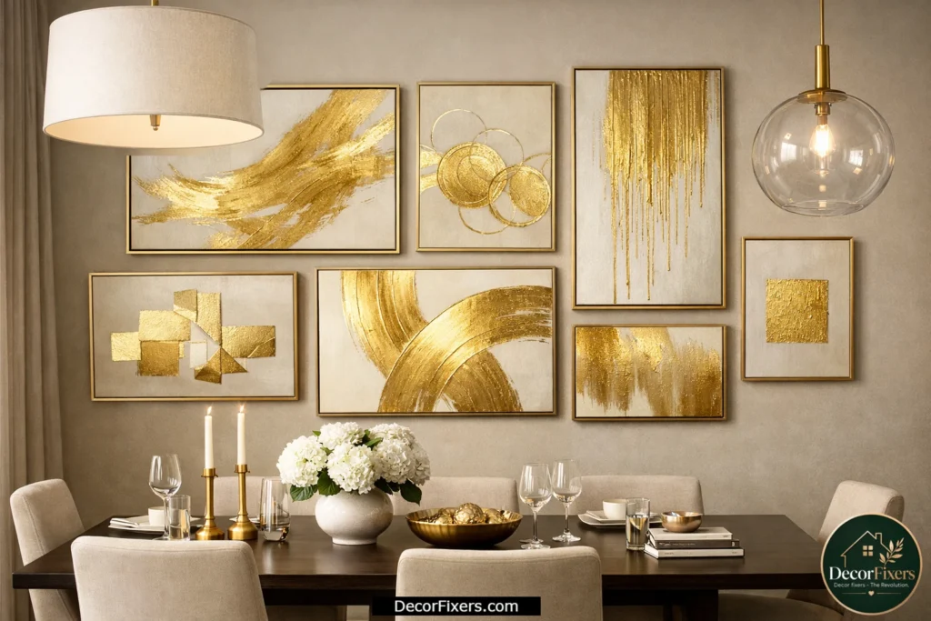
A gallery wall of gold abstract canvases in a dining room works only when the pieces share a unifying element, the same background tone, consistent gold intensity, or uniform framing. A random collection of abstract prints in vaguely gold colors looks like indecision on a wall.
Start with your largest piece, at least 24″ × 30″, as the anchor at center-left or center. Build outward with smaller pieces (12″ × 16″ and 16″ × 20″) in a loose grid. Leave 2–3″ between each piece. The goal is a curated feel: planned but not rigid. Lay it all out on the floor first.
17. Fluid Pour Art in Gold, Abstract That Sells Itself
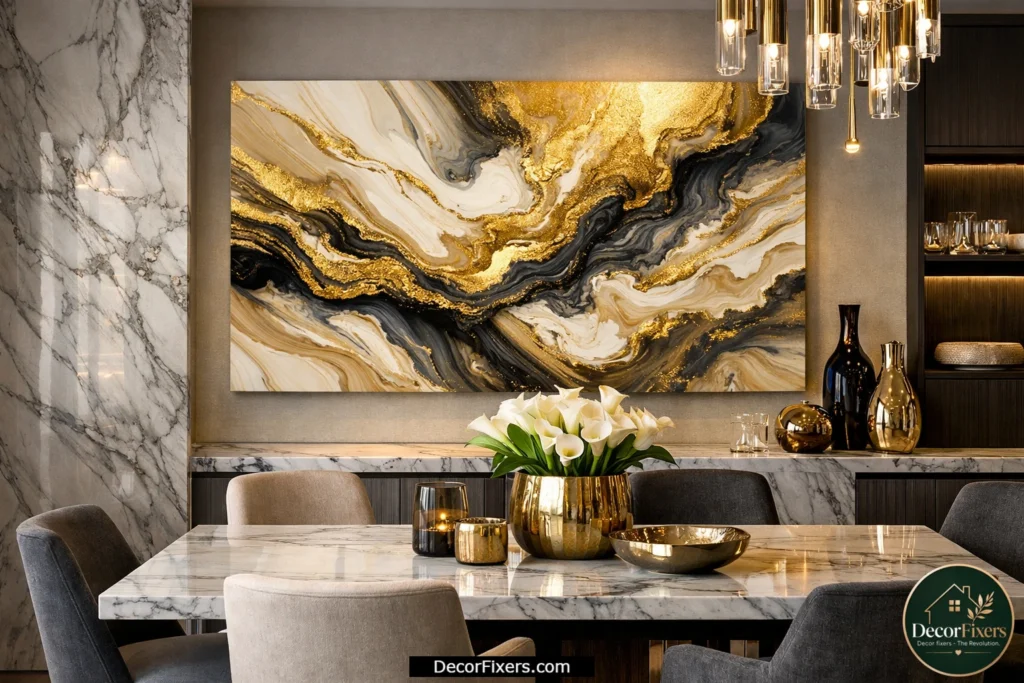
Fluid acrylic pour art, where liquid gold, ivory, and dark tones bleed and swirl into organic marble-like patterns, has become one of the most searched abstract styles for dining rooms. The appeal is obvious: it looks expensive and handmade, even in budget print versions.
The style reads especially well in dining rooms that have marble or stone countertops nearby; the visual language echoes across surfaces. If your dining room connects to a marble kitchen island, a gold pour abstract canvas creates a designed thread between the spaces. This is the kind of detail that makes a room look styled rather than decorated.
18. Gold Abstract Canvas for a Boho Dining Room
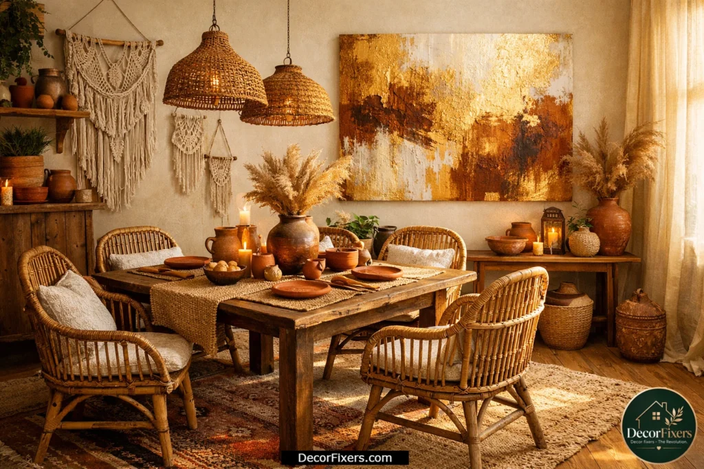
Some experts argue that gold art belongs exclusively in modern or glam dining rooms. That’s valid for very specific high-contrast design schemes. But if you’re dealing with a boho or eclectic dining room, rattan chairs, macramé, warm terracotta accents, earthy gold abstract art fits beautifully.
The key is choosing gold pieces with organic, imperfect brushwork rather than crisp geometric patterns. Look for tones that include rust, burnt orange, or sienna alongside the gold. The mix feels collected and intentional rather than decoratively placed. Society6 has a strong boho-leaning abstract gold selection at prices mostly under $100.
19. Gold Abstract Canvas Positioned on a Dining Room Accent Wall
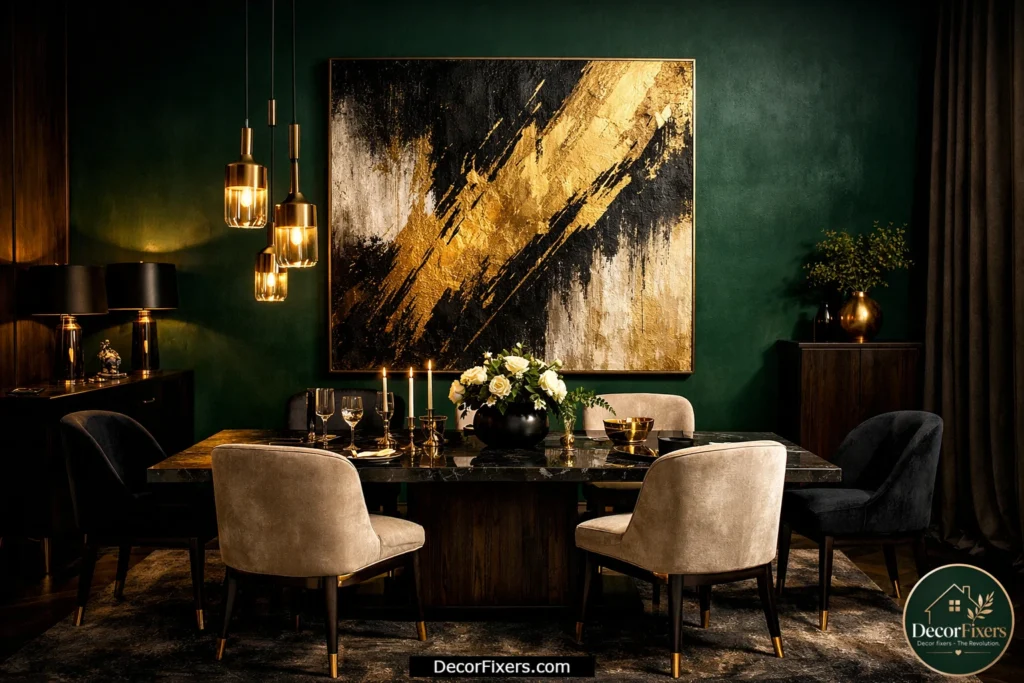
A moody accent wall, deep green, slate blue, charcoal, or even a warm rust, behind the dining table, creates an instant dramatic backdrop. And gold abstract art against a dark accent wall is simply one of the strongest combinations in residential interior design.
The canvas becomes part of the wall composition rather than something hung on it. If you’re going this route, choose a piece with strong gold-to-dark contrast, golden yellows, and blacks on a neutral base, so it holds its visual presence against the colored wall. Lighter, more delicate gold pieces get lost on dark surfaces.
20. Gold Abstract Canvas, Matching It to Your Furniture Finish
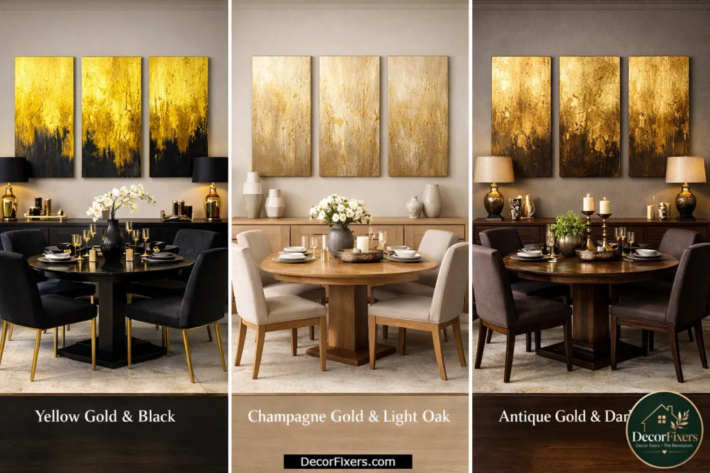
This is the decision that competitor articles consistently skip. And it’s arguably the most important one. Yellow gold (bright, saturated) pairs best with cool-toned furniture: white lacquer, grey upholstery, black metal. Champagne gold pairs best with light neutrals: off-white walls, light oak, and linen. Antique gold pairs best with warm brown woods: walnut, cherry, dark oak.
Get this wrong and the art looks forced, no matter how beautiful it is in isolation. Look, if you’re in a situation where you’ve bought a piece and it just doesn’t feel right in the room, this is almost always why. It’s not the art. It’s the mismatch of the gold tone to the furniture finish.
21. Budget Gold Abstract Canvas Options That Don’t Look Cheap
You don’t need to spend $300+ to get a dining room canvas that looks considered. Society6 and Amazon both offer gallery-wrap canvas prints in gold abstract styles starting around $35–$70 for a 24″ × 32″. The secret to making budget prints look elevated: buy one size larger than you think you need, use a simple thin frame if the print itself doesn’t have one, and hang it with precision.
Anyway, the resolution and vibrancy of modern print-on-demand have genuinely improved. I’ve seen $50 Society6 canvas prints that photograph better than $400 gallery pieces. The difference in person is real but not as dramatic as the price gap suggests.
22. Custom Commission, Gold Abstract Canvas Made for Your Exact Space
When nothing off the shelf fits, either because your wall is an unusual size, or your color palette is specific, or you just want something no one else has, a custom-commissioned abstract canvas is the right move.
Etsy has hundreds of abstract artists who take color-specific commissions. Share photos of your dining room, your furniture tones, and your wall dimensions. Most independent artists can deliver a custom gold abstract canvas in 2–4 weeks for $120–$350, depending on size and complexity. You’ll end up with something genuinely site-specific, art that was made for that wall in that room.
What size gold abstract canvas is best for above a dining table?
The right size depends on your table width. For a standard 60″ dining table, a 36″ × 48″ single canvas or a diptych totalling 40–50″ in combined width works well. The canvas grouping should span roughly 50–75% of the furniture width beneath it. Hang the bottom edge 6–8 inches above the table surface. This is one of the most consistent sizing rules across professional interior designers.
Does gold abstract art work in every style of dining room?
It works across most styles, but the tone of gold must match the room’s finish temperature. According to Fortune Business Insights (2025), canvas abstract remains the leading material in the residential wall art segment, reflecting broad consumer acceptance across design styles. The limiting case is very cool, stark Scandinavian interiors where even champagne gold may feel too warm; in those spaces, silver or white-on-white abstract pieces serve better.
What is the counterintuitive truth about dining room wall art size?
Most people buy dining room art that is too small, not too large. A canvas that feels ‘too big’ in the store almost always looks correct on the wall, because walls have height, depth, and competing visual elements that shrink artwork in context. What most guides skip is this: when you hang art above a piece of furniture, the furniture’s visual mass must be balanced by the art above it. A 60″ sideboard needs at least 40–48″ of total artwork width above it to feel grounded.
Conclusion
I’ll be honest, I spent a long time getting this wrong in my own dining room. I bought a canvas that was two sizes too small, hung it six inches too high, and wondered why the space never felt finished. It wasn’t a décor problem. It was a measurement problem.
Gold abstract canvas wall art is genuinely one of the most versatile and forgiving choices for a dining room, but the gold tone, the size, and the placement have to work together. Get all three right, and the room transforms. Get one wrong, and the piece looks like a mistake.
Start with your table width. Then match the gold tone to your furniture. Then measure twice and hang once. The 22 ideas above give you the full range, from a $45 Amazon print to a $400 custom commission, and every one of them can look exactly right in the right room.
FAQs:
Q: What’s the best gold abstract canvas wall art for a small dining room?
A: A single canvas in the 24″ × 36″ range with a light background, champagne gold on cream, works best. It’s large enough to make an impact without crowding. Avoid multi-panel sets in small rooms; they create visual busyness.
Q: How do I hang gold abstract canvas art in a dining room?
A: Measure 57–60 inches from the floor to the center of the canvas for open walls. For art above a dining table, position the bottom edge 6–8 inches above the table surface. Use a level, two wall anchors for any canvas over 16″ wide, and a paper template taped to the wall before you drill.
Q: Should I choose framed or unframed canvas for my dining room?
A: Gallery-wrap canvas (no frame) suits contemporary and modern dining rooms. A thin black, gold floater, or white frame suits transitional and traditional rooms. Avoid thick ornate frames on abstract pieces; the frame competes with the art, and both lose.
Q: Why does my gold abstract canvas look wrong in my dining room?
A: The most common reason is a mismatch between the gold tone and furniture finish. Bright yellow gold clashes with warm brown wood. Champagne gold gets lost against cream walls if the contrast is too low. Check your gold tone against your dominant furniture finish before purchasing.
Q: When should I choose a triptych over a single canvas for dining room wall art?
A: Choose a triptych when your wall is over 6 feet wide, and you don’t want a single oversized piece. Triptychs work especially well above sideboards, in open-plan dining areas, and where ceiling height is standard (8 feet), where a very tall single canvas would feel disproportionate.

Creator of DecorFixers, sharing practical home and interior ideas focused on real-life usability, simple design improvements, and budget-friendly solutions.
1 thought on “22 Gold Abstract Canvas Wall Art Dining Room Ideas”