

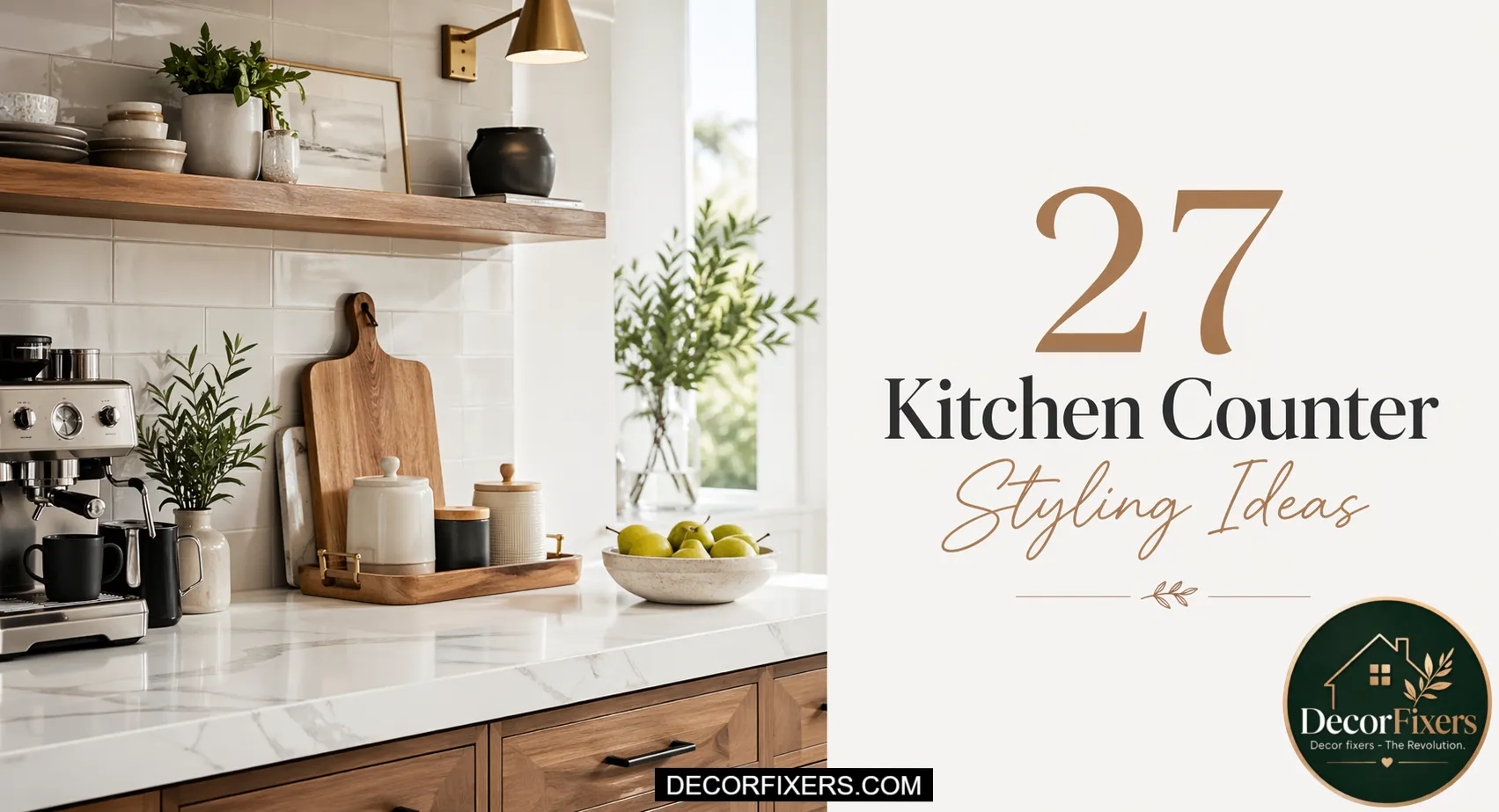
You wiped the kitchen counters down. You moved things around. You bought the matching canisters everyone recommends. Your kitchen still feels like a surface where things land, not a space someone designed.
Here’s what nobody tells you: a clean kitchen counter and a beautiful counter are entirely different things. Cleaning removes the mess. Styling builds the intention. And the gap between those two, that specific frustration of doing everything right and still feeling underwhelmed, is rarely about what you own. It’s about what you don’t yet know how to see.
That’s precisely what these 27 ideas address. Not storage. Not renovation. The micro-layer of styling that interior designers apply to every kitchen counter surface they touch, and that almost no home guide has ever explained in plain language.
You’ll find ideas here that cost nothing and take three minutes. You’ll also find the one principle that explains why everything you’ve tried so far hasn’t quite worked. By the time you reach idea five, your kitchen counters will look different in your mind, and that’s when the physical change becomes easy.
Read this once. Apply three ideas. Your kitchen will look like a different room.
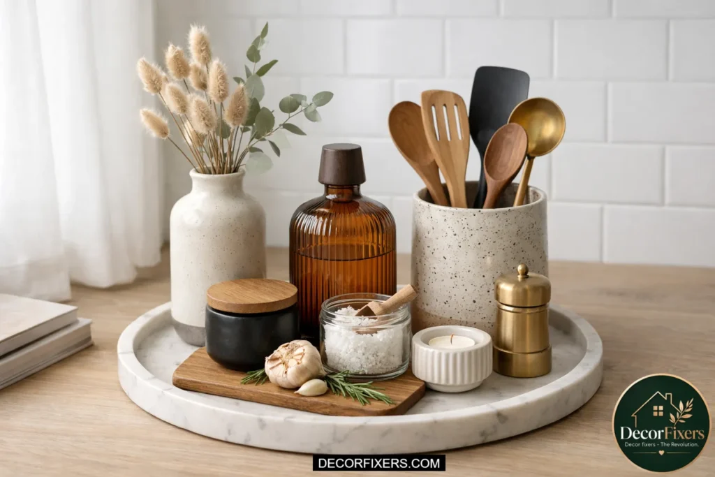
Anchor Every Zone with a Tray
Zone Anchoring
A tray is the single most powerful styling tool on a kitchen counter. It does one thing nothing else can: it creates a visual boundary that tells the eye, “This is a composed area.” Without a tray, a grouping of objects looks accidental.
With one, it looks curated. Use a matte marble tray, a round rattan tray, or a simple rectangular wood board from CB2 or West Elm. Keep everything within the tray’s edge, and let the space outside the tray breathe.
Use the Rule of Three in Every Grouping

Three objects group more naturally than two or four. Two feels symmetrical and static. Four feels crowded. Three allows the eye to form a visual triangle, which reads as dynamic and intentional.
When building a counter vignette, select one tall object (a canister or small plant), one medium object (a cutting board leaned against the wall, a small jar), and one low, flat object (a small dish, a folded cloth). That simple triangle is what makes a counter look styled rather than stacked.
Lean a Cutting Board Against the Backsplash
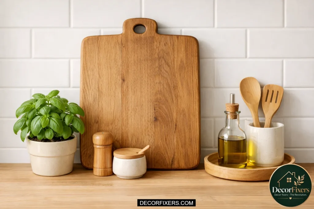
A quality cutting board propped upright against the backsplash functions as both a tool and a design element. It adds a vertical line to an otherwise horizontal surface, introduces natural texture, especially in end-grain walnut or maple, and visually anchors the cooking zone without taking up functional workspace.
Look for boards with a carved handle or a clean rectangular profile. This works especially well on Cambria Quartz or white laminate counters, where the wood grain creates immediate warmth and contrast.
Vary Heights Intentionally, Never Arrange Objects at the Same Level
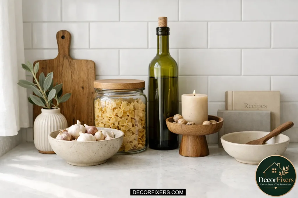
When every object on a counter sits at the same height, the surface looks flat, like a shelf in a drugstore. Height variation is what gives a counter its visual rhythm. A simple rule: arrange objects in a low-medium-tall sequence from front to back or side to side, never clustering same-height items together.
A squat ceramic bowl, a medium canister, and a taller olive oil bottle, when that triad is grouped with intention, read as a composed still life rather than random objects sharing a surface.
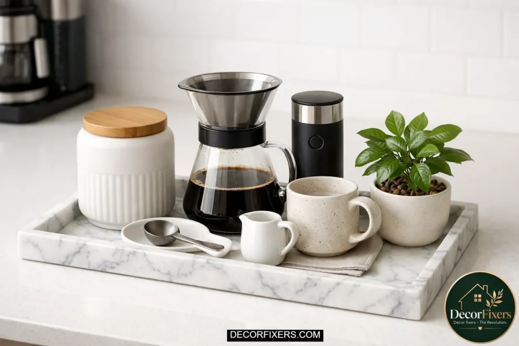
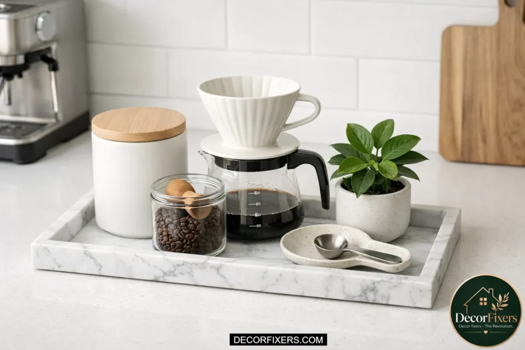
Style a Coffee Station as Its Own Vignette
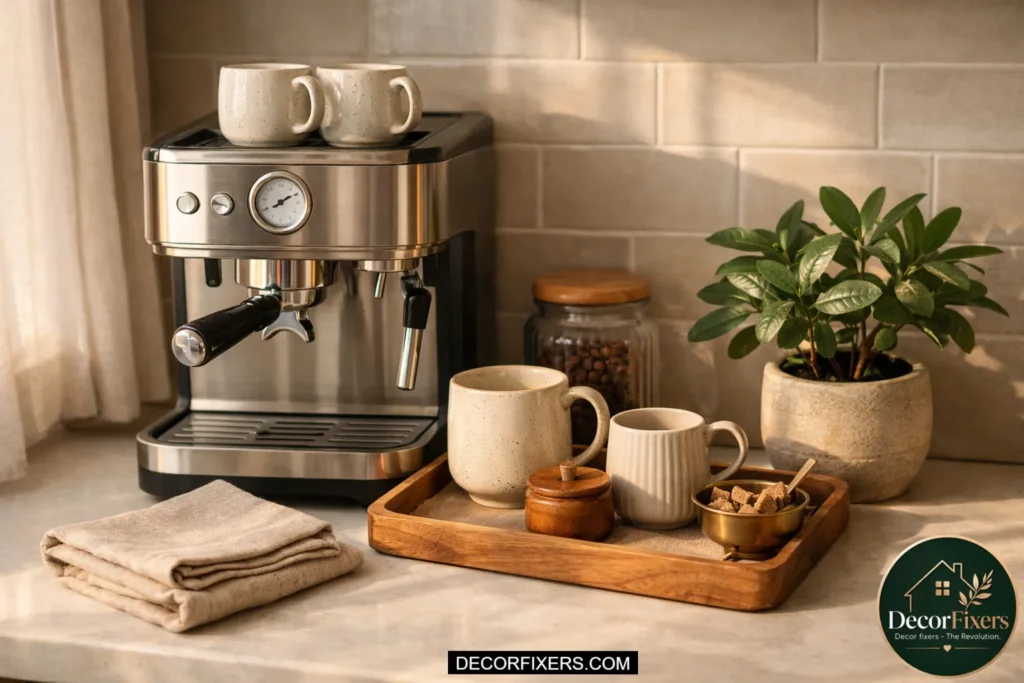
The coffee corner is usually the most active zone on a kitchen counter, and it’s also the easiest to style because it already has a functional anchor, the machine itself. Build a superficial form from it using a tray to contain the subsidiary objects: a small jar of sugar, a matte ceramic mug turned face-out, a folded linen cloth, and one small plant or bud vase.
Keep the palette tight, two to three colors extreme. When the zone looks good while being genuinely used every morning, that’s everyday elegance at its most practical.
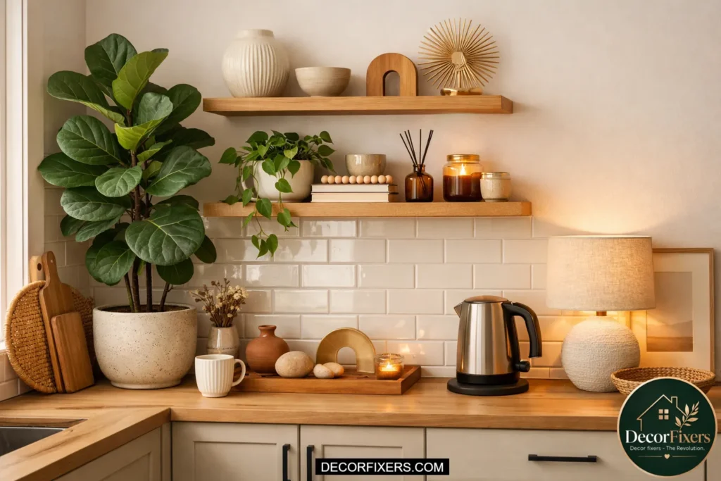
Introduce One Living Element, Plant, Herb, or Branch
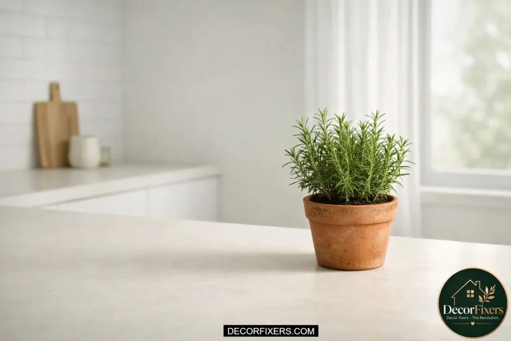
A single living element on a kitchen counter does something no object can: it creates softness and movement. A small potted herb (rosemary, thyme, or a trailing pothos) brings organic shape into a surface that tends toward hard lines. It also signals that the counter is a place of life, not just a function.
Keep it proportional, one small pot, not a garden. If you can’t maintain living plants reliably, a single dried branch in a bud vase or a sprig of fresh eucalyptus tucked into the coffee zone offers the same visual warmth with much less upkeep.
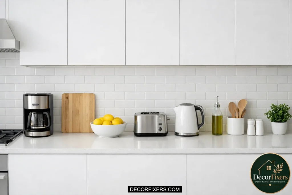
Keep Appliances Pushed to the Back Wall

This is the one styling rule that costs nothing and changes everything. Every appliance—toaster, air fryer, and coffee maker—should sit flush against the backsplash, not floating in the middle of the counter. Moving appliances back creates a “landing strip” of clear counter along the front edge that instantly makes the whole kitchen feel more spacious and controlled.
That strip of negative space is what separates a styled counter from a crowded one. It’s also where your styled zones get room to breathe without competing visually with functional equipment.
Use a Matching Canister Set, But Style It, Not Just Line It Up
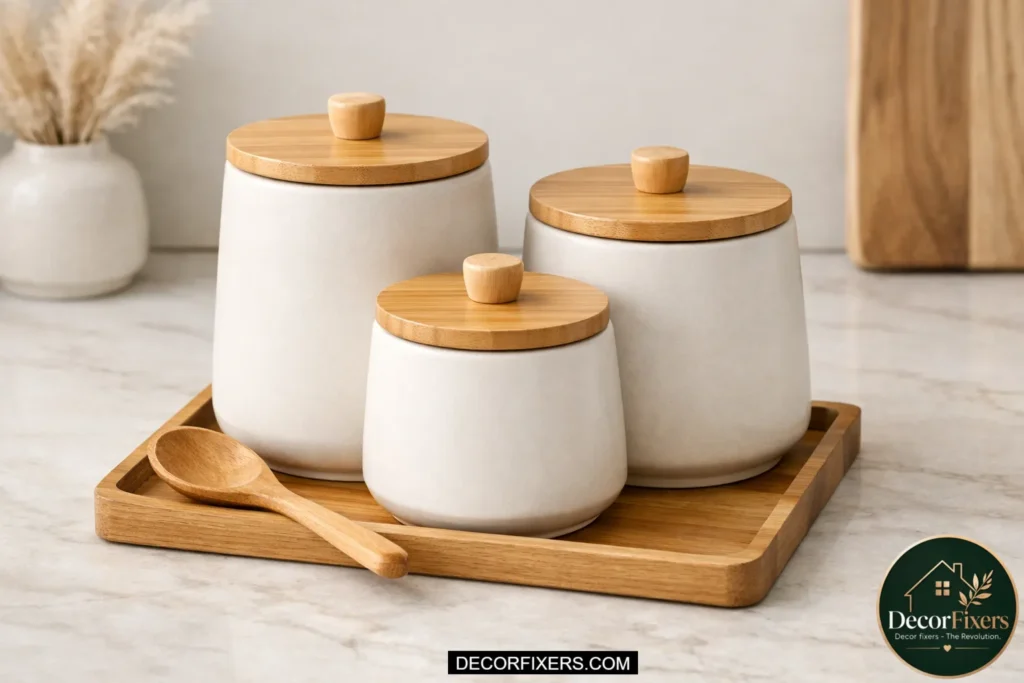
Matching canisters that “still look random” is one of the most common frustrations readers describe, and it’s almost always a placement issue. Canisters lined up in a row look like a store shelf. Instead, cluster them in a loose triangle: two side by side and one slightly in front of or behind them.
Place them on a small tray or wood board to anchor the grouping. Add one contrasting object, a small oil bottle or a ceramic spoon rest, to break the uniformity. Now those same canisters look like they were arranged on purpose.
Limit the Counter Palette to Three Colors Max
Color chaos is the fastest way to make a styled counter look accidental. A tight, intentional palette is what separates an Instagram-worthy counter from one that just looks busy. Pick one dominant neutral (white, cream, or natural wood), one supporting tone (black matte, sage, or terracotta), and one accent (a metallic, a pop of color from a fruit bowl, or a plant’s green).
Every object on the counter should belong to one of those three. Anything that doesn’t fit the palette, move it inside a cabinet or replace it when you can.
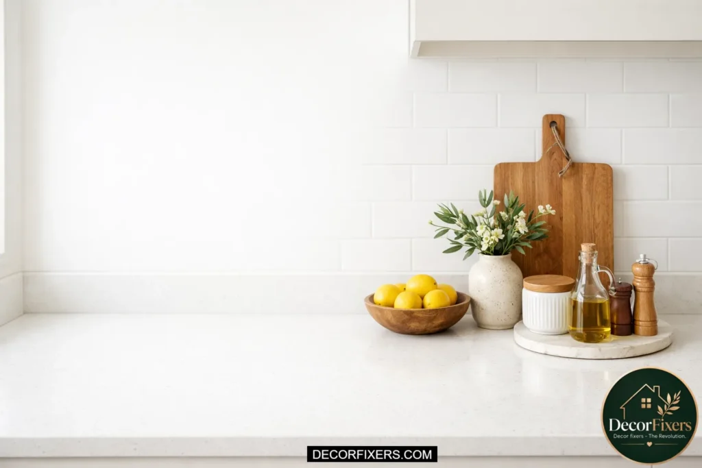
Style the Fruit Bowl, Don’t Just Fill It
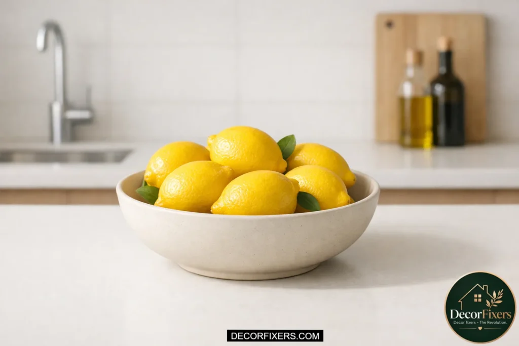
The fruit bowl is the most neglected styling opportunity on most kitchen counters. A mismatched bowl crammed with whatever’s on hand reads as pure overflow. To make it work visually, choose a bowl with a strong shape (deep, round, with a subtle footing), keep the fruit to one or two varieties maximum, and let some of the bowl’s rim show above the fruit.
A bowl of only lemons is more elegant than a bowl of mixed fruit. One kind of stone fruit, one citrus, styled slightly asymmetrically, that reads as intentional every time.
Add Negative Space, Leave at Least One-Third of the Counter Empty
This one gets pushback. “But I need that space.” Here’s the thing: negative space doesn’t mean unused space; it means visually unoccupied space, which is the breathing room that makes the styled zones pop. Aim to leave at least one-third of your total counter surface clear at all times. That empty section next to a styled zone is what gives the zone its weight. Without it, everything merges into visual noise. The tighter your counter’s square footage, the more disciplined you need to be about protecting that empty third.
Decant Dish Soap and Hand Soap into Matching Dispensers
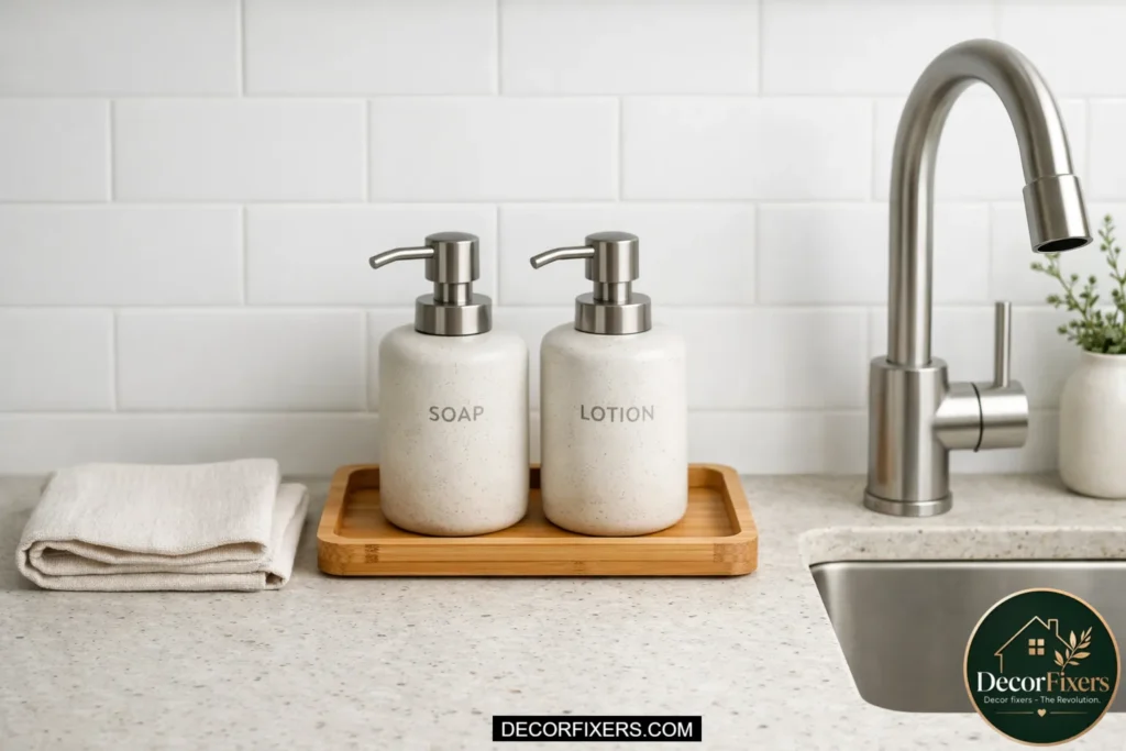
The sink zone is usually the least styled area on a kitchen counter, and the culprit is almost always a plastic soap bottle with a brand logo. Swapping dish soap and hand soap into matching ceramic or glass dispensers takes about five minutes and permanently elevates that corner. Use matte black, chalk white, or clear glass, all of which disappear visually against most backsplashes and let the countertop material speak instead. Pair it with a matching dish tray for the sponge, and the counter around the sink suddenly looks designed rather than just functional.
Use a Small Wooden Board as a Mini Styling Platform

A small wooden board, thinner than a full cutting board, about 8 to 10 inches, works beautifully as a low platform that elevates a grouped arrangement without adding real height. Place a canister, a small oil bottle, and a ceramic dish on top of it, and the whole grouping reads as more intentional simply because it’s been “staged” on a surface. It also adds a layer of warm, natural material that contrasts with quartz or laminate countertops. West Elm’s acacia boards and CB2’s walnut slabs are both worth looking at for this purpose.
Store Only What You Use Every Day on the Counter
Before any styling principle can work, the editing has to happen. Only objects used daily, or objects that earn their visual keep, belong on the counter surface. Anything used weekly or less should live in a cabinet. This sounds obvious, but most counters fail here first. The KitchenAid mixer that only comes out for holidays, the rarely used blender, the stack of cookbooks you reference twice a year, all of those belong in storage. Once the counter holds only daily-use items and a few deliberate decor pieces, the styling arranges itself far more naturally.
Introduce a Ceramic Utensil Holder as a Sculptural Element
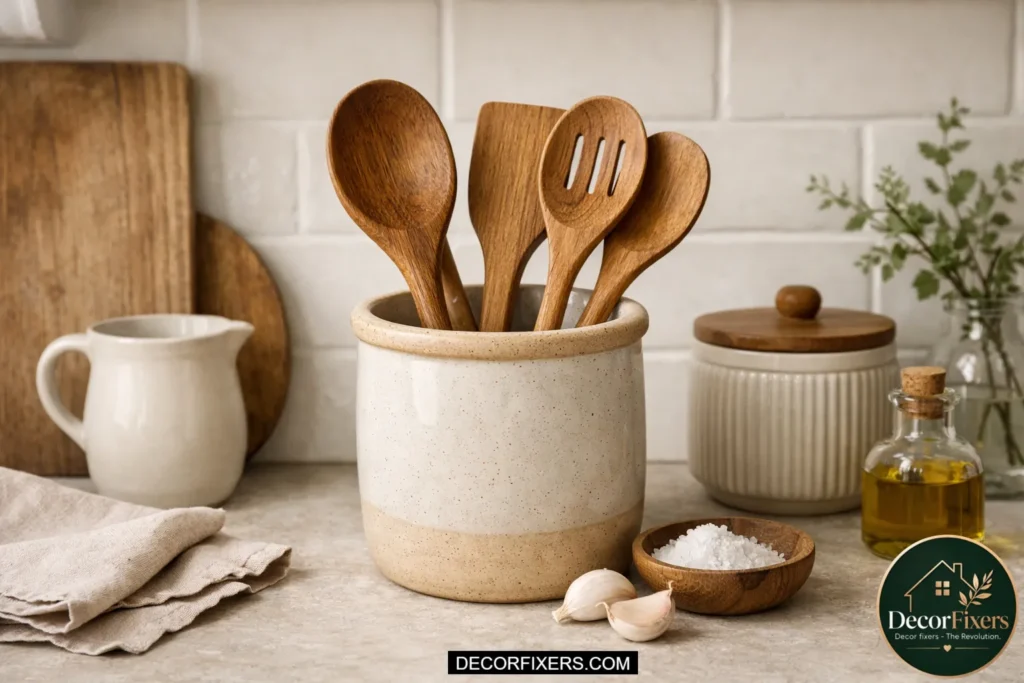
A utensil holder is one of those objects that most people treat as purely functional, a jar or cup that holds spatulas and spoons without any design consideration. Upgrading to a ceramic crock with a strong silhouette turns a cluttered cluster of cooking tools into a vertical design element. Choose a matte-finish piece with a bit of weight to it: stoneware crocks in warm grey, cream, or terra cotta work especially well. Limit what goes in it, to five to six utensils maximum so the holder’s form stays visible and the grouping reads cleanly.
Layer a linen or cotton cloth under objects for Softness
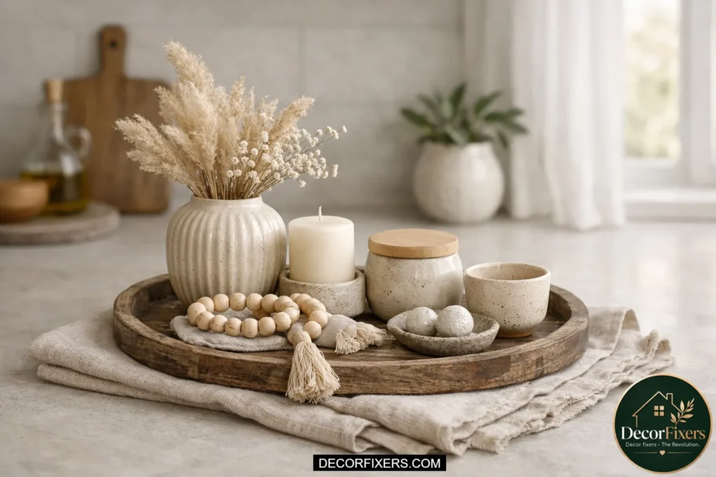
A folded tea towel or a small square of linen placed beneath a tray or a grouping of objects adds a layer of textile texture that breaks up the hardness of the countertop material. It’s a technique borrowed from tabletop styling, and it’s surprisingly effective on kitchen surfaces. Choose a cloth in a neutral tone, oatmeal, soft white, or a very subtle stripe, and fold it so a clean edge is visible. The goal isn’t a tablecloth look; it’s a subtle grounding element that signals the whole area was arranged with care rather than just set down.
Create a Dedicated Oil and Vinegar Station
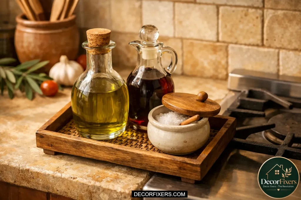
A small, styled oil and vinegar station near the stove does double duty: it keeps everyday cooking essentials immediately accessible while creating a European kitchen aesthetic that looks very intentional. Use olive oil in a dark glass bottle (the original packaging is almost always beautifully designed), a slim vinegar bottle, and a small ceramic salt cellar. Group them on a small round tray and place the plate at the back corner of the stove zone, slightly offset from the center. The result is a functional arrangement that reads like a curated still life from a Tuscan farmhouse kitchen.
Choose One Statement Appliance and Style Around It
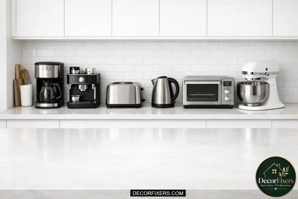
Most appliances are visual noise. But one appliance, chosen deliberately for its design, can become the anchor of an entire counter zone. A vintage-style toaster in cream or red, a lusterless black espresso machine, or a pastel KitchenAid mixer in the right context can function as the hero piece around which everything else is styled. The rule is one statement appliance per counter run, pushed to the back wall, surrounded by a tight, tonal supporting cast of smaller objects. Everything on the counter should point toward it, the way furniture in a room points toward a fireplace.
Add a Bud Vase or Single-Stem Arrangement
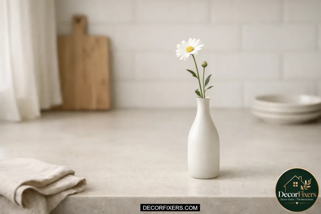
A full floral arrangement is impractical for daily kitchen life. A single stem in a narrow bud vase is not. One stem of eucalyptus, a dried poppy head, or a single grocery-store ranunculus in a small glass or ceramic vase brings the proportionally correct amount of organic shape to a counter without overwhelming the surface. Place it at the edge of a tray, slightly taller than the objects beside it, so it functions as the “peak” of a visual triangle. Replace it weekly if it’s fresh, or choose dried stems that last for months with no maintenance.
Use a Cookbook as a Styling Object, Not Just a Reference

A beautifully designed cookbook with a strong spine or a striking cover can function as a visual anchor on a counter surface, even when it’s not being read. Lean one against the backsplash in the cooking zone, a linen-covered spine, a photographic cover in warm tones, and treat it the way a bookshelf stylist would: as an object with both content and visual presence. You don’t need a cookbook stand (though one adds another design layer). Just one book, leaned at a slight angle, signals that the kitchen is populated by someone with taste and intention.
Bring in Warmth with Natural Wood Accents
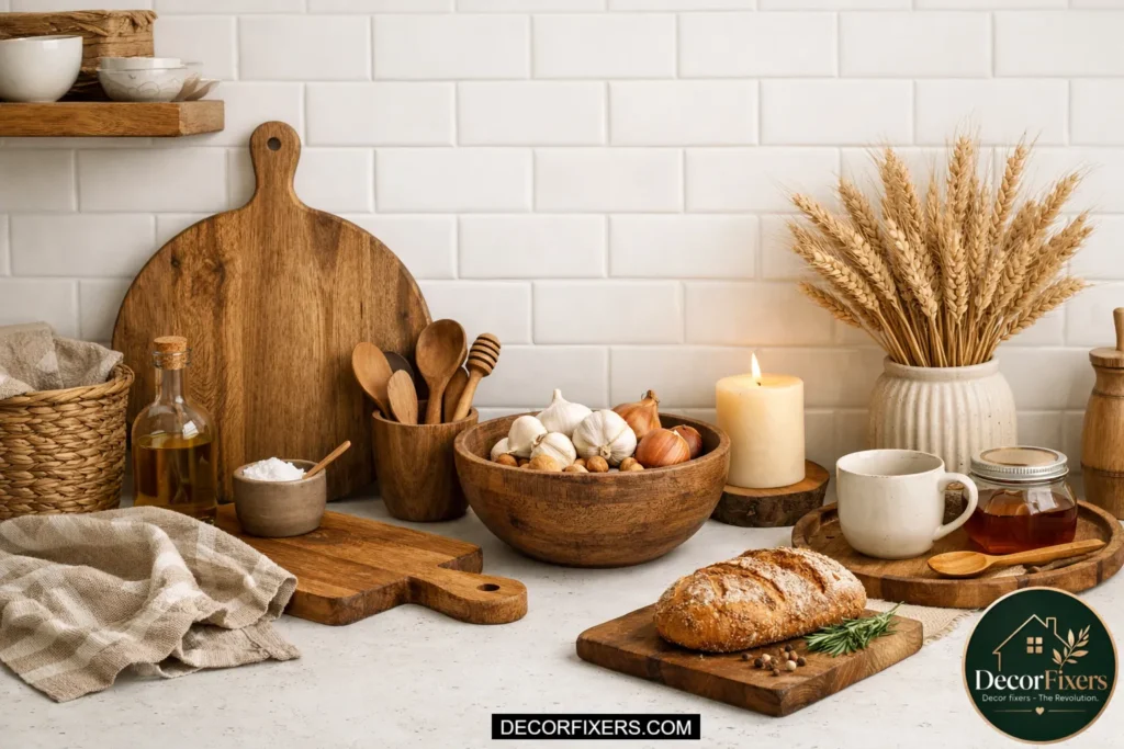
Wood is the warm layer in kitchen counter styling. On white, grey, or neutral quartz surfaces, which are most kitchens, according to Houzz data, wood accents prevent the counter from reading as cold or clinical. A wood cutting board, a wood tray, a wood-handled utensil, or a wood salt box introduces grain, warmth, and natural imperfection that stone and ceramic can’t provide. You don’t need all of these at once. Even a single wood element in the right zone shifts the whole counter toward warmth. Opt for walnut, acacia, or light maple depending on how warm or cool your existing palette runs.
Build a Counter-Vignette Using the Three-Layer Method
How-To: Build a Counter Vignette
To create a styled counter vignette, follow these steps:
1. Place a tray or board to define the zone’s boundary.
2. Add one tall object at the back (canister, plant, or oil bottle).
3. Add one medium object offset to the side (cutting board, jar, vase).
4. Add one low, flat object in front (dish, folded cloth, small tray).
5. Step back and remove any object that competes visually with the group.
This three-layer method, tall anchor at back, medium object to the side, and low object in front—mimics the composition structure used by professional stylists to create depth on a flat surface. The key is that “step back and remove” moment at the end. Most over-styled counters suffer not from too few objects but from one extra object that breaks the visual logic of the group.
Coordinate the Counter Palette with Your Backsplash, Not Your Cabinets
Most people try to coordinate countertop objects with their cabinet color, which creates a flat, monochromatic result. The more effective approach is to pull the palette of your counter styling from your backsplash, since the backsplash is the vertical backdrop against which your counter objects are read. If your backsplash is white subway tile, cool tones and black matte accents on the counter will create a clean contrast. If it’s a warm terracotta tile or a warm-veined stone, wooden and earth-toned objects on the counter will read as cohesive. Or maybe I should say it this way: the backsplash is your canvas; the counter objects are the brushstrokes.
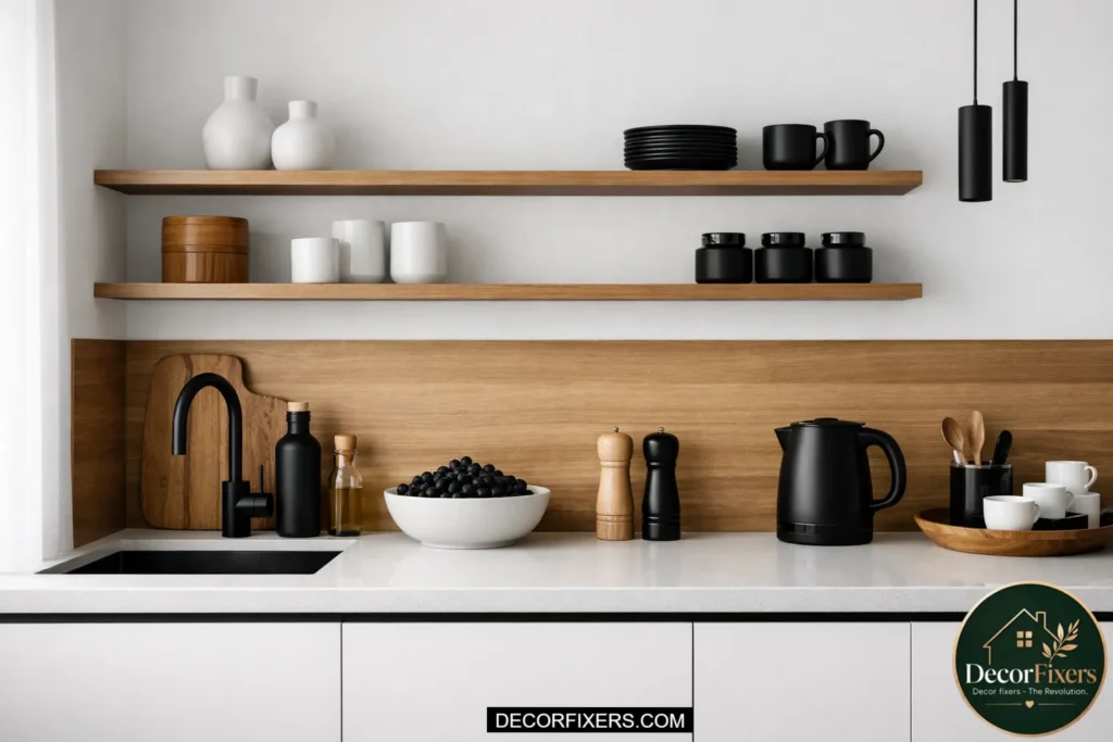
Make the Knife Block or Magnetic Strip a Design Feature
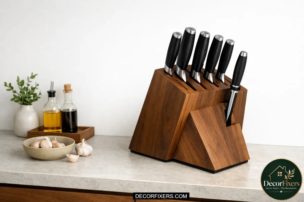
A knife block is one of the bulkiest objects on most counters, and it’s rarely thought of as a design element. Swapping a plastic or dated block for a magnetic wall-mounted strip keeps knives off the counter entirely, frees visual real estate, and creates a striking functional display. If you prefer a counter-mounted option, walnut knife blocks with a modern, angled profile are widely available and genuinely beautiful. Either way, positioning the knives so they’re presented consistently, blade down, with handle heights varied naturally, turns a utilitarian tool storage solution into a deliberate visual feature.
Style the Corner, Don’t Leave It as a Dead Zone
Counter corners are consistently the most understyled and most visually conspicuous spots in a kitchen. Because they sit at the convergence of two counter runs, the eye naturally travels there, which means an unstilled corner reads as a confusion, not a choice. A small potted plant, a stacked pair of cookbooks, or a mini tray with a candle and a ceramic object gives the corner visual purpose without cluttering the more functional stretches of counter on either side. Keep it simple: two or three objects maximum, with clear height variation, and the corner transforms from dead zone to focal point.
Add a Candle, But Position It Intentionally
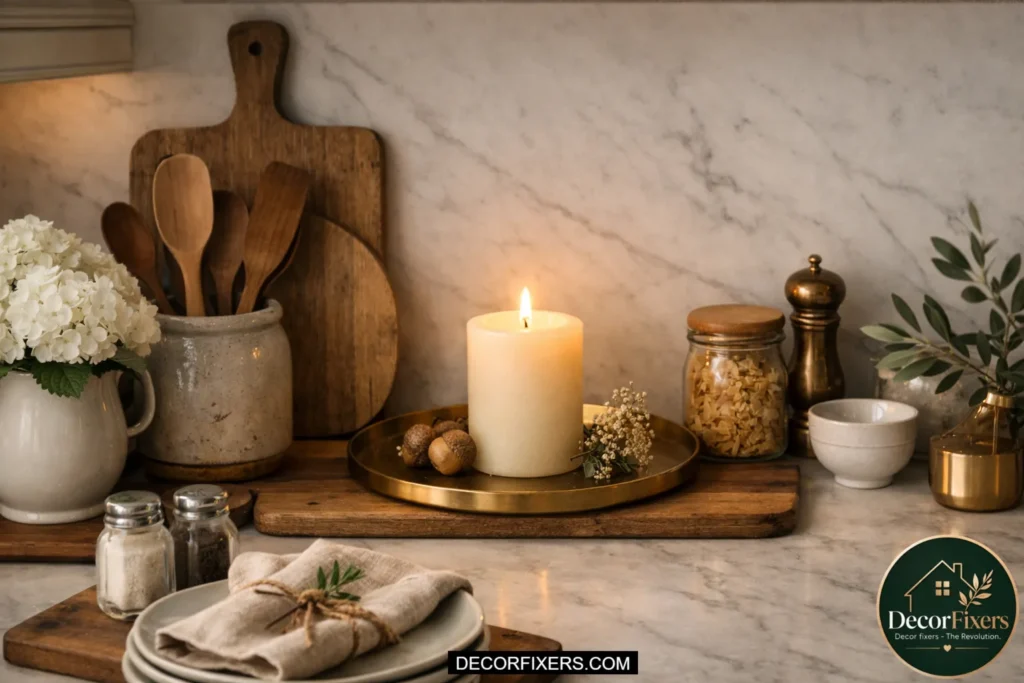
A candle on a kitchen counter is a small decision with a disproportionate visual impact. It signals that the space is cared for, that someone styled it rather than just cleaned it. Use a squat, wide pillar candle or a lidded ceramic vessel candle in a neutral or earthy tone. Position it at the back of a tray, not in the front where it blocks other objects, and not in the center where it reads as a centerpiece. Unlit or lit, it adds a soft visual anchor. Some experts argue candles belong only in living and dining spaces, but in a styled kitchen, they’re completely at home if the scale is right.
Build a 90-Second Daily Reset Routine to Maintain the Look
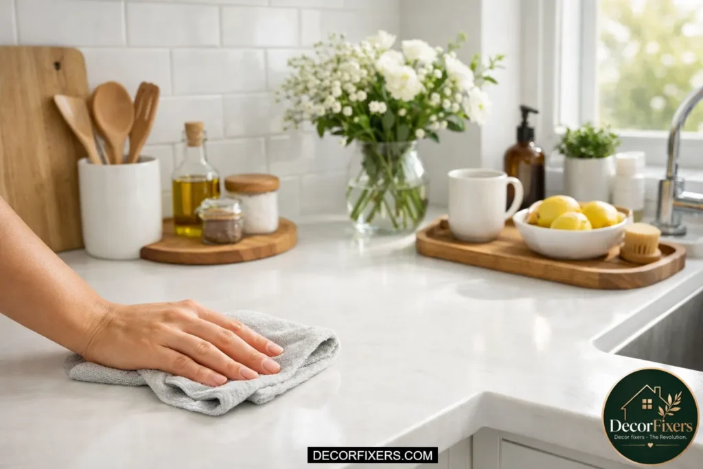
This is the one idea no competing article addresses, and it’s the reason most beautifully styled counters look wrecked by midweek. A daily reset routine is a 90-second habit performed at the same time each day (typically after dinner cleanup) where you return every object to its styled position, remove anything that drifted onto the counter that doesn’t belong, and wipe the surface so the tray zone is clean. Look, if you’ve done the work of building a considered counter arrangement, the reset is what protects that investment every single day. Without it, even the best-styled counter erodes in under 48 hours.
Quick Comparison: Counter Styling Approaches
| Approach | Best For | Key Benefit | Limitation |
| Tray-Anchored Zones | Counters with multiple functional areas | Creates immediate visual structure | Requires tray purchase; wrong size ruins the effect |
| Minimalist Single Zone | Small kitchens or counters with a heavy appliance load | Clean, high-impact with little maintenance | Can feel cold without a warm material element |
| Vignette Layering | Larger counter runs with display potential | Looks most “designed” and photo-ready for any platform | Takes longer to reset daily; needs more curation |
| Functional Styling | Busy households where aesthetics must serve real use | Looks good AND works hard every day | Requires discipline to keep styled objects from drifting |
| Statement Appliance Anchor | Kitchens with one hero appliance in good condition | Builds the whole zone around one strong focal point | Only works if the appliance is genuinely well-designed |
Maintaining Everyday Elegance After the Initial Styling
Styling a kitchen counter for everyday elegance is a two-part process: the initial arrangement and the daily maintenance that keeps it intact. According to residential styling consultants, most counter styling fails not because the arrangement is wrong but because no reset system exists to maintain it. The visual principles of height variation, zone anchoring, and negative space work together as a system. Disrupting one element (a randomly placed mail pile, a moved canister) degrades the whole composition faster than most people expect.
READ MORE: 21 Smart Kitchen Storage Features That Actually Deserve Counter Space
The 90-Second Counter Reset: A Daily Routine
Run this routine once daily, after dinner, and cleanup works best for most households.
- Remove everything from the counter that doesn’t belong to a styled zone, mail, bags, and random items placed during the day.
- Return every styled object to its designated position within its tray or zone.
- Wipe the counter surface so the material (quartz, laminate, stone) is clean and visible around the zones.
- Check that each tray boundary is intact; nothing should be half-in, half-out.
- Step back from the kitchen entry point and confirm the overall impression reads as intended.
What Most Guides Skip: The Backsplash as Styling Backdrop
Most kitchen counter styling articles treat the counter as an isolated surface. What actually controls whether the counter looks designed is the relationship between the counter objects and the vertical plane behind them, the backsplash. Every object on the counter is read against that backdrop, which means the backsplash material, color, and pattern should actively inform the styling choices.
On a white subway tile backsplash, use objects with clean edges and contrasting colors: black matte, dark wood, and dark glass. The graphic contrast does the work. On a warm stone or terracotta tile backsplash, earth-toned ceramics, natural wood, and muted greens blend into a cohesive, warm arrangement. On a patterned or Zellie tile backsplash, preserve the counter styling extremely minimal and tonal, or the two visual layers will compete.
Cambria Quartz countertops, particularly the Britannica or White Cliff lines, are among the most versatile backdrops for counter styling because their low-movement veining doesn’t compete with objects placed on them.
Conclusion:
Here’s the truth most guides don’t say: your kitchen counter will never stay perfect, and it doesn’t need to. What you’re aiming for isn’t a showroom surface. It’s a counter that looks put together even after you’ve actually used it.
After years of writing about homes (and watching how people really live in them), the difference always comes down to one thing: intention over accumulation. Not more products. Not better containers. Just a clearer decision about what belongs on the surface and what doesn’t.
When you start seeing your counter in zones instead of one long dumping ground, everything shifts. The coffee corner stops blending into the cooking area. The sink stops looking like an afterthought. And suddenly, the space feels calmer, even if nothing new was added.
And then there’s the part nobody loves, but everyone needs: maintenance. Not deep cleaning. Just that quick, almost automatic reset at the end of the day. Put things back where they belong. Clear what drifted in. Wipe it down. Ninety seconds, maybe less. That small habit is what protects the look you’ve created. Without it, even the best styling unravels faster than you expect.
If this guide did its job, you’re probably already looking at your counter a little differently. That’s the turning point. Because once you can see what’s off, the crowded corner, the flat arrangement, the lack of breathing room, fixing it becomes simple.
So don’t try all 27 ideas. You don’t need to.
Pick two. Maybe three. Apply them today.
Move something back. Group a few items. Clear a little space.
That’s usually all it takes for a kitchen to go from “just cleaned” to quietly, intentionally styled, the kind of difference you feel every time you walk into the room, even if no one else can quite explain why.
FAQs:
Q: What’s the best way to style kitchen counters on a budget?
A: Start with what you already own, but arrange it using the rule of three and a tray boundary. Repositioning existing objects costs nothing. A simple wooden board or a $12 rattan tray from a home goods store is enough to anchor a zone and create an immediate visual upgrade.
Q: How do I style kitchen counters without making them look cluttered?
A: Keep at least one-third of the surface completely clear, limit each styled zone to three to five objects, and use a tray to define the zone’s boundary. Objects outside a defined zone always read as clutter, even when there are only a few of them.
Q: Should I keep appliances on the counter or put them away?
A: Keep only appliances used daily on the counter, pushed to the back wall. Anything used less than daily belongs in a cabinet or pantry. One well-designed statement appliance can stay as a design anchor; a cluster of functional appliances always reads as clutter, regardless of styling.
Q: Why does my counter still look messy even after I clean it?
A: A clean counter and a styled counter are different things. Cleaning removes dirt; styling arranges objects using visual principles like height variation, negative space, and zone anchoring. Most counters look random because objects are placed for convenience rather than composition. Start by building one intentional zone using a tray.
Q: When should I use a minimalist approach vs. a layered vignette?
A: Use a minimalist approach when your kitchen is small, heavily used, or already has a visually complex backsplash or countertop. Use layered vignettes on longer counter runs where you have display real estate to spare and enough separation from the cooking zone to keep the styled area protected from daily cooking activity.

Welcome to DecroFixers! I’m Mujahid Ali
4 thoughts on “27 Kitchen Counter Styling Ideas for Everyday Elegance”