

I still remember the day I hung what I thought was the perfect piece above my dining table. Ivory abstract, warm gold accents, absolutely stunning on the Wayfair product page.I unwrapped it, stepped back after hanging it, and my stomach dropped. It looked like a sticky note on a billboard.
The piece was 18 inches wide. My table was 72. That mistake, one that costs nothing to avoid once you know the 2/3-width formula, is exactly why I wrote this guide. Because if you’ve been scrolling through Pinterest pinning gorgeous gold abstract wall art for your dining room and still can’t figure out what size to actually order, how high to hang it, or whether it’ll clash with your walnut table and brass chandelier, you’re in the right place.
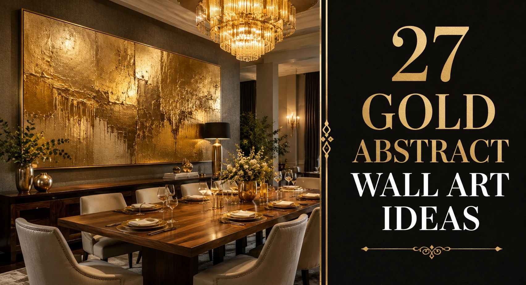
Look, if you’re staring at a blank dining room wall right now and feeling overwhelmed, here’s what actually works: one clear sizing formula, one hanging rule, and 27 specific ideas organized by style, wall size, and room vibe. No vague inspiration. Real numbers.
| What Is Gold Abstract Wall Art? Gold abstract wall art refers to non-representational paintings, prints, or mixed-media pieces that use gold tones, from muted champagne to deep burnished amber, as a primary or accent color. In a dining room setting, these pieces work as focal points above a dining table, sideboard, or buffet, drawing the eye while warming the overall palette of the space. |
These ideas are organized by format, scale, and style, not by “boho” or “modern” buzzwords. Find the wall you’re working with, then find the approach that fits.
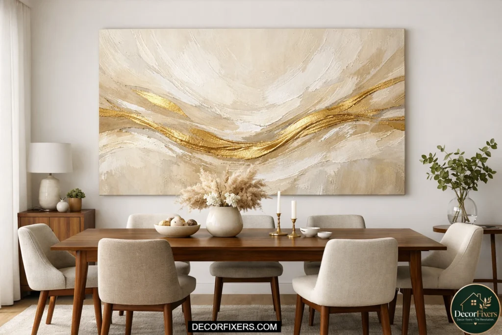
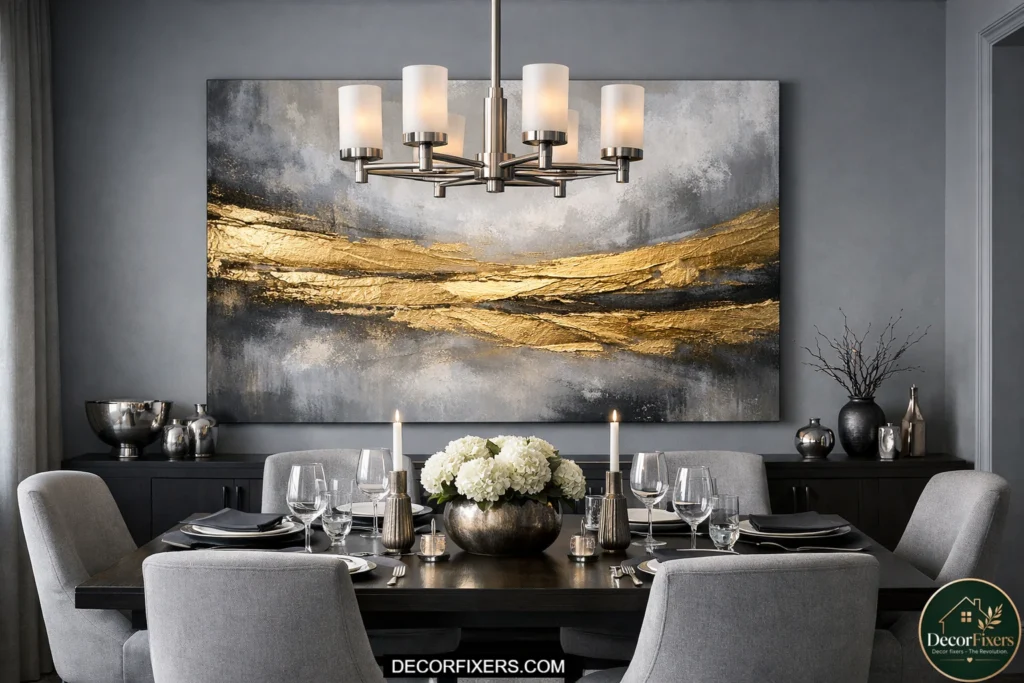
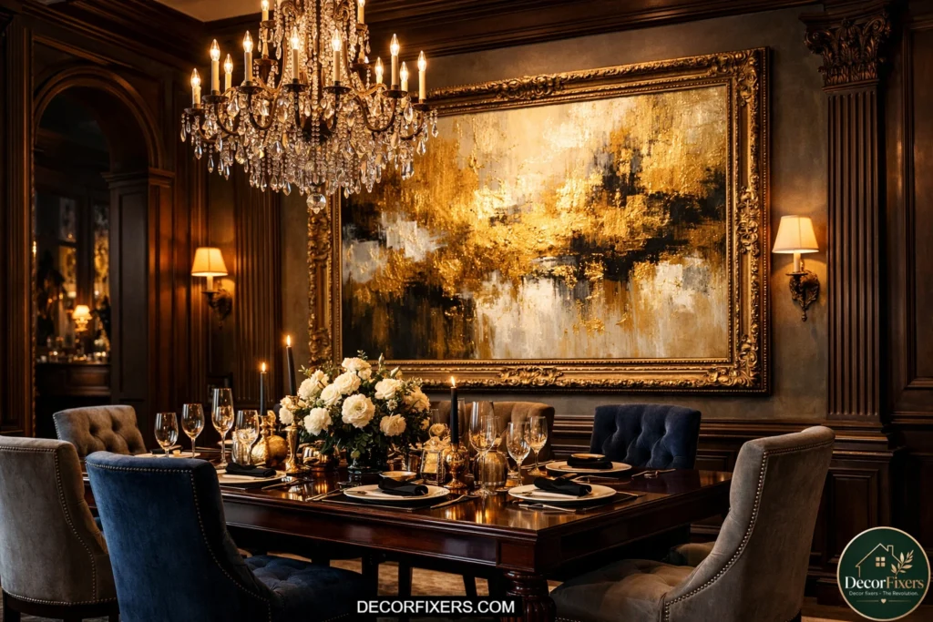
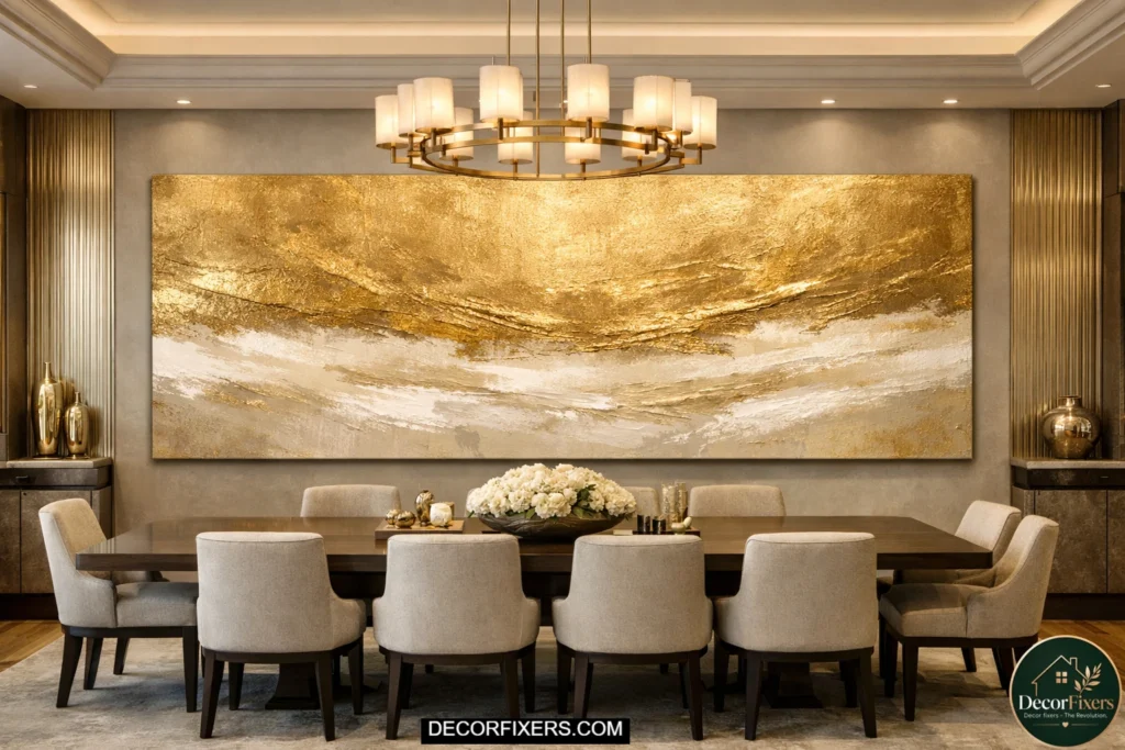
1. The Oversized Single Canvas Above a Rectangular Table
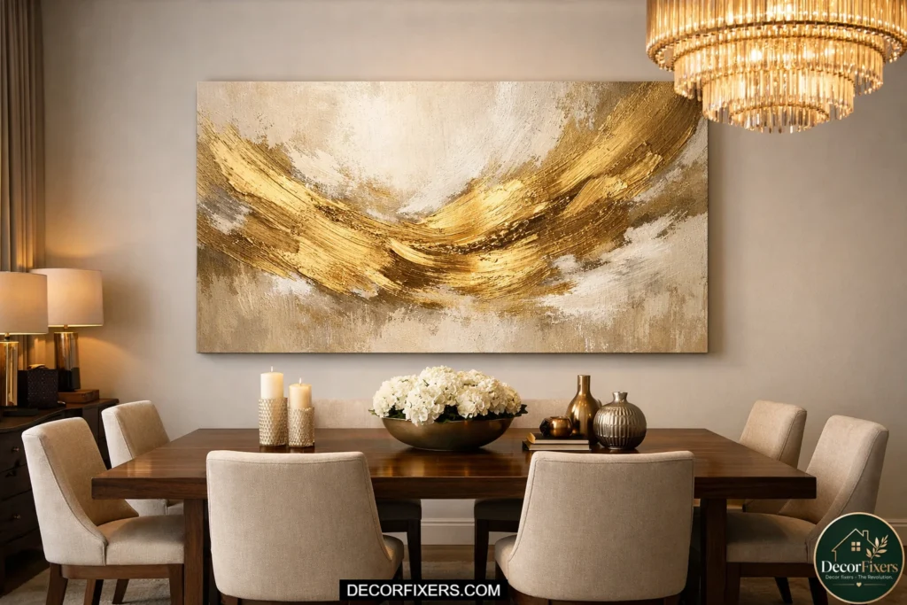
One bold piece, sized at 60–72 inches wide, hung centered above a rectangular dining table, is the fastest way to anchor a dining room and make it look professionally designed.
Gold abstract canvases at this scale, think broad gestural brushstrokes, or layered gold and cream wash with visible texture, do something a cluster of small frames can’t: they unify the entire wall with a single visual statement. They’re also surprisingly forgiving with furniture styles because the abstraction doesn’t compete with anything specific in the room.
For ceiling heights under 9 feet, keep the canvas height at 30–36 inches to avoid it looking like a mural. Above 10 feet, you can go to 48 inches tall without the room feeling suffocated.
Center it at 57–60 inches from the floor to the canvas midpoint, and leave at least 12 inches of wall on each side for visual breathing room.
2. Gold and Black Abstract Diptych for Mid-Size Walls
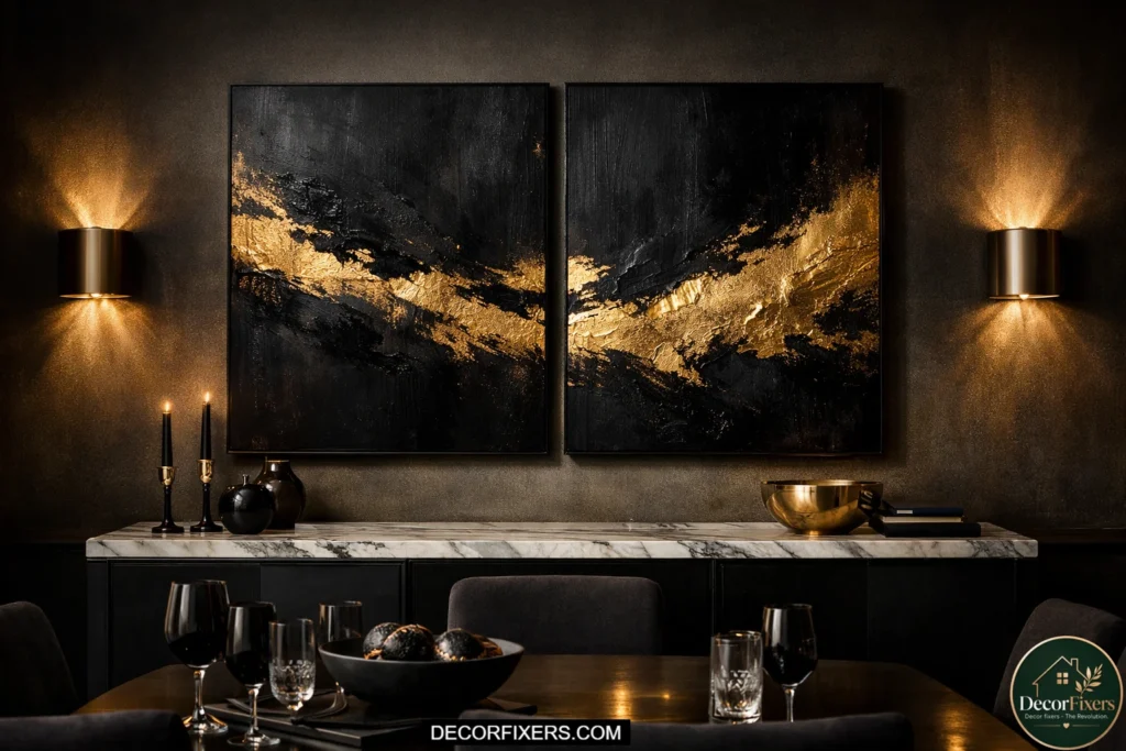
A diptych, two panels displayed as a pair with 1–2 inches of space between them, is ideal for walls between 48 and 72 inches wide, where a single oversized canvas feels like too much of a commitment.
Gold abstract diptychs are particularly effective in dining rooms with dark furniture or moody accent walls because the contrast is sharp enough to read from across a table.
The secret to making a diptych look intentional rather than like two unrelated pieces that happen to be near each other: buy them as a matched set from the same artist or seller, and hang them with precisely 2 inches between panels, no more.
Wider gaps read as two separate pieces. You’ll find strong options on Etsy from independent artists who sell matched pairs specifically designed to hang together.
3. Gold Metallic Abstract Above the Dining Buffet
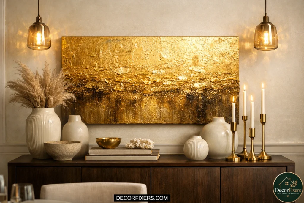
The buffet or sideboard is an underused anchor point for dining room art, and it’s actually one of the best placements in the room because the furniture gives the art a grounded foundation. Apply the 2/3 rule strictly here: a 60-inch buffet needs art at least 40 inches wide.
Leave 6–8 inches between the top of the sideboard and the bottom of the frame; any closer, and the art looks like it’s sitting on top of the furniture; any farther, and they look unrelated.
Gold metallic abstract pieces, especially those with thick impasto texture or acrylic gold leaf application, catch light beautifully when positioned above a sideboard beneath a sconce or pendant.
The three-dimensional surface of textured metallic art creates a play of light and shadow that flat prints basically can’t replicate. This is worth the investment if your buffet wall gets any direct or angled light.
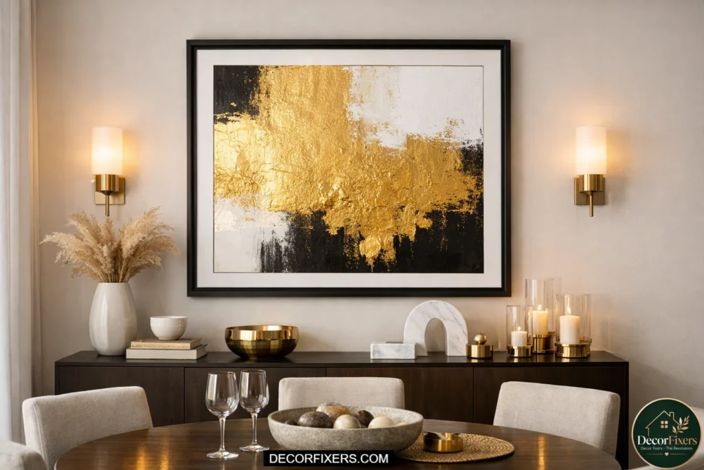
4. Abstract Gold Leaf Canvas with Resin Finish
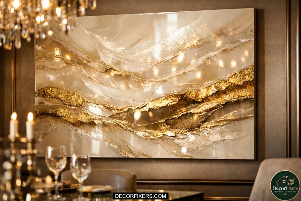
Gold leaf art involves applying actual sheets of metallic foil, either genuine 24K gold leaf or imitation Dutch metal, to canvas, often combined with poured resin or thick gel medium to create an organic, fluid composition.
The result is a piece that doesn’t look like a print or a painting. It has physical depth and reflects light in ways that change as you move around the room.
In a dining room, this type of piece works best on the wall opposite a window or chandelier because the reflective surface will catch and scatter light across the room during dinner.
Resin finishes can be quite glossy, so avoid hanging these opposite another highly reflective surface like a large mirror or glass-fronted cabinet, as the competing reflections become distracting. For sourcing original gold resin art, Etsy has a deep catalog of independent artists selling original pieces and made-to-order custom sizes.
5. Champagne Gold Abstract Print in a Thin Gold Frame
If your dining room runs light, white walls, a pale oak table, linen chairs, a champagne or pale gold abstract print in a matching slim gold or brass frame creates a tone-on-tone effect that reads as elegant rather than understated.
The key is the frame finish: it should be brushed or matte brass, not high-gloss gold, which tends to look cheap next to a sophisticated print.
This approach works at almost any size, but it’s especially effective at 24×30 or 30×40 inches in a smaller dining room or eat-in kitchen where an oversized canvas would overwhelm the space. Minted offers curated abstract prints with built-in dining room styling guidance and premium frame options that fit this aesthetic.
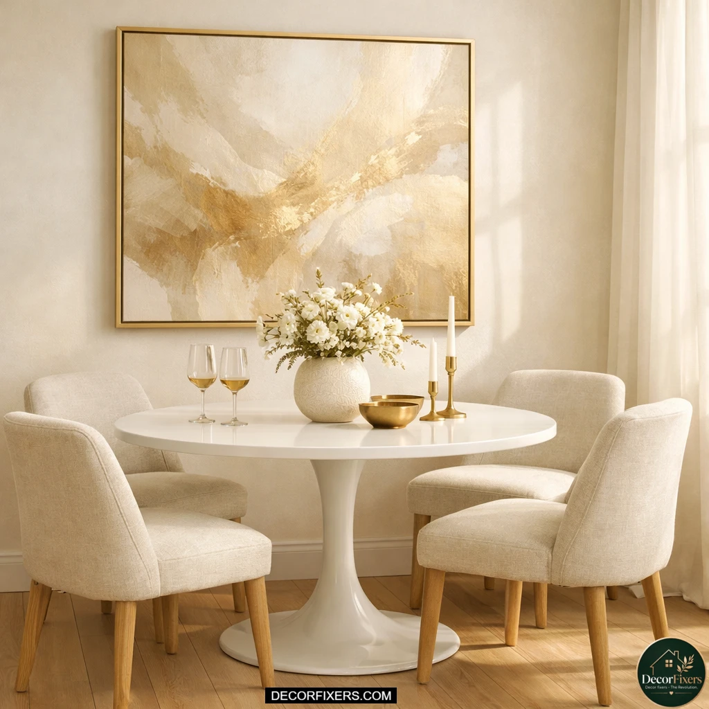
6. Large-Scale Gold and Cream Abstract for White Walls
White-walled dining rooms can swallow artwork that isn’t sized boldly enough. For these spaces, the right move is a large-format gold and cream abstract, at least 40×50 inches, ideally larger, with visible brushwork or layered texture that creates depth against the flat wall.
The cream tones tie into the wall color naturally without blending invisibly, and the gold provides enough contrast to anchor the composition.This pairing is one of the most universally safe approaches in the gold abstract category because it flatters almost every furniture style. Dark walnut table? The gold warms it.
Light oak? The cream bridges it. Black metal chairs? The gold provides contrast. You can source high-resolution, large-format abstract prints on canvas from Canvas Discount, which allows custom sizing so you can enter the exact dimensions produced by your 2/3 formula rather than settling for a stock size.
7. Gold Abstract Triptych for Long Dining Room Walls
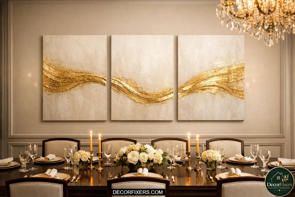
Long walls, anything over 8 feet of continuous, unbroken space, can be tricky for art because a single piece sized to fill them becomes unwieldy to hang and often impossible to ship.
A triptych (three equal panels in a sequence) solves this elegantly: each piece is manageable, but the combined visual weight fills the wall proportionately. Gold abstract triptychs with a flowing composition across all three panels look cohesive when hung with 2–3 inches between panels and unified by a shared color palette.
The most common mistake with triptychs is treating the gaps as irrelevant. Keep them consistent, measure and mark each hanging point before driving a single nail. An irregular gap destroys the visual rhythm, even if each individual panel is beautiful. On a 10-foot wall, three 24×30 panels with 2-inch gaps span 74 inches total, which follows the 2/3 rule for a standard 8-person dining table at approximately 90–96 inches.
What size gold abstract art should I get for my dining room?
The correct size is determined by the 2/3 formula, not personal preference. Measure your dining table width and multiply by 0.67 for the minimum art width. A 72-inch table needs art at least 48 inches wide.
According to professional art hanging standards used by galleries and interior designers, the center of the piece should sit at 57–60 inches from the floor. When in doubt, choose a size larger than your instinct tells you; undersized art is the most common and most visible mistake in dining room decorating.
8. Abstract Gold and White with Geometric Elements
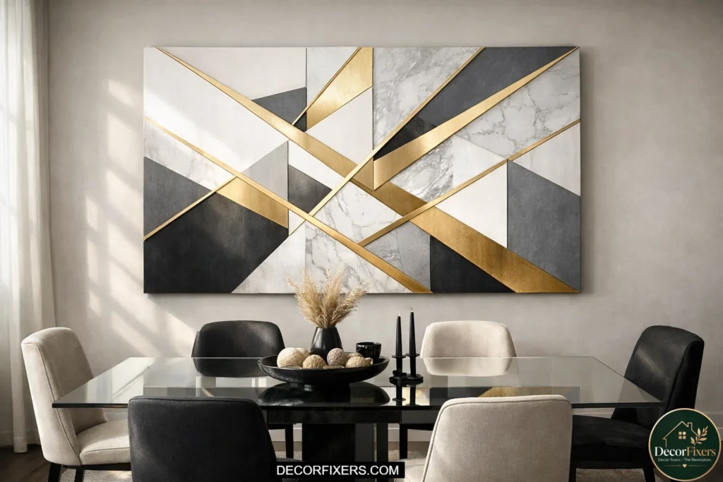
Geometric gold abstract art, think intersecting planes, sharp triangular forms, or grid-based compositions with gold and white negative space, brings structure to a dining room that can feel unanchored with purely fluid, organic abstracts.
It’s a particularly good fit for dining rooms that already have strong structural lines: coffered ceilings, a grid-patterned rug, or furniture with straight, architectural framing.
Some designers argue that geometric art feels too corporate for a dining room. That’s valid for dense, monochrome geometric patterns.
But geometric compositions with warm gold tones and generous white space feel modern rather than institutional, especially when the gold has visible texture, or the lines aren’t perfectly crisp, which introduces the handmade quality that makes geometric art feel alive rather than printed.
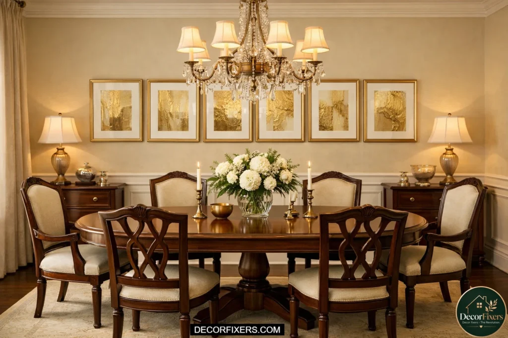
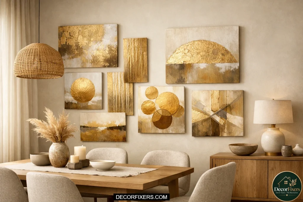
9. Gold Abstract Gallery Wall with Varied Frame Sizes
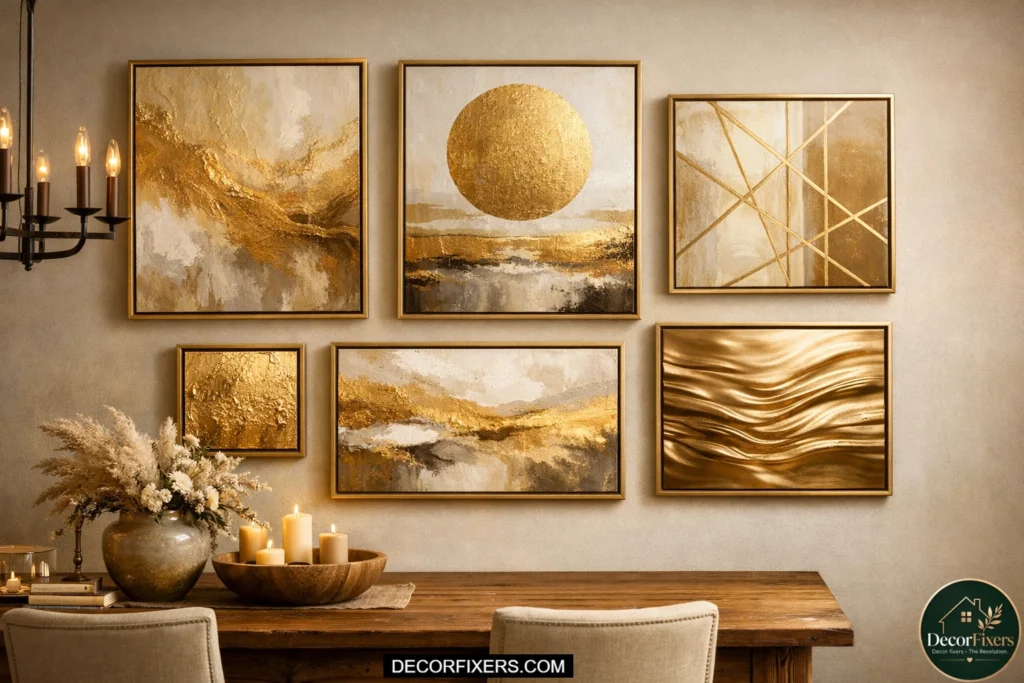
A gallery wall in a dining room works when it’s treated as one unified piece rather than a collection of unrelated art.
The key is finding a visual thread, in this case, gold tones across every piece, and maintaining consistent frame color throughout, whether that’s all brushed gold, all matte black with gold mats, or all natural wood with gold-toned prints inside.
Plan the layout on the floor first. Measure the total footprint of the arrangement to confirm it follows the 2/3 rule against your dining table.
Then treat the center of the entire arrangement as your 57-inch hanging point, not the center of any individual piece. Keep gaps between frames at exactly 2–3 inches. Layouts that get too spread out lose cohesion; the eye starts tracking individual frames rather than reading the wall as a whole.
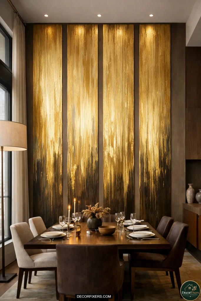
10. Oversized Abstract Gold Canvas for 10-Foot Ceilings
High ceilings fundamentally change the scale equation. In a dining room with 10+ foot ceilings, standard 30×40 artwork looks small, not because it’s the wrong style, but because the wall mass dwarfs it.
For these rooms, you need to think vertically: a 48×60 or even 48×72 inch canvas creates the commanding presence the space demands.
Gold abstract compositions on large-format canvases often feature layered washes and poured or flowing forms that work better at scale; details that look overwhelming at 18×24 become elegant at 48×60.
If you’re concerned about overwhelming a dining room with tall ceilings, a vertical orientation (taller than it is wide) actually draws the eye upward and makes the ceiling feel like an asset rather than an echoing void.
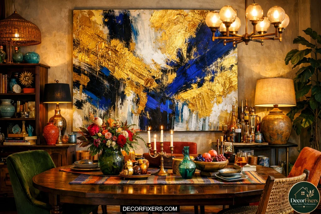
11. Gold and Navy Abstract for a Dramatic Contrast
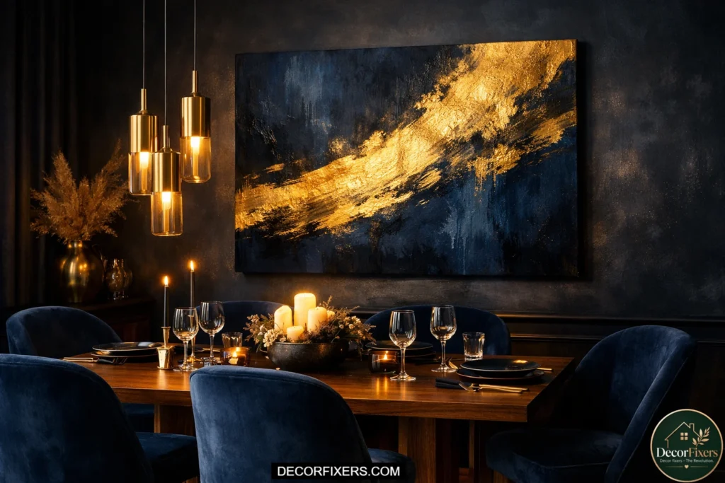
Gold and navy is one of the most visually satisfying color pairings in abstract art, warm and cool, rich and deep, neither color competing, both elevating the other. In a dining room with navy or dark teal accents, chairs, curtains, a feature wall, and a gold and navy abstract canvas create a curated look that feels deliberate and sophisticated without requiring you to redesign anything around it.
The gold reads differently depending on which tone dominates. Navy-heavy abstracts with gold detail accents feel moody and intimate, ideal for evening dinner parties or rooms with low ambient lighting.
Gold-dominant pieces with navy shadow areas feel energetic and commanding. Choose based on your chandelier brightness: a dimmer, warmer room calls for gold-dominant; a well-lit dining room can carry the navy-heavy version.
12. Abstract Gold Botanical Prints in a Dining Room
Gold botanical art sits in interesting territory, technically representational (leaves, branches, organic forms), but rendered in gold leaf or metallic paint in a way that reads as abstract rather than illustrative.
These pieces are perfect for homeowners who love the warmth of gold art but feel uneasy with pure abstraction that “doesn’t look like anything.”
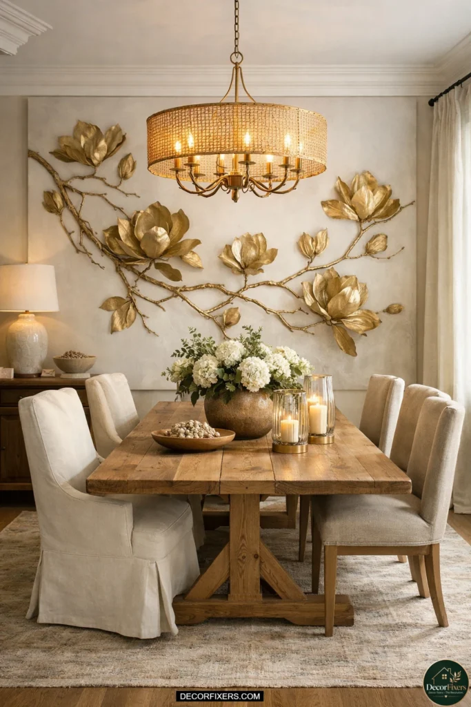
A large-format gold leaf botanical, magnolia branches, tropical leaves, or organic fern forms in gold against a white or charcoal background, works exceptionally well in transitional and eclectic dining rooms.
It connects to natural forms without being literal, and the gold finish gives it the warmth and visual weight of abstract metallic art. These pieces typically photograph beautifully for social media, which is why you see them constantly on Pinterest dining room inspo boards.
13. Minimalist Abstract Gold Line Art for Small Dining Rooms
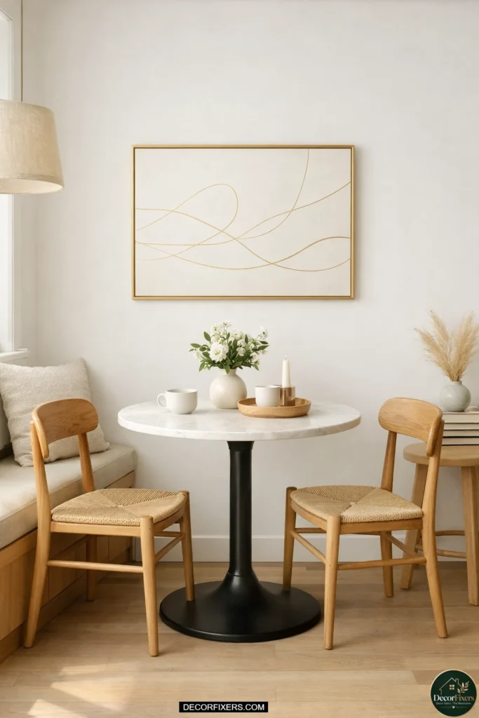
Small dining rooms, particularly eat-in kitchens or dining nooks under 10×10 feet, need art that contributes visual interest without adding visual weight.
Minimalist gold line art accomplishes this: a single continuous gestural line, a loose abstract form, or a sparse composition on a white background in a thin gold frame adds warmth and personality without crowding the wall. The rule for small spaces: keep backgrounds light, keep lines spare, and avoid heavy matting.
A 20×24 inch piece with a simple gold-tone line drawing can look completely proportional above a small bistro table or a wall-mounted drop-leaf.If you’re working with a very narrow wall, under 36 inches, two small coordinated pieces hung as a pair create more presence than one tiny canvas alone.
Why Gold Abstract Art Works So Well in a Dining Room
Most people assume gold wall art reads as flashy or overly formal. The data says otherwise. According to Fortune Business Insights, the global wall art market was valued at $63.61 billion in 2024 and is projected to reach $118.79 billion by 2032, driven largely by demand for premium, personalized home decor, with warm metallic tones leading trending aesthetics. Buyers aren’t going maximalist. They’re going intentionally.
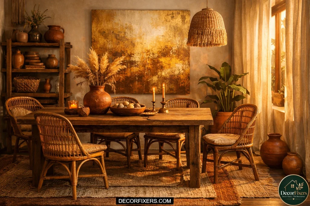
14. Abstract Gold Canvas with Earthy Brown Tones
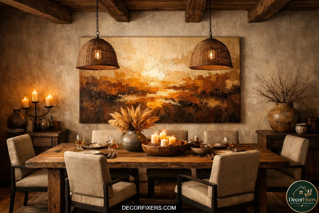
Gold abstract art isn’t always about shimmer. Some of the most successful dining room pieces in this category are matte, textural compositions that combine raw gold ochre with umber, sienna, and cream, colors that read as warm and grounded rather than glamorous.
These earthy gold abstracts suit farmhouse dining rooms, rooms with exposed wood beams, and spaces with terracotta, rust, or warm neutral paint colors. This style also tends to be the most forgiving with furniture choices. Whether you have a rustic reclaimed wood table, a painted cottage dining set, or a classic pedestal table in cherry, earthy gold abstract art tends to complement rather than clash.
Look for pieces described as “textural,” “layered,” or featuring palette knife application. The physical texture of the surface catches warm light beautifully and adds dimension to rooms with simple architectural detailing.
The Sizing Formula Every Dining Room Needs (and Nobody Tells You)
Here’s the thing: the single most common decorating mistake in dining rooms isn’t choosing the wrong style. It’s buying art that’s too small. A piece that looks generous online will look apologetic on an actual wall.
The formula professionals use is called the 2/3 rule. Your artwork, or grouping of pieces, should span approximately two-thirds the width of the furniture beneath it.
For a standard 72-inch dining table, that means your art needs to be at least 48 inches wide. For a 60-inch sideboard, aim for 40 inches minimum.
| How-To: Size Gold Abstract Wall Art for Your Dining Room 1. Measure the width of your dining table or sideboard in inches. 2. Multiply that number by 0.67 to find your minimum art width. 3. Multiply by 0.75 for the ideal upper-end width. 4. For height, stay between 24–36 inches for a standard 8-ft ceiling. 5. Center the piece at 57–60 inches from the floor to the artwork’s midpoint. 6. If hanging above a sideboard, leave 6–8 inches between the furniture top and frame bottom. |
Or maybe I should say it this way: when you’re second-guessing a size, almost always go bigger.
Designers repeat this constantly, and it’s true every single time. You’ll never stand back from a room and think, “That oversized gold canvas is ruining everything.” You will absolutely stand back and think, “That’s too small.”
15. Gold Foil Abstract Print, Budget-Friendly Metallic Look
Not every gold abstract piece needs to be an original painting or even a high-end giclee print. Gold foil abstract art, printed on specialty foil paper or with metallic ink on fine art stock, delivers the warm reflective quality of genuine metallic finishes at a fraction of the cost of original canvas work.
From a standard viewing distance in a dining room, the difference between a $40 gold foil print in a quality frame and a $400 canvas print is nearly imperceptible.
The investment is the frame. A gold foil print in a flimsy plastic frame reads cheap from across the room; the same print in a deep box frame with UV-protective glass reads as considered and intentional.
Budget your art funds accordingly: spend 40% on the print and 60% on the frame when working in this category.
16. Gold and Gray Abstract for Cool-Toned Dining Rooms
Dining rooms with gray walls, silver hardware, or cool-toned furniture can struggle with warm gold art that fights rather than integrates.
The solution is gold and gray abstracts: compositions that use warm gold tones alongside dove gray, charcoal, and silver, creating a bridge between the warmth of gold and the coolness of the room’s existing palette.
I’ve seen conflicting design advice on this; some sources say don’t mix warm and cool in a dining room, while others say the contrast is exactly what creates visual energy.
My read: it depends on the value contrast. Low-contrast gold-and-gray abstracts (pale champagne gold with light gray) feel harmonious and calm. High-contrast pieces (deep antique gold with dark charcoal) create drama. Both work; choose based on whether you want the dining room to feel like a sanctuary or a statement.
17. Abstract Art with Gold Accents for a Subtle Metallic Touch
Not every piece in this category is predominantly gold. Sometimes the most effective approach is an abstract painting in another dominant color, teal, rust, deep plum, cream, with gold accent elements: a brushstroke of metallic paint, gold ink detail, or leaf gilding applied to specific passages of the composition.
These pieces tie into gold room elements (hardware, frames, lighting) without overwhelming the wall with warm yellow tones. This is particularly useful in dining rooms that already have significant gold presence, a brass chandelier, gold cabinet pulls, and gold-toned wood floors. Adding a fully gold-dominant canvas in this context creates visual overload.
An abstract piece that “references” gold through accent elements creates cohesion without redundancy. Look for artist descriptions that mention “metallic accents,” “gold ink,” or “gilt details” when searching on platforms like Etsy.
18. Framed Abstract Gold Prints Above a Dining Chair Rail
In dining rooms with chair rail molding, typically found in traditional, colonial, or craftsman-style homes, the wall space above the rail is your primary art zone.The challenge is that this space is often narrower vertically than a full wall, which rules out oversized single canvases.
The solution: a horizontal row of three to four coordinated gold abstract prints in matching gold or wood frames, spaced evenly across the upper wall.This approach creates a strong horizontal visual rhythm that reinforces the room’s architectural character rather than fighting it.
Keep all prints in portrait orientation at the same size (16×20 or 18×24 works well), maintain 2–3 inch gaps between frames, and ensure the row is centered to the dining table below, not to the wall itself. The horizontal alignment of the prints creates an implicit “line” that connects the art to the chair rail below it.
19. Abstract Gold Canvas in a Boho Dining Room
Boho dining rooms, rattan chairs, macramé, layered textiles, and earthy tones might seem like an odd pairing with gold abstract art, but warm gold actually sits beautifully in the boho palette. The key is the gold’s character:
You want amber, raw ochre, or antique gold rather than bright or metallic yellow gold. Matte finishes on textured canvas with organic, flowing forms that feel natural and collected rather than formal.
Pair these pieces with normal wood or rattan frames rather than refined metal frames. The organic texture of the frame solid connects the gold abstract to the room’s broader natural material story.
Sizes can be more relaxed in a boho context, an asymmetric canvas, or one slightly off-center above the table, reads as intentionally casual rather than careless.
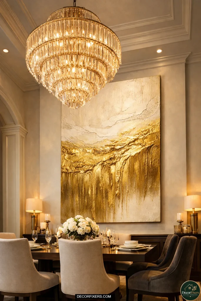
20. Gold Abstract Wall Art in a Formal Dining Room
Formal dining rooms, dark wood furniture, upholstered chairs, wainscoting, and traditional architectural details demand gold abstract art that carries visual weight and finish quality. This is where investment pieces pay off most visibly.
Original oil paintings with gold impasto work, large-format giclée prints in gilded ornate frames, or gallery-quality abstract pieces with museum-grade framing all elevate the formality of the room rather than creating a jarring contemporary contrast.
Frame choice is critical here. A formal dining room with a mahogany table and velvet dining chairs needs art in a proportionate frame; a slim float frame or an unframed canvas would look underdressed.Look for traditional or transitional gold leaf frames (they can be found affordably on Etsy) that add architectural presence while allowing the abstract composition inside to provide modern energy.
21. Gold Abstract Piece with a Pop of Color for Eclectic Rooms
Eclectic dining rooms, rooms that deliberately mix periods, textures, and styles, can handle more visual boldness from their art than any other room type.
A gold abstract piece with an unexpected pop of a complementary color (deep cobalt, burnt sienna, muted sage, or dusty rose alongside the gold) adds the layered energy an eclectic room needs while keeping the palette coherent.
The practical rule: pull the pop color from something already in the room. A cobalt-and-gold abstract above a table with cobalt water glasses creates an intentional visual connection. A dusty-rose-and-gold piece next to a rose velvet dining chair does the same.
The room starts to feel like it was planned by someone with a vision rather than assembled from separate shopping carts.
22. Abstract Gold Canvas Cluster for a Statement Corner
Not every gold abstract idea lives on the main dining wall. A corner cluster, three to five pieces of varying sizes hung as a loose arrangement in a dining room corner, creates a secondary focal point that makes the room feel curated from multiple angles.
etThis works particularly well in open-plan living and dining rooms where the dining corner is visible from the kitchen or living area. Keep the cluster anchored: the largest piece should be at the center-top of the arrangement, with smaller pieces radiating outward and slightly lower.
All pieces should share a gold tonal relationship. The corner placement means the arrangement wraps slightly around two walls, which is a sophisticated technique that most online guides don’t address, but it works beautifully in rooms with dead corner space that would otherwise collect nothing but a forgotten floor lamp.
Quick note: Gold leaf and metallic acrylic finishes are especially sensitive. They can look absolutely stunning under directed warm light or a picture light, and dull under flat overhead fluorescents. If you’re investing in an original or high-end print, budget for a simple adjustable picture light. The difference is not subtle.
Does gold abstract art work with dark wood dining furniture?
Gold abstract art is particularly effective with dark wood furniture because the warm metallic tones create contrast against dark surfaces while remaining tonally harmonious.
Deep antique gold or burnished ochre canvases work especially well with walnut, mahogany, and espresso-stained furniture. Avoid high-gloss metallic gold finishes with very dark furniture, as the brightness gap can read as jarring. Matte or satin finishes on the canvas integrate more naturally.
23. Vertical Gold Abstract Panels for Narrow Walls
Narrow walls, under 36 inches wide, often found between windows, beside doorways, or in compact dining rooms, need vertical compositions that use the available height rather than fighting for width.
A single tall vertical gold abstract panel (24×48 or 20×60 inches) hung in a narrow space creates visual height and draws the eye upward, making the room feel taller.Vertical gold abstract panels are especially effective in rooms with low 8-foot ceilings where you want to create the illusion of more height.
The elongated format suggests height even while the ceiling stays where it is. For pairs of narrow walls (two walls separated by a doorway), matching vertical panels create bookend symmetry that grounds the room’s architecture.
24. Gold Abstract Mixed-Media Art (Texture, Fabric, Collage)
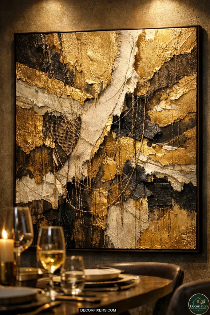
Mixed-media gold abstract art combines painting with collage elements, torn fabric, metallic thread, book pages, tissue layers, and found materials to create pieces with extraordinary physical depth and texture.
In a dining room, these pieces reward close viewing (the kind that happens naturally when guests walk in to sit down) and create a conversation piece that no flat print can replicate. Look for terms like “mixed media,” “collage art,” “encaustic,” or “textural abstract” when searching.
These pieces are almost always one-of-a-kind originals, which means they carry an authenticity that guests can sense even if they can’t articulate why. The range in pricing is enormous, from $80 for a small Etsy original to thousands for gallery-level work, but even modest original mixed-media pieces bring a warmth to a dining room that mass-produced prints struggle to match.
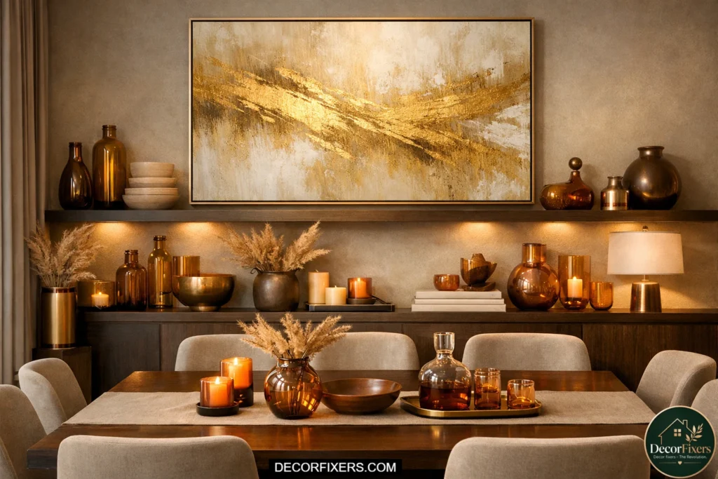
25. Abstract Gold Canvas Above an Open Shelving Dining Room Wall
Dining rooms with open shelving built into the wall, increasingly common in modern and transitional home design, need art that coexists with the shelving rather than competing with it.
A single gold abstract canvas placed above the shelving unit, sized to the 2/3 width of the shelving footprint, creates a visual cap that ties the whole installation together.The art color palette should pull from objects already on the shelves.
If you display amber glass, warm ceramic, or gold-accented dishes, a gold abstract canvas above integrates naturally into the total composition.The goal is for the art and shelving to read as one cohesive installation, not as a shelf with a random piece of art floating above it.
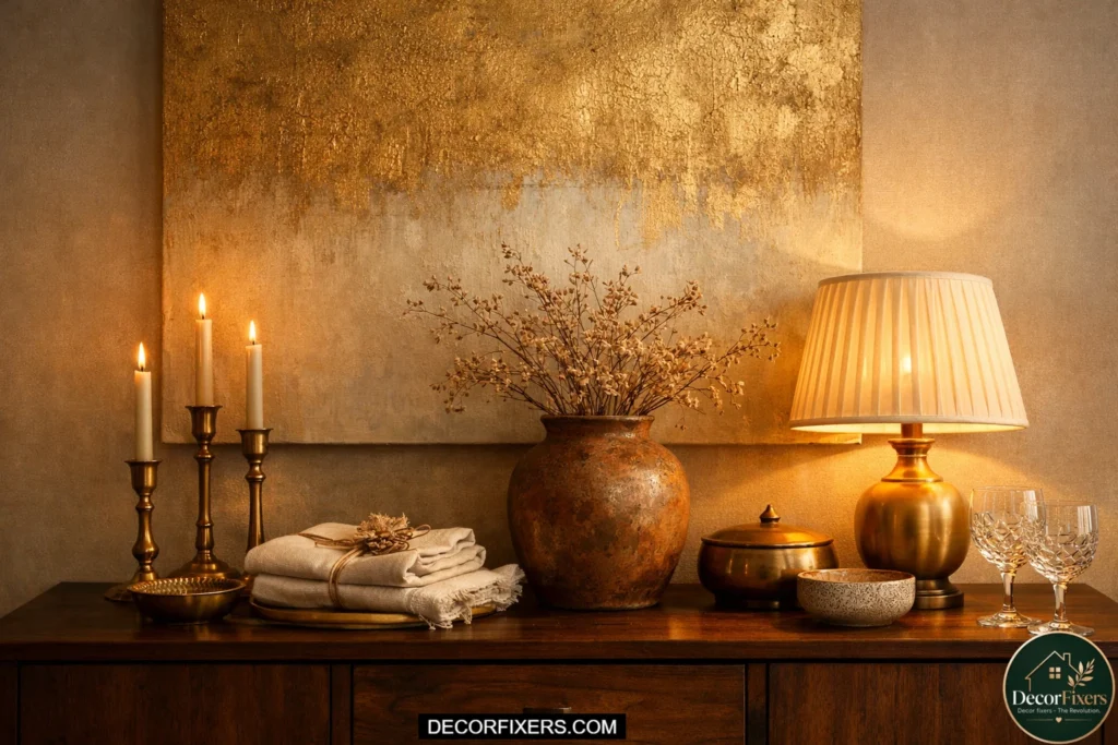
26. Abstract Gold Wall Art as Part of a Dining Room Vignette
A vignette, a small, curated still-life arrangement of objects on a surface, becomes significantly more powerful when anchored by art above it.In a dining room, the most common vignette surface is the sideboard or console: a few objects arranged intentionally, with a gold abstract canvas above tying the whole composition together.
The art and objects should relate to each other tonally. A gold abstract canvas above a sideboard with a brass candlestick, a terracotta vase, and a stack of linen napkins creates cohesion through shared warmth.
Add a small table lamp to the arrangement, and the vignette becomes a fully considered design moment that elevates the entire dining room. Scale the art to the sideboard using the 2/3 rule, and keep the object arrangement below centered to the canvas, not to the edges of the furniture.
27. Custom-Sized Gold Abstract Canvas for an Unusual Wall
Sometimes the wall you’re working with simply doesn’t conform to standard canvas dimensions. An unusually wide wall, a wall with an awkward window or door cutout, or a dining room addition with non-standard proportions may need art sized specifically for the space.
This is exactly where custom sizing from platforms like Canvas Discount or commissioned original art from Etsy artists makes the investment worthwhile.
When ordering a custom size, always input your measurements from the 2/3 formula, not from a rough estimate or a standard size that’s “close enough.” A custom 54×36-inch piece for a specific wall will always look better than a stock 48×30 that you forced into service.
Custom canvas printing costs are often only marginally higher than stock sizes for the same quality, and the visual payoff of art that actually fits your exact wall is immediate and permanent.
How high should I hang gold abstract art above my dining table?
The center of the artwork should sit at 57–60 inches from the floor; this is the standard used by galleries and professional designers and aligns with average seated and standing eye level.
If you’re hanging art above a sideboard or buffet rather than a bare wall, position the bottom of the frame 6–8 inches above the top of the furniture.
Never center the art on the wall; center it on the dining table, which is the room’s visual anchor.
Quick Comparison:
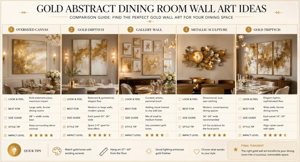
Use this at-a-glance table to narrow down your format based on your wall and room type.
| Option | Best For | Key Benefit | Limitation |
| Large single canvas (36–60″) | Open feature walls | Bold focal point, no clutter | Hard to return if the wrong size |
| Gold & black diptych | Dining rooms under 12 ft | Fills the wall without heaviness | Needs precise alignment |
| Gallery wall with gold frames | Eclectic or transitional rooms | Tells a layered story | Time-consuming to hang |
| 3D metallic wall sculpture | Modern/industrial spaces | Adds texture & depth | Can look dated quickly |
| Gold-framed triptych prints | Long walls above the buffet | Symmetry without bulk | Repetitive if overused |
Conclusion:
After that 18-inch canvas disaster, I measured everything. I printed out the 2/3 rule and taped it inside a kitchen cabinet. I learned that 57 inches from floor to canvas center isn’t arbitrary; it’s the number galleries use because it works for actual human bodies in actual rooms. I learned that the warm glow I loved on Pinterest dining rooms wasn’t just the art, it was 2700K bulbs bouncing off gold-toned surfaces.
Here’s what I’d tell someone starting from scratch: get the sizing right first. Everything else, style, finish, abstract vs. geometric, single vs. gallery, is secondary to proportion. A mediocre piece hung at the right size in the right place looks intentional. A beautiful piece hung at the wrong size or too high looks like an afterthought.
The 27 ideas in this guide cover nearly every dining room scenario: small, large, formal, casual, light-walled, dark-walled, high-ceilinged, compact. Pick the idea that fits your actual room, run the 2/3 formula on your actual table width, and order one size larger than you think you need.
The difference between a dining room that stops guests in their tracks and one that’s just fine usually isn’t the furniture, the chandelier, or the paint color. It’s one well-chosen, correctly sized piece of gold abstract wall art on the right wall, hung at the right height, lit with the right bulb.
That’s it. That’s the whole thing.
FAQs:
Q: What’s the best size gold abstract wall art for a dining room?
A: Measure your dining table width and multiply by 0.67; that’s your minimum art width. For a 72-inch table, you need at least a 48-inch-wide piece. Center it at 57–60 inches from the floor.
Q: How do I hang abstract art above a dining room buffet?
A: Apply the 2/3 rule; art should be at least two-thirds the width of the buffet. Leave 6–8 inches between the top of the furniture and the bottom of the frame. Center the piece to the buffet, not the wall.
Q: Should I choose one large piece or a gallery wall for my dining room?
A: One large piece is simpler, more forgiving, and creates a stronger focal point. A gallery wall works better when you have multiple smaller pieces you want to display together. Both work; the decision should be based on your wall width and how much hanging time you want to invest.
Q: Why does my gold wall art look dull in my dining room at night?
A: Your bulbs are likely running above 3500K (cool white). Gold tones respond best to warm 2700K–3000K light. Swap your bulbs or add a directed picture light above the canvas for immediate improvement.
Q: When should I use a triptych instead of a single canvas in a dining room?
A: Use a triptych when your wall is over 72 inches wide and shipping or handling a single oversized canvas is impractical. Triptychs also allow you to fill a long wall proportionately without heavy-duty wall anchors. Keep panel gaps at exactly 2 inches for a cohesive look.

Creator of DecorFixers, sharing practical home and interior ideas focused on real-life usability, simple design improvements, and budget-friendly solutions.
1 thought on “27 Gold Abstract Wall Art Dining Room Ideas: Size, Style & Placement That Actually Work”